
相关文章链接:
作者:远方的星
CSDN:https://blog.csdn.net/qq_44921056
腾讯云:https://cloud.tencent.com/developer/column/91164
本文仅用于交流学习,未经作者允许,禁止转载,更勿做其他用途,违者必究。
这一篇是关于数分三剑客之一–matplotlib的一些学习笔记。
它的功能非常强大,可以让枯燥的数据“美腻”起来,那么先来看一下官方给的一些样图:
说到绘图,那必须要有一个画板。Figure作为一个“老画板”,在matlab中经常能看到它的出没,在python中,它的具体语法是什么呢?让我们来看一下。
figure(num, figsize, dpi, facecolor, edgecolor, frameon)
num:画板的编号;
figsize:指定画板的长和高;
dpi:绘图对象的参数;
facecolor:背景颜色;
edgecolor:边框颜色;
frameon:是否需要显示边框;
数学图形怎么能离开坐标轴呢?
创建的方法不一、这里利用set函数创建坐标轴。
xlim:x轴的范围 [min,max];
ylim:y轴的范围 [min,max];
xlable:自定义x轴的名称;
ylable:自定义y轴的名称;
title:自定义标题;
如:
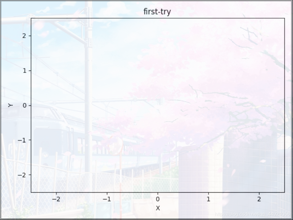
import matplotlib.pyplot as plt
fig = plt.figure()
ax = fig.add_subplot(111)
ax.set(xlim=[-2.5, 2.5], ylim=[-2.5, 2.5], xlabel='X', ylabel='Y', title='first-try')
plt.show()
输出:(这里的樱花树,是pycharm的背景,不是代码实现的效果)
看了上例,ax = fig.add_subplot(111)的作用是啥呀?
其实,这部分和matlab中的subplot作用一样,就是在一个打的区域,布置“几个”(可以是1个)画板。
这里面的三个数字可以这么理解:第一个数字代表几行,第二个数字代表几列,第三个数字代表第几个(顺序是自左向右,自上到下)
如:
import matplotlib.pyplot as plt
fig = plt.figure()
ax1 = fig.add_subplot(221)
ax2 = fig.add_subplot(222)
ax3 = fig.add_subplot(224)
plt.show()
输出:

matplotlib绘图中与颜色相关的参数(color颜色参数、linestyle线型参数、marker标记参数)可选列表集合
使用plt.plot
import matplotlib.pyplot as plt
x = [1, 2, 3, 4, 5, 6]
y = [1, 3, 2, 5, 9, 2]
# 传进去x,y的坐标
plt.plot(x, y)
plt.show()
输出:

使用plt.bar
import matplotlib.pyplot as plt
x = [1, 2, 3, 4, 5, 6]
y = [1, 3, 2, 5, 9, 2]
# 传进去x,y的坐标
plt.bar(x, y, color='blue')
plt.show()
输出:

使用plt.pie
import matplotlib.pyplot as plt
name = ['one', 'two', 'three', 'four', 'five', 'six']
x = [1, 3, 2, 5, 9, 2]
plt.pie(x, labels=name, colors=['b', 'r', 'g', 'k', 'c', 'm'])
plt.axis('equal')
plt.show()
输出:

使用plt.scatter
import matplotlib.pyplot as plt
x = [1, 2, 3, 4, 5, 6]
y = [1, 3, 2, 5, 9, 2]
# market的作用是用什么记号来标记点
plt.scatter(x, y, color='red', marker='*')
plt.show()
输出:

在处理随机数的时候,感觉挺有意思的。
import matplotlib.pyplot as plt
import numpy as np

plt.figure(figsize=(8, 8))
x = np.random.rand(50)
y = np.random.rand(50)
z = np.random.rand(50)
# color代表颜色,alpha代表透明度
plt.scatter(x, y, s=z * 1000, color='b', alpha=0.5)
plt.show()
输出:

对于坐标轴的改动,需要用到plt.gca函数,它有四个参数:top 、bottom、left、right。分别对应上下左右四个轴。如何操作,先看下面的例子。


代码:
import matplotlib.pyplot as plt
fig = plt.figure()
ax = fig.add_subplot(111)
ax.set(xlim=[-2.5, 2.5], ylim=[-2.5, 2.5], title='first-try')

bx = plt.gca()

# 将下面的轴(x轴)设置为xaxis
bx.xaxis.set_ticks_position('bottom')
# 将设置后的轴移动到y=0的地方
bx.spines['bottom'].set_position(('data', 0))

bx.yaxis.set_ticks_position('left')
bx.spines['left'].set_position(('data', 0))
# 将不想看到的右、上方向的轴“删除”,其实就是把轴的颜色改为无色
bx.spines['top'].set_color('none')
bx.spines['right'].set_color('none')

plt.show()
import matplotlib.pyplot as plt
fig = plt.figure()
ax = fig.add_subplot(111)
ax.set(xlim=[-2.5, 2.5], ylim=[-2.5, 2.5], title='first-try')
# 对x、y轴的刻度值进行设置
plt.yticks(fontsize=20, color='#00000')  # y轴刻度值大小为20 ,颜色为黑色
# plt.yticks(fontsize=20, color='black')  # 用black也可以
plt.xticks([])  # [] ,即不显示x轴刻度值

plt.show()
输出:

对于颜色转换可以看一下这位大佬的总结:2020 RGB颜色查询大全 #000000 【颜色列表】
import matplotlib.pyplot as plt
fig = plt.figure()
ax = fig.add_subplot(111)
ax.set(xlim=[-2.5, 2.5], ylim=[-2.5, 2.5], title='first-try')
fig.autofmt_xdate()  # 默认旋转45°,可以在括号里加rotation=‘角度’
plt.show()
import matplotlib.pyplot as plt
from numpy import *
x = linspace(0, 4, 50)  # linspace(A,B,C),指从A开始B结束,中间分布C个值,C默认为100
y1 = x
y2 = x**2
plt.figure()
l1, = plt.plot(x, y1, color='b', linestyle='-')
l2, = plt.plot(x, y2, color='r', linestyle='--')
# handles:需要制作图例的对象;labels:图例的名字;loc:图例的位置,loc的内容可选“best”,最佳位置
plt.legend(handles=[l1, l2], labels=['function1', 'function2'], loc='upper left')
plt.show()
注意:l1后面有个 ,
输出:

import matplotlib.pyplot as plt
from numpy import *
x = linspace(0, 4, 50)  # linspace(A,B,C),指从A开始B结束,中间分布C个值,C默认为100
y = x**2
plt.figure()
# 选取需要标注的点
x0 = 1.5
y0 = x0**2
# 作图
plt.plot(x, y)
# 作垂线,
plt.plot([x0, x0], [0, y0], 'k--', linewidth=1)
# 作出标注的点
plt.scatter([x0, ], [y0, ], s=50, color='b')
# 做标注
plt.annotate(r'$x^2=%s$' % y0, xy=(x0, y0), xycoords='data', xytext=(+30, -30),
             textcoords='offset points', fontsize=16,
             arrowprops=dict(arrowstyle='->', connectionstyle="arc3,rad=.2"))
# 参数xycoords='data' 是说基于数据的值来选位置,
# xytext=(+30, -30) 和 textcoords='offset points' 对于标注位置的描述 和 xy 偏差值
# arrowprops是对图中箭头类型的一些设置
plt.show()
``'-'``        None
``'->'``       head_length=0.4,head_width=0.2
``'-['``       widthB=1.0,lengthB=0.2,angleB=None
``'|-|'``      widthA=1.0,widthB=1.0
``'-|>'``      head_length=0.4,head_width=0.2
``'<-'``       head_length=0.4,head_width=0.2
``'<->'``      head_length=0.4,head_width=0.2
``'<|-'``      head_length=0.4,head_width=0.2
``'<|-|>'``    head_length=0.4,head_width=0.2
``'fancy'``    head_length=0.4,head_width=0.4,tail_width=0.4
``'simple'``   head_length=0.5,head_width=0.5,tail_width=0.2
``'wedge'``    tail_width=0.3,shrink_factor=0.5
输出:

import matplotlib.pyplot as plt
from numpy import *
x = linspace(0, 4, 50)  # linspace(A,B,C),指从A开始B结束,中间分布C个值,C默认为100
y = x**2
fig = plt.figure()

# 这四个数字分别代表的是相对figure的位置
left, bottom, width, height = 0.1, 0.1, 0.8, 0.8
ax1 = fig.add_axes([left, bottom, width, height])
ax1.plot(x, y, 'r')
ax1.set_xlabel('x')
ax1.set_ylabel('y')
ax1.set_title('main')

ax2 = fig.add_axes([0.2, 0.6, 0.25, 0.25])
ax2.plot(y, x, 'b')
ax2.set_xlabel('x')
ax2.set_ylabel('y')
ax2.set_title('children1')

ax3 = fig.add_axes([0.65, 0.2, 0.2, 0.2])
ax3.plot(y, x, 'b')
ax3.set_xlabel('x')
ax3.set_ylabel('y')
ax3.set_title('children2')

plt.show()
输出:

这里系统会有提示:This figure includes Axes that are not compatible with tight_layout, so results might be incorrect.
意思为:此图包括与紧固件布局不兼容的轴,因此结果可能不正确。
前排提示:如果使用pycharm无法播放动画,可参考:pycharm中动画函数animation.FuncAnimation不起作用
import numpy as np
import matplotlib.pyplot as plt
from matplotlib.animation import FuncAnimation

fig, ax = plt.subplots()
xdata, ydata = [], []
ln, = plt.plot([], [], 'ro')


def init():
    ax.set_xlim(0, 2*np.pi)
    ax.set_ylim(-1, 1)
    return ln,


def update(frame):
    xdata.append(frame)
    ydata.append(np.sin(frame))
    ln.set_data(xdata, ydata)
    return ln,


ani = FuncAnimation(fig, update, frames=np.linspace(0, 2*np.pi, 128), init_func=init, blit=True)
plt.show()
输出:
 (待更动画)
参考文章1
参考文章2
参考文章3
参考文章4
参考文章5
参考文章6
参考文章7
如有不足,还请大佬评论区留言或私信我,我会进行补充。
感谢您的支持,希望可以点赞,关注,收藏,一键三连哟。
作者:远方的星
CSDN:https://blog.csdn.net/qq_44921056
腾讯云:https://cloud.tencent.com/developer/column/91164
本文仅用于交流学习,未经作者允许,禁止转载,更勿做其他用途,违者必究。

其实这三种编程技术各有优势,我们大概可以从语言、平台这二点来区分: 一、语言...
vscode从插件库里安装eslint和prettier 实现自动格式化 { // 是否允许自定义的sn...
本文主要讲述如何在Visual Studio 2015中配置Opencv3.2版本 例子使用的是WIN 10 ...
最近在update某张表时突然提示了个比较少见的错误,ORA-01591,这个问题跟平时的...
前言 一个 Redis 需要从另一个 Redis 数据同步 或者 数据迁移,这种一般怎么做? ...
1) a href= 'JavaScript :history.back(1)'『返回上一页』/a 2) a href='window....
1月29日消息 目前,基于 Chromium 的 Edge 浏览器已经越来越完善,不过相比老版...
开启慢查询日志 在项目中我们会经常遇到慢查询,当我们遇到慢查询的时候一般都要...
ASP.NET Core 提供运行状况检查中间件和库,以用于报告应用基础结构组件的运行状...
% Dim bSurvey ' 是否显示调查表 const bID="1" ' 调查表的 id bSurvey=false ' ...