
欢迎关注公众号:pythonic生物人
holoviews是一个超级简洁的python可视化工具,后端为bokeh、matplotlib、datashader库,最擅长干的是一行代码搞定一张图(类似seaborn),如下文的河流图(Sankey);
HoloViews helps you understand your data better, by letting you work seamlessly with both the data?and?its graphical representation.
欢迎阅读类似文章(列出公众号的部分内容)
Python可视化44|画个“圣诞树”
Python可视化|Matplotlib40-LaTeX in Matplotlib和python
Python可视化|Matplotlib39-Matplotlib 1.4W+字教程(珍藏版)
Python可视化|Matplotlib38-Matplotlib官方Cheat sheet(上篇)
Python可视化35|matplotlib&seaborn-一些有用的图
Python可视化34|matplotlib-多子图绘制(为所欲为版)
Python可视化33|matplotlib-rcParams及绘图风格(style)设置详解
Python可视化32|matplotlib-断裂坐标轴(broken_axis)|图例(legend)详解
Python可视化31|matplotlib-图添加文本(text)及注释(annotate)
Python可视化30|matplotlib-辅助线(axhline|vlines|axvspa|axhspan)
Python可视化29|matplotlib-饼图(pie)
Python可视化28|matplotlib绘制韦恩图(2-6组数据)
Python可视化27|seaborn绘制线型回归图曲线
Python可视化26|seaborn绘制分面图(seaborn.FacetGrid)
Python可视化25|seaborn绘制矩阵图
Python可视化24|seaborn绘制多变量分布图(jointplot|JointGrid)
Python可视化23|seaborn.distplot单变量分布图(直方图|核密度图)
Python可视化22|Seaborn.catplot(下)-boxenplot|barplot|countplot图
Python可视化21|Seaborn.catplot(上)-小提琴图等四类图
Python可视化20|Seaborn散点图&&折线图
Python可视化19|seborn图形外观设置
Python可视化17seborn-箱图boxplot
Python可视化matplotlib&seborn16-相关性heatmap
Python可视化matplotlib&seborn15-聚类热图clustermap
Python可视化matplotlib&seborn14-热图heatmap
Python可视化|matplotlib13-直方图(histogram)详解
Python可视化|matplotlib12-垂直|水平|堆积条形图详解
Python可视化|matplotlib11-绘制折线图matplotlib.pyplot.plot
Python可视化|matplotlib10-绘制散点图scatter
Python可视化|matplotlib04-绘图风格(plt.style)大全
Python可视化|matplotlib03-一文掌握marker和linestyle使用
python可视化|matplotlib02-matplotlib.pyplot坐标轴|刻度值|刻度|标题设置
python可视化|matplotlib01-绘图方式|图形结构plotnine
Python可视化43|plotnine≈Python版ggplot2
pygal
颜色使用
Python可视化18|seborn-seaborn调色盘(六)
Python|R可视化|09-提取图片颜色绘图(五-颜色使用完结篇)
Python可视化|08-Palettable库中颜色条Colormap(四)
Python可视化|matplotlib07-自带颜色条Colormap(三)
Python可视化|matplotlib06-外部单颜色(二)
Python可视化|matplotlib05-内置单颜色(一)
import pandas as pd
import holoviews as hv
hv.extension('matplotlib')
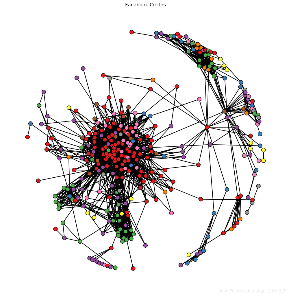
edges_df = pd.read_csv('fb_edges.csv')
nodes_df = pd.read_csv('fb_nodes.csv')
fb_nodes = hv.Nodes(nodes_df).sort()
fb_graph = hv.Graph((edges_df, fb_nodes), label='Facebook Circles') #绘图
fb_graph.opts(cmap='Set1',
node_color='circle',
fig_size=350,
show_frame=False,
xaxis=None,
yaxis=None,
node_size=10)?
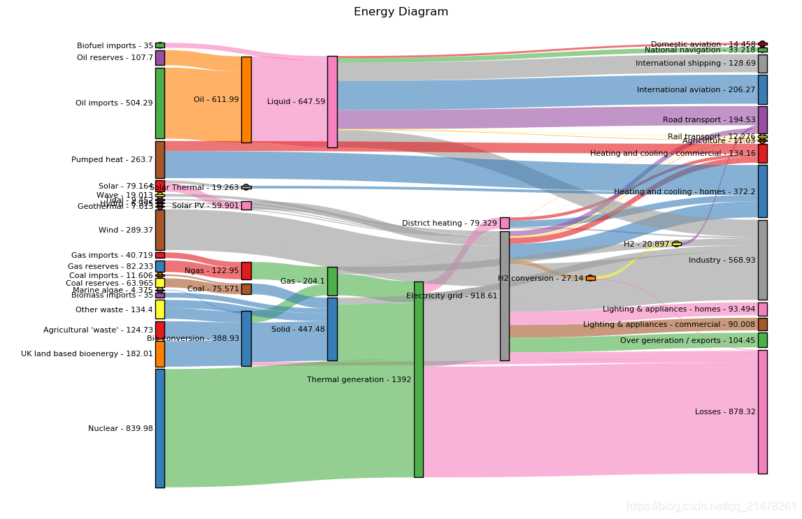
edges = pd.read_csv('energy.csv')  #导入数据
sankey = hv.Sankey(edges, label='Energy Diagram')  #绘图
sankey.opts(label_position='left',
            edge_color='target',
            node_color='index',
            cmap='set1')  #图形属性设置
hv.Sankey(edges, label='Energy Diagram') 一行代码搞定小面的河流图~~
# 矩阵图
import holoviews as hv
from holoviews import opts

hv.extension('bokeh')

from bokeh.sampledata.iris import flowers
from holoviews.operation import gridmatrix

ds = hv.Dataset(flowers)

grouped_by_species = ds.groupby('species', container_type=hv.NdOverlay)
grid = gridmatrix(grouped_by_species, diagonal_type=hv.Scatter)#绘图

grid.opts(opts.Scatter(tools=['hover', 'box_select'], bgcolor='#efe8e2', fill_alpha=0.2, size=4))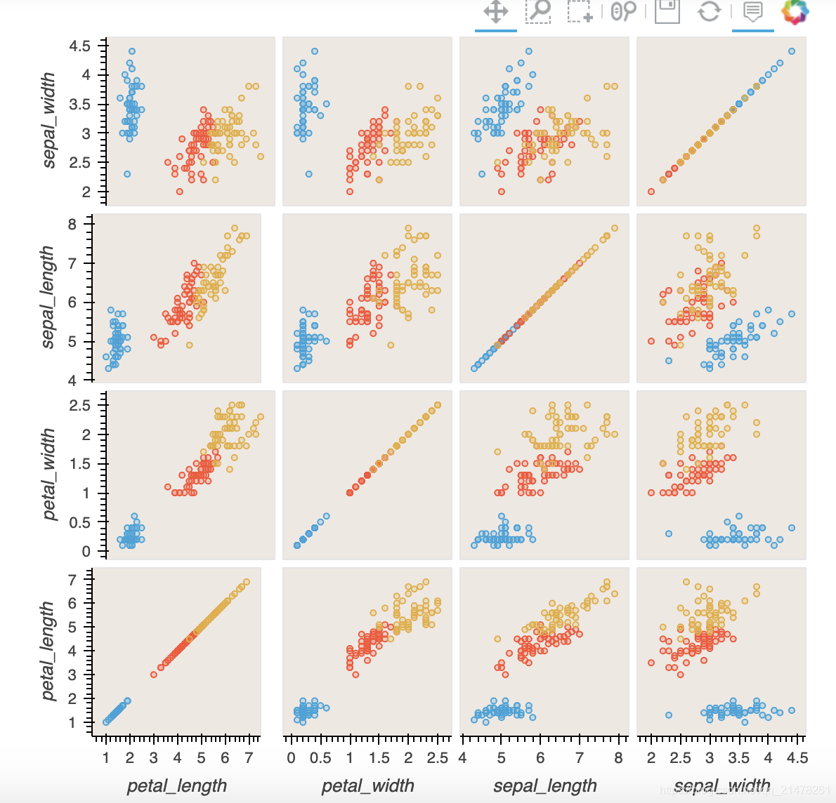
pip install holoviews -i https://pypi.tuna.tsinghua.edu.cn/simpleimport pandas as pd
import numpy as np
import holoviews as hv
from holoviews import opts
hv.extension('bokeh', 'matplotlib') #导入扩展'bokeh','matplotlib'
station_info = pd.read_csv('station_info.csv')
hv.Scatter(station_info, 'services', 'ridership') #轻松绘制散点图
# 使用“+”添加Layout
hv.Scatter(station_info, 'services', 'ridership') + \
hv.Histogram(
    np.histogram(station_info['opened'], bins=24), kdims=['opened'])+\
hv.Scatter(station_info, 'services', 'ridership')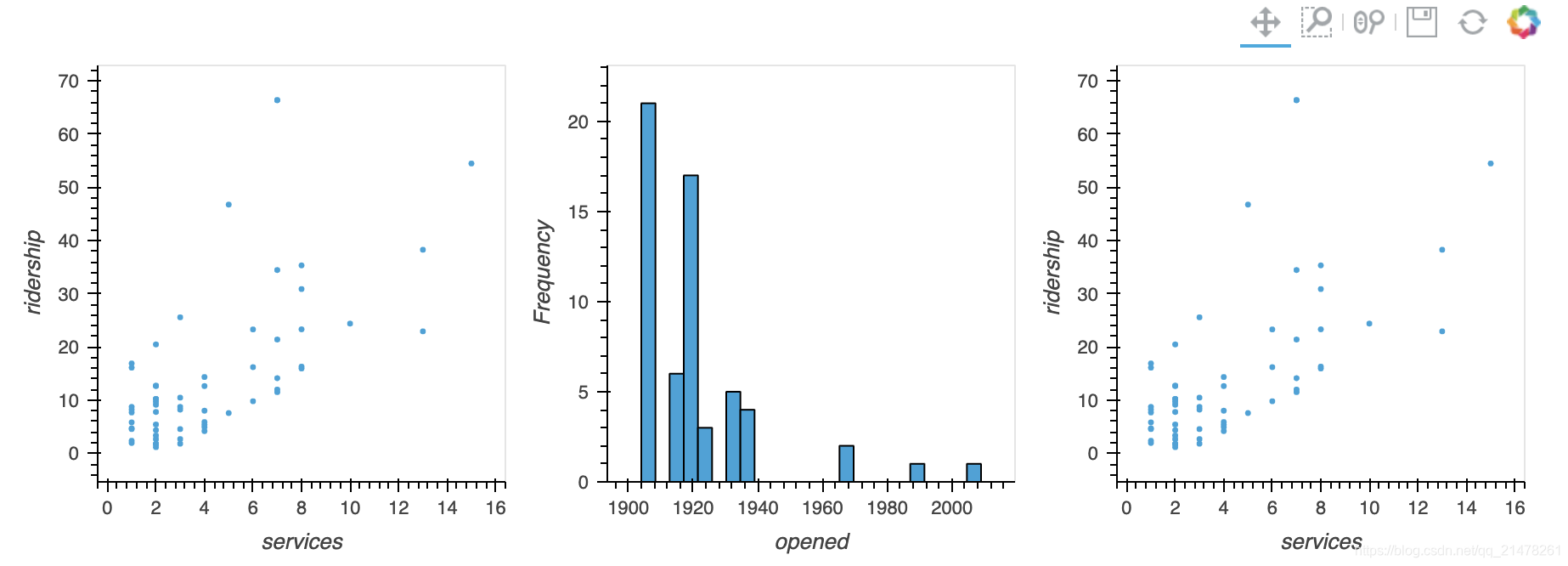
# 使用“*”添加Overlay
taxi_dropoffs = {
    hour: arr
    for hour, arr in np.load('hourly_taxi_data.npz').items()
}

bounds = (-74.05, 40.70, -73.90, 40.80)
image = hv.Image(taxi_dropoffs['0'], ['lon', 'lat'], bounds=bounds)
points = hv.Points(station_info, ['lon', 'lat'])
image + image * points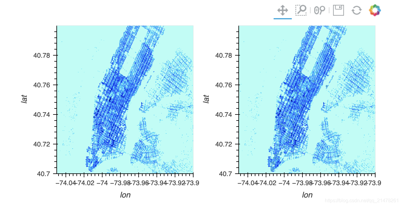
# 添加交互小部件
dictionary = {
    int(hour): hv.Image(arr, ['lon', 'lat'], bounds=bounds)
    for hour, arr in taxi_dropoffs.items()
}
hv.HoloMap(dictionary, kdims='Hour')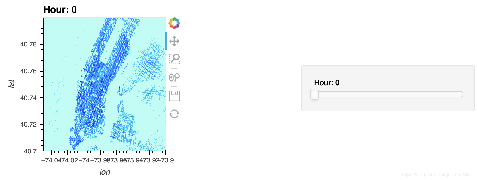
# 默认bokeh后端
spike_train = pd.read_csv('spike_train.csv.gz')
curve = hv.Curve(spike_train, 'milliseconds', 'Hertz')  # 折线图
spikes = hv.Spikes(spike_train, 'milliseconds', [])  # 条形码

layout = curve + spikes  #
layout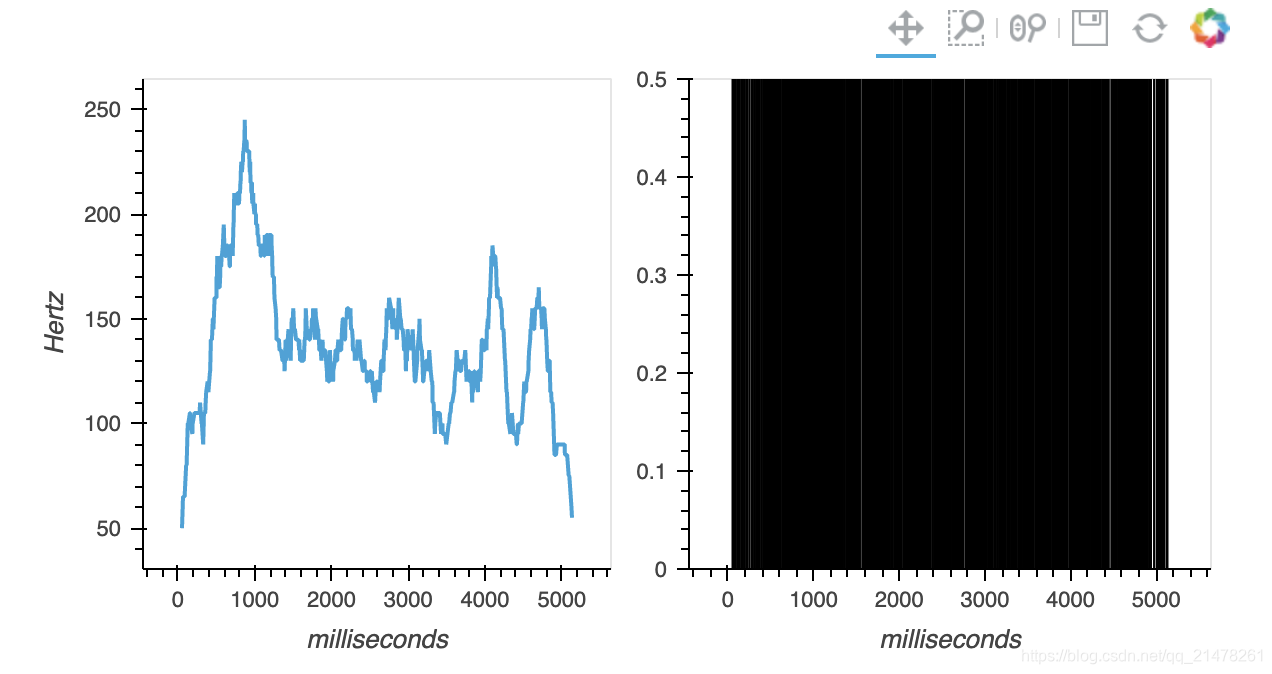
#opts个性化图形属性设置
layout.opts(
    #Options
    opts.Curve(height=200,
               width=900,
               xaxis=None,
               line_width=1.50,
               color='red',
               tools=['hover']),
    opts.Spikes(height=150,
                width=900,
                yaxis=None,
                line_width=0.25,
                color='grey')).cols(1)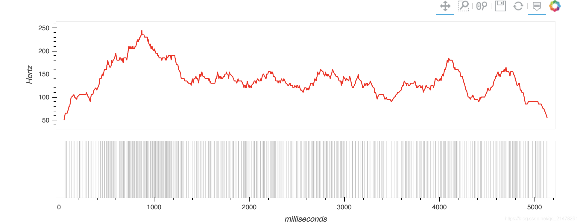
https://github.com/holoviz/holoviews
?
?

歌词编辑器 歌词编辑器 第一步:选择要播放的歌曲并播放 第二步:填写全部的歌词...
一石激起千层浪,继中国区浩浩荡荡的大裁员告一段落之后,甲骨文并未因此收起手...
前言 相信大家都知道在IDE中代码的智能提示几乎都是标配,虽然一些文本编辑器也...
ADO对象: Connection Command Recordset Record Stream ASP支持的对象很多,可...
一、正则表达式概述 二、正则表达式在VBScript中的应用 三、正则表达式在VavaScr...
vbs:把一段文字中指定字符颜色变成红色的正则 functionc(Tstr,Word) Dimre Setre...
计算属性computed: 支持缓存,只有依赖数据发生改变,才会重新进行计算 不支持...
微信文件传输助手是微信电脑版与手机微信之间相互传输图片等文件的好工具,但很...
【排序算法】之lowb三人组冒泡、插入、选择 什么是lowb三人组 冒泡排序bubble so...
本文将研究 ES6 的 for ... of 循环。 旧方法 在过去,有两种方法可以遍历 javas...