

1、自定义文本选择
::selection {
  background: red;
  color: black;
}
2、去掉video的controls中的下载按钮
video::-internal-media-controls-download-button {
    display:none;
}

video::-webkit-media-controls-enclosure {
    overflow:hidden;
}

video::-webkit-media-controls-panel {
    width: calc(100% + 30px);
}
3、css3特性中的transform:translateZ(0)有什么作用
GPU加速,优化前端性能
4、滚动条样式修改
/* * 可以换其他选择器 */
*::-webkit-scrollbar {
    width: 2px;
  height: 2px;
}
*::-webkit-scrollbar-thumb {
  border-radius: 5px;
  box-shadow: inset 0 0 5px rgba(0, 0, 0, 0.2);
    -webkit-box-shadow: inset 0 0 5px rgba(0, 0, 0, 0.2);
  background: #00063a;
}
*::-webkit-scrollbar-track {
  box-shadow: inset 0 0 5px rgba(0, 0, 0, 0.2);
    -webkit-box-shadow: inset 0 0 5px rgba(0, 0, 0, 0.2);
    border-radius: 0;
  background: #00063a;
}
5、input type number 隐藏上下按钮
input::-webkit-outer-spin-button,
input::-webkit-inner-spin-button {
    -webkit-appearance: none;
}
input[type="number"]{
    -moz-appearance: textfield;
}
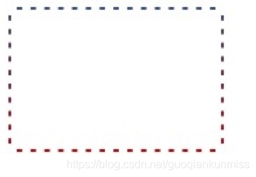
6、css渐变虚框
<style>
    .box {
        width: 150px;
        border: 2px dashed #fff;
        background: linear-gradient(to bottom, #34538b, #cd0000);
        background-origin: border-box;
    }
    .content {
        height: 100px;
        background-color: #fff;
    }
</style>
<div class="box">
    <div class="content"></div>
</div>
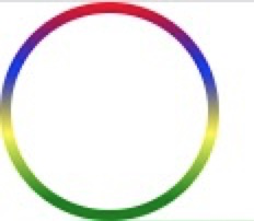
7、border渐变色圆角
<style type="text/css">
	.content {
		width: 100px;
	   	height: 100px;
	    box-sizing: border-box;
	    padding: 5px;
	    border-radius: 50%;
	    background-image: -webkit-linear-gradient(top, red 0%, blue 30%, yellow 60%, green 90%);
	    background-image: -moz-linear-gradient(top, red 0%, blue 30%, yellow 60%, green 90%);
	    background-image: linear-gradient(top, red 0%, blue 30%, yellow 60%, green 90%);
	}
	.box {
		width:100%;
	    height:100%;
	    border-radius:50%;
	    background:#fff;
	}
</style>
<div class="content">
	<div class="box"></div>
</div>
8、输入框光标变色,文字不变色
input{
    caret-color: red;
}
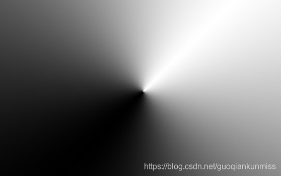
9、锥形渐变
.box {
    width: 300px; height: 300px;
    background: conic-gradient(from 45deg, white, black, white);
}
10、 text-decoration实现波浪线
wavy {
    display: block;
    height: .5em;
    white-space: nowrap;
    letter-spacing: 100vw;
    padding-top: .5em;
    overflow: hidden;
}
wavy::before {
    content: "\2000\2000";
    /* IE浏览器实线代替 */
    text-decoration: overline;
    /* 现代浏览器 */
    text-decoration: overline wavy;
}

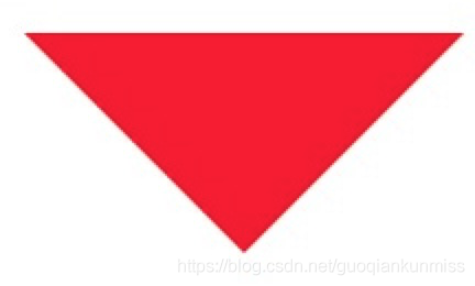
11、css三角形
<style type="text/css" media="screen">
.div1{
	width: 0;
	height: 0;
	border: 100px solid;
	<!--上右下左-->
	border-color: red transparent transparent transparent;
}
</style>
<div class="div1"></div>
12、css背景渐变与背景图片并存
background: url(https://img.alicdn.com/imgextra/i4/1881744325/O1CN01JBktT81hotb8c6Py0_!!1881744325.png) center no-repeat,linear-gradient(to bottom,red,#3c3f40);

13、自定义浏览器滚动条
/*定义滚动条宽高及背景,宽高分别对应横竖滚动条的尺寸*/
::-webkit-scrollbar {
    width: 5px;
    height: 5px;
    background-color: rgba(245, 245, 245, 0.47);
}

/*定义滚动条的轨道,内阴影及圆角*/
::-webkit-scrollbar-track {
    -webkit-box-shadow: inset 0 0 6px rgba(0, 0, 0, .3);
    border-radius: 10px;
    background-color: #f5f5f5;
}

/*定义滑块,内阴影及圆角*/
::-webkit-scrollbar-thumb {
    /*width: 10px;*/
    height: 20px;
    border-radius: 10px;
    -webkit-box-shadow: inset 0 0 6px rgba(0, 0, 0, .3);
    background-color: rgba(85, 85, 85, 0.25);
}
14、改变placeholder的字体颜色大小
input::-webkit-input-placeholder {
    /* WebKit browsers */
    font-size:14px;
    color: #333;
}
input::-moz-placeholder {
    /* Mozilla Firefox 19+ */
    font-size:14px;
    color: #333;
}
input:-ms-input-placeholder {
    /* Internet Explorer 10+ */
    font-size:14px;
    color: #333;
}
到此这篇关于css一些不常见但很有用的属性操作大全的文章就介绍到这了,更多相关css 属性操作内容请搜索脚本之家以前的文章或继续浏览下面的相关文章,希望大家以后多多支持脚本之家!

各位小伙伴们好,今天我们来聊一聊JavaScript 中的“类型系统”。 但是在开始之...
基本语法 text-overflow的使用需配合hight,over-flow:hidden;white-space:nowrap...
在做网站的时候,希望网页能实现一个效果,就是可以弹出一个网页窗口,用来显示...
1.我不会挽留任何一个企图离开我的人,你是例外。 2.有些记忆,注定无法抹去,...
公司项目需求,要实现任务卡片在不同任务列表之间进行拖拽实现任务类别的更改。...
测试试一下!...
在使用HTML表的时候有时候需要我们改变行距,但是改变margin,padding,collapse...
IE6/IE7/IE8/IE9中tbody的innerHTML不能赋值,重现代码如下 复制代码 代码如下: ...
Dreamweaver中的代码想要插入注释,该怎么添加呢?下面我们就来看看详细的教程。...
注 :目前比较流行的前端框架有Bootstrap、Foundation,这两都有着常用的网页设...