

实现思路
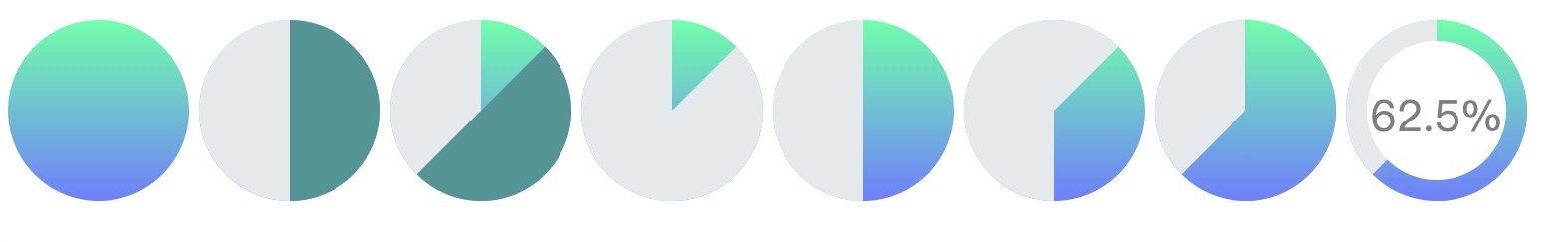
如图所示:
注意到的属性:
下面代码是绘制 33%的圆
<div class="circle-bar">
    <div class="circle-bar-left"></div>
    <div class="circle-bar-right"></div>
    <div class="mask">
        <span class="percent">33%</span>
    </div>
</div>
.circle-bar {
    background-image: linear-gradient(#7affaf, #7a88ff);
    width: 182px;
    height: 182px;
    position: relative;
}
.circle-bar-left {
    background-color: #e9ecef;
    width: 182px;
    height: 182px;
    clip: rect(0, 91px, auto, 0);
}
.circle-bar-right {
    background-color: #e9ecef;
    width: 182px;
    height: 182px;
    clip: rect(0, auto, auto, 91px);
    transform: rotate(118.8deg);
}
.mask {
    width: 140px;
    height: 140px;
    background-color: #fff;
    text-align: center;
    line-height: 0.2em;
    color: rgba(0, 0, 0, 0.5);
    position: absolute;
    left: 21px;
    top: 21px;
}
.mask > span {
    display: block;
    font-size: 44px;
    line-height: 150px;
}
/*所有的后代都水平垂直居中,这样就是同心圆了*/
.circle-bar * {
    position: absolute;
    top: 0;
    right: 0;
    bottom: 0;
    left: 0;
    margin: auto;
}
/*自身以及子元素都是圆*/
.circle-bar,
.circle-bar > * {
    border-radius: 50%;
}
到此这篇关于css 实现圆形渐变进度条效果的示例代码的文章就介绍到这了,更多相关css 渐变进度条内容请搜索脚本之家以前的文章或继续浏览下面的相关文章,希望大家以后多多支持脚本之家!

先来看一下效果,这在CSS3之前,完全是不可想象的,只有图片才能做的到,但在HTM...
如上图,padding值是复合属性按照顺时针(上右下做)顺序,其中padding的内边距影响...
一、少用偏门。 类似break-word断行,z-index手动分层,还有像垂直对齐等等这些...
1.什么是母校?就是那个你一天骂他八遍却不许别人骂的地方。 2.拍毕业照三秒的...
png透明 AlphaImageLoader filter:progid:DXImageTransform.Microsoft.AlphaImag...
接口和类型别名非常相似,在大多情况下二者可以互换。在写TS的时候,想必大家都...
在经典配色中,可能每个人都不会否认黑白灰的永恒魅力。虽然人们总是想outstandi...
前言 当页面的html结构嵌套的盒子很多的时候,可能会导致一个页面中含有多个垂直...
简介 Amaze UI 是一个针对 HTML 5 开发的轻量级、模块化、移动优先的跨屏前端框...
recorder.js microphone基于HTML5的录音功能,输出格式为mp3文件。 前言 完全依...

