

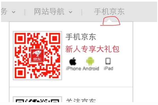
一、效果图
京东效果
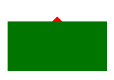
模拟的效果
二、原理
准备一个高度和宽度为0的盒子
将这个盒子设置一个边框
将边框不需要的地方用 transparent 来代替,需要显示的地方设置对应的颜色
如果需要改变其大小,直接设置边框的宽度 border-width
将字体 font-size 和行高 line-height 设置为0,以免影响显示
最后使用定位将其设置到需要的位置
三、代码
HTML结构
<div class="square">
    <p class="triangle"></p>
</div>
CSS样式
.square {
  position: relative;
  width: 400px;
  height: 200px;
  background: green;
  margin: 150px auto;
}
.triangle {
	position: absolute;
  top: -40px;
  left: 50%;
  margin-left: -20px;
  width: 0;
  height: 0;
  border-style: solid;
  border-width: 20px;
  border-color: transparent transparent red transparent;
  font-size: 0;
  line-height: 0;
}
到此这篇关于CSS聊天气泡的文章就介绍到这了,更多相关CSS聊天气泡内容请搜索脚本之家以前的文章或继续浏览下面的相关文章,希望大家以后多多支持脚本之家!

分布式锁注意点 1)互斥性 在任意时刻只有一个客户端可以获取锁 2)防死锁 假如...
1、要响应式开发web,也就是页面必须自适应屏幕大小,可以采用流体布局,如之前...
话不多说,先来看一下效果图 源代码如下 !DOCTYPE htmlhtml lang=enhead meta ch...
在如今响应式布局的要求下,很多能自动调整尺寸的元素能够做到高宽自适应,如img...
使用flex布局,如果是九宫格的话正好可以平分,如图 如果是我们只需要八块,如图...
注:使用的是的模块注入方式,适用各种前端单页面应用及H5 创建一个AMap.js文件 ...
概述 最近由于一些原因需要升级 spring boot 版本,项目原来的版本是 spring boo...
命令简介 ldd 命令打印程序和库的共享库依赖项。注意:ldd 不是一个可执行程序,...
美国YAHOO在页面制作中所用到的图片整合技术,这样做虽然需要花一定的时间来有规...
分析XML文档可通过程序来做,分析器有两大类,一种是事件驱动的,一种是基于树模...