

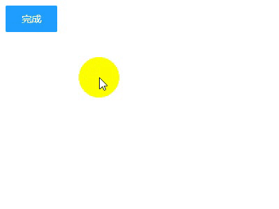
之前老板让做一个登陆后 可以显示一个打钩的效果 百度死活搜不到 今天在B站看到的一个视频居然有 根据需求改进了一下废话不多说先看效果!
html代码
<!DOCTYPE html>
<html lang="en">
<head>
    <meta charset="UTF-8">
    <title>打钩动画</title>
</head>
<body>
<div id="d1">
    <input type="checkbox" style="display: none" id="love1" />
    <label for="love1" id="btn1" >完成</label>
<svg width="200px" height="200px">
    <circle r="90" class="circle" fill="none" stroke="#2de540" stroke-width="10" cx="100" cy="100" stroke-linecap="round" transform="rotate(-90 100 100) " ></circle>
    <polyline  fill="none" stroke="#2de540" stroke-width="10" points="44,107 86,137 152,69" stroke-linecap="round" stroke-linejoin="round" class="tick" ></polyline>
</svg>
<h2 style="text-align: center;width: 200px">成功</h2>

</div>
</body>
<!--这里引入你本地的jq-->
<script src="http://libs.baidu.com/jquery/2.0.0/jquery.min.js"></script>
</html>
css代码
h2 {
        font-family: Helvetica;
        font-size: 30px;
        margin-top: 20px;
        color: #333;
        opacity: 0;
    }
    input[type="checkbox"]:checked+ label ~ h2 {
        animation: .6s title ease-in-out;
        animation-delay: 1.2s;
        animation-fill-mode: forwards;
    }
    .circle {
        stroke-dasharray: 1194;
        stroke-dashoffset: 1194;
    }
    input[type="checkbox"]:checked + label + svg .circle {
        animation: circle 1s ease-in-out;
        animation-fill-mode: forwards;
    }
    .tick {
        stroke-dasharray: 350;
        stroke-dashoffset: 350;
    }
    input[type="checkbox"]:checked + label+ svg .tick {
        animation: tick .8s ease-out;
        animation-fill-mode: forwards;
        animation-delay: .95s;
    }
    @keyframes circle {
        from {
            stroke-dashoffset: 1194;
        }
        to {
            stroke-dashoffset: 2388;
        }
    }
    @keyframes tick {
        from {
            stroke-dashoffset: 350;
        }
        to {
            stroke-dashoffset: 0;
        }
    }
    @keyframes title {
        from {
            opacity: 0;
        }
        to {
            opacity: 1;
        }
    }
    label {
        display: inline-block;
        height: 38px;
        width: 38px;
        line-height: 38px;
        padding: 0 18px;
        background-color: #1E9FFF;
        color: #fff;
        white-space: nowrap;
        text-align: center;
        font-size: 14px;
        border: none;
        border-radius: 2px;
        cursor: pointer;
    }
    #d1 {
        display: flex;
        justify-content: center;
        min-height: 100px;
        flex-direction: column;
    }
写到这里本来应该就结束了 但是我们在真正实现功能的时候 不太可能用 checkbox切换动画效果的显示 一般还是需要按钮操作动画效果 下面是jq操作的代码 其实用jq的.animate()更好一些但是我是小白所以就偷了个懒 (ps:好吧其实是不会)直接用.css()
JavaScript代码
  $("#btn1").on("click",function () {
       if($(this).text()==="完成"){
           $(".circle").css({'animation':'circle 1s ease-in-out','animation-fill-mode':'forwards'});
           $(".tick").css({'animation':'tick .8s ease-out','animation-fill-mode':'forwards','animation-delay':'.95s'});
           $("h2").css({'animation':'.6s title ease-in-out','animation-fill-mode':'forwards','animation-delay':'1.2s'})
           $(this).text("取消")
       }else{
           $(".circle").css({'animation':'none','animation-fill-mode':'none'});
           $(".tick").css({'animation':'none','animation-fill-mode':'none'});
           $("h2").css({'animation':'none','animation-fill-mode':'none'})
           $(this).text("完成")
       }
   });
到此这篇关于svg+css 或者js制作打钩的动画效果的文章就介绍到这了,更多相关svg css 打钩动画内容请搜索脚本之家以前的文章或继续浏览下面的相关文章,希望大家以后多多支持脚本之家!

之前的博文中,一直有关注一些HTML 5中的值得关注但少用的API或者tips,这次继续...
Flutter 是 Google 的开源 UI 工具包。利用它,只需一套代码库,就能开发出适合...
原始代码: center.html : !DOCTYPE htmlhtml lang=Zhhead meta charset=UTF-8 ...
最近手机端开启了https,为了绿锁需要解决如下问题: 1、图片 2、js 3、css样式 ...
导读:界面设计师Joshua Porter在自己的博客中发表了这篇文章,文章中列举了20条...
最近在进行开发的过程中,有遇到两端对齐的布局,是按照百分比来进行布局的,之...
为表达全国各族人民对抗击新冠肺炎疫情斗争牺牲烈士和逝世通报的深切哀悼,国务...
1、使用css精灵。 好处是将css中使用的小图片可以合并为一张大图片减少了对服务...
转载请注明出处:葡萄城官网,葡萄城为开发者提供专业的开发工具、解决方案和服...
首先可以打开朋友圈观察不同图片数量的几种布局,也可参考下图示例; 可以发现除1...

