

今天是618 ,各大商城都在搞促销活动,今天我们就来用css做一个商城卡卷,具体如下:
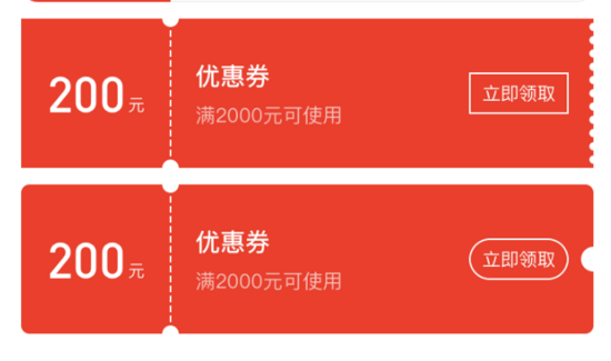

还在为上面这样格式各样的商城卡券的样式而发愁?CSS 不熟,canvas 太难,怎么办?
用 CSS 写一个商城卡券需要几步?
一共需要三步:
交给测试后,我们来分析下 CSS 卡券。
我们来准备一下基础知识
radial-gradien:
background: radial-gradient(shape size at position, start-color, ..., last-color);
| 值 | 描述 |
|---|---|
| shape | 确定圆的类型: ellipse (默认): 指定椭圆形的径向渐变。 circle :指定圆形的径向渐变 |
| size | 定义渐变的大小 |
| position | 定义渐变的位置 |
这样,我们能很容易写出一个居中的圆形背景图
.center-circle {
    width: 100px;
    height: 100px;
    background: radial-gradient(circle at 50px 50px, transparent 10px, #00adb5 0);
  }
linear-gradient
background: linear-gradient(direction, color-stop1, color-stop2, ...);
| 值 | 描述 |
|---|---|
| direction | 用角度值指定渐变的方向(或角度) |
| color-stop1, color-stop2,... | 用于指定渐变的起止颜色 |
我们不需要知道具体的渐变过程,只要写一个简单的,写一个使用渐变属性而不渐变背景图即可:
.linear-gradient {
    width: 100px;
    height: 100px;
    background: linear-gradient(to right, #00adb5, #00adb5);
  }
background
background 是可以设置多个图片的,遵循 background: [background-color] [background-image] [background-repeat] [background-attachment] [background-position] / [ background-size] [background-origin] [background-clip]; 使用 , 隔开即可。
开始组合基础知识
写一个最简单的

只要把上述中心圆示例的圆形位置定位在左侧即可
.left-circle{
  width: 100px;
  height: 100px;
  position: relative;
  background: radial-gradient(circle at 0 50px, transparent 10px, #00adb5 0) top left/100px 100% no-repeat;
}
进一步学习

你可还记得 background 是有 repeat 属性吗?也就是说我们只要设置一部分样式,再使用 repeat 即可,看下图片,这不就是一个不渐变的 linear-gradient 和 radial-gradient 的组合吗,再借助伪类,我们即可写出来了。
.hollow-circles {
  width: 300px;
  height: 100px;
  position: relative;
  background: #00adb5;
  margin-bottom: 10px;
}
.hollow-circles::after {
  content: '';
  position: absolute;
  height: 5px;
  width:100%;
  left: 0;
  bottom: -5px;
  background-image: linear-gradient(to right, #00adb5 5px, transparent 5px, transparent),
  radial-gradient(10px circle at 10px 5px, transparent 5px, #00adb5 5px);
  background-size: 15px 5px;
}
复杂一点

看见很简单,不就是刚才那个圆再画一个吗,但是要考虑到两侧的颜色是不同的,所以我们需要画四个背景图才行,将每个圆定位在方形的各个角落,然后组合在一起即可。
.two-circles {
  width: 300px;
  height: 100px;
  background: radial-gradient(circle at right top, transparent 10px, #00adb5 0) top left / 60px 51% no-repeat,
    radial-gradient(circle at right bottom, transparent 10px, #00adb5 0) bottom left /60px 51% no-repeat,
    radial-gradient(circle at left top, transparent 10px, #eeeeee 0) top right /240px 51% no-repeat,
    radial-gradient(circle at left bottom, transparent 10px, #eeeeee 0) bottom right /240px 51% no-repeat;
}
以上就是本文的全部内容,希望对大家的学习有所帮助,也希望大家多多支持脚本之家。

本文没有咬文嚼字的地方,只是一个配色技巧的分享,十分简单,简单到流泪,但或...
在默认情况之下,如果在Canvas之中将某个物体(源)绘制在另一个物体(目标)之...
一、虽然有的属性是boolean类型,但仍旧建议按照XHTML书写(属性名=属性值)格式...
作者:Joe Seifi 译者:前端小智 移动: https://mp.weixin.qq.com/s/p5... 有梦...
简介: 6月4日,以“开启分布式云新时代”为主题2021云边协同大会在北京举行,本...
1、纯工具操作步骤,懂代码更容易 划线就是不符合国人的审美观念,看着就别扭,...
折叠式卡片布局在PC版网站中可能不常见,但是在手机版,小屏幕的网页浏览会大发...
1.先瞧瞧效果: 2.代码是这样的: img src=images/circle.png alt= id=circle/@m...
前言 Canvas绘制多变形非常简单,只要懂得Canvas路径 + 简单的初中数学知识即可...
背景 在公司参与一个原生APP和h5混合开发的项目,本人在项目中负责h5部分,现将...

