

今天我们学习如何使用CSS创建一个炫酷的图片轮播组件。它的原理简单的说就是通过单击标签元素(label)来切换背景图像和动画效果。核心是使用与标签关联的单选按钮和使用通用兄弟选择器来定位每张图片。
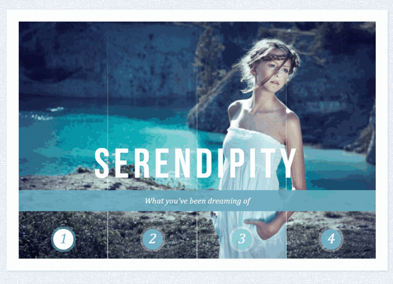
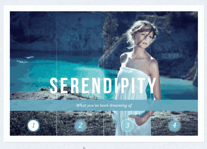
我们要实现的最终效果是这样的:
轮播的构成
HTML由三个主要部分组成:单选按钮和标签、包含四个面板的容器及其每张图片的“切片”以及标题。设置为class="cr-bgimg"的容器将为每个图片划分四个面板,其中,在每个面板里通过background-position属性将背景图片定位在合适的位置上。所以,第一个面板将有四个切片,每个切片都有一个图片作为背景,并且位于容器最左边的位置。第二个面板也有四个切片,它位于第一个面板的右侧,用于显示图片的第二个切片部分:
<section class="cr-container">
    <!-- 单选按钮和label标签 -->
    <input id="select-img-1" name="radio-set-1" type="radio" class="cr-selector-img-1" checked/>
    <label for="select-img-1" class="cr-label-img-1">1</label>
    <input id="select-img-2" name="radio-set-1" type="radio" class="cr-selector-img-2" />
    <label for="select-img-2" class="cr-label-img-2">2</label>
    <input id="select-img-3" name="radio-set-1" type="radio" class="cr-selector-img-3" />
    <label for="select-img-3" class="cr-label-img-3">3</label>
    <input id="select-img-4" name="radio-set-1" type="radio" class="cr-selector-img-4" />
    <label for="select-img-4" class="cr-label-img-4">4</label>
    <div class="clr"></div>
    <!-- 面板 -->
    <div class="cr-bgimg">
        <div>
            <span>Slice 1 - Image 1</span>
            <span>Slice 1 - Image 2</span>
            <span>Slice 1 - Image 3</span>
            <span>Slice 1 - Image 4</span>
        </div>
        <div>
            <span>Slice 2 - Image 1</span>
            <span>Slice 2 - Image 2</span>
            <span>Slice 2 - Image 3</span>
            <span>Slice 2 - Image 4</span>
        </div>
        <div>
            <span>Slice 3 - Image 1</span>
            <span>Slice 3 - Image 2</span>
            <span>Slice 3 - Image 3</span>
            <span>Slice 3 - Image 4</span>
        </div>
        <div>
            <span>Slice 4 - Image 1</span>
            <span>Slice 4 - Image 2</span>
            <span>Slice 4 - Image 3</span>
            <span>Slice 4 - Image 4</span>
        </div>
    </div>
    <!-- 标题 -->
    <div class="cr-titles">
        <h3>
            <span>Serendipity</span>
            <span>What you've been dreaming of</span>
        </h3>
        <h3>
            <span>Adventure</span>
            <span>Where the fun begins</span>
        </h3>
        <h3>
            <span>Nature</span>
            <span>Unforgettable eperiences</span>
        </h3>
        <h3>
            <span>Serenity</span>
            <span>When silence touches nature</span>
        </h3>
    </div>
</section>
h3元素中包含两个span元素,一个是主标题,一个是子标题。
CSS
为了代码的简洁,文章的CSS中都省略了浏览器前缀,但是你获取到的代码是包含完整的。
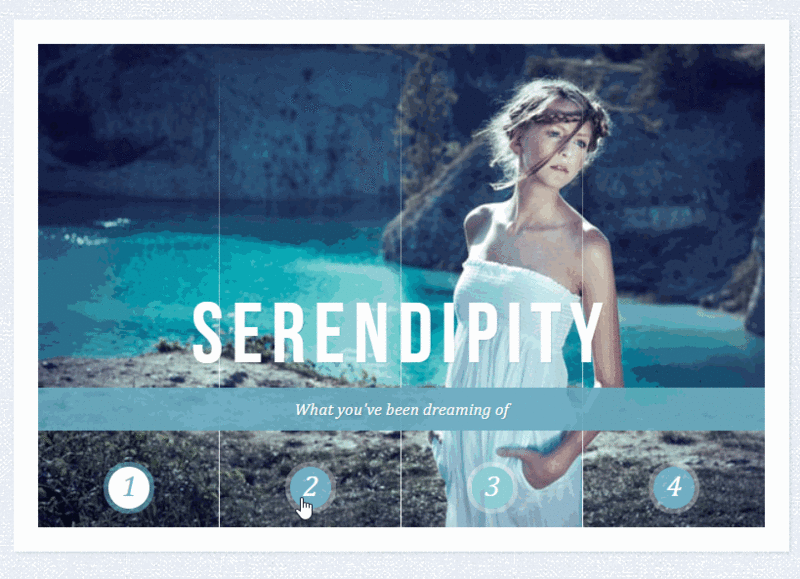
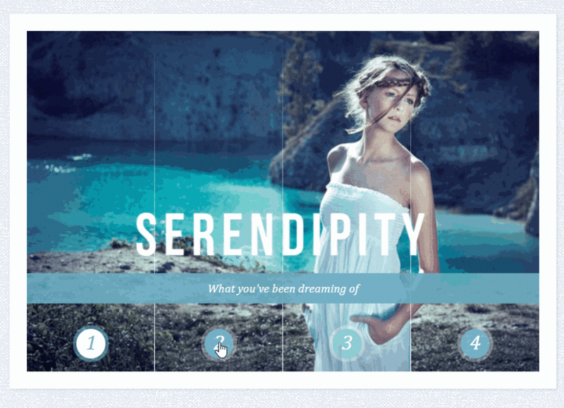
我们的第一个目标是实现点击label元素的时候触发对应的单选按钮,方法很简单,就是将label元素的for属性值与单选按钮的ID值对应起来就可以了。
第二步,我们要将所有的背景图片定位在正确的位置上。第三步,在单击label标签时,显示对应的图片切片和标题。
我们一步一步看,首先设置最外层section元素的样式,给它设置一个淡淡的阴影效果。
.cr-container{
    width: 600px;
    height: 400px;
    position: relative;
    margin: 0 auto;
    border: 20px solid #fff;
    box-shadow: 1px 1px 3px rgba(0,0,0,0.1);
}
因为后面我们要使用通用兄弟选择器“~”来选中对应的图片切片和标题,于是将所有的label元素放在代码的最上面。通过设置z-index属性确保label元素显示在图片和文字的上面,并且通过margin-top属性使它们距离整体上边框350px。
.cr-container label{
    font-style: italic;
    width: 150px;
    height: 30px;
    cursor: pointer;
    color: #fff;
    line-height: 32px;
    font-size: 24px;
    float:left;
    position: relative;
    margin-top: 350px;
    z-index: 1000;
}
接着,添加一个小圆圈来美化label元素,我们创建一个伪元素,并将其放在文字的中心位置。
.cr-container label:before{
    content:'';
    width: 34px;
    height: 34px;
    background: rgba(130,195,217,0.9);
    position: absolute;
    left: 50%;
    margin-left: -17px;
    border-radius: 50%;
    box-shadow: 0px 0px 0px 4px rgba(255,255,255,0.3);
    z-index:-1;
}
为了在面板与面板之间创建一个分隔线,我们使用label元素的另一个伪元素,并通过渐变背景将它从图片的上边缘延伸到下边缘。
.cr-container label:after{
    width: 1px;
    height: 400px;
    content: '';
    background: linear-gradient(top, rgba(255,255,255,0) 0%,rgba(255,255,255,1) 100%);
    position: absolute;
    bottom: -20px;
    right: 0px;
}
最后一个面板的右侧不应该有分隔线,所以我们将它的宽度设置为0。
.cr-container label.cr-label-img-4:after{
    width: 0px;
}
现在,label标签的样式就完成了,我们可以将所有的单选按钮隐藏掉。
.cr-container input{
    display: none;
}
当我们点击一个label元素时,它对应的单选按钮就是被选中。反过来,就可以使用通用兄弟选择器来选择选中按钮对应的label元素,并改变它的文字颜色。
.cr-container input.cr-selector-img-1:checked ~ label.cr-label-img-1,
.cr-container input.cr-selector-img-2:checked ~ label.cr-label-img-2,
.cr-container input.cr-selector-img-3:checked ~ label.cr-label-img-3,
.cr-container input.cr-selector-img-4:checked ~ label.cr-label-img-4{
    color: #68abc2;
}
我们还可以改变小圆圈的颜色并添加一个阴影效果。
.cr-container input.cr-selector-img-1:checked ~ label.cr-label-img-1:before,
.cr-container input.cr-selector-img-2:checked ~ label.cr-label-img-2:before,
.cr-container input.cr-selector-img-3:checked ~ label.cr-label-img-3:before,
.cr-container input.cr-selector-img-4:checked ~ label.cr-label-img-4:before{
    background: #fff;
    box-shadow: 0px 0px 0px 4px rgba(104,171,194,0.6);
}
图片的容器将占据所有的宽度,并且绝对定位。稍后使用这个容器将背景图片设置为当前选定的图片。我们还需要一张默认可见的图片,因此,再添加一些背景属性:
.cr-bgimg{
    width: 600px;
    height: 400px;
    position: absolute;
    left: 0px;
    top: 0px;
    z-index: 1;
    background-repeat: no-repeat;
    background-position: 0 0;
}
因为我们有四个面板,每个面板的宽度为150像素(600除以4)。面板设置为左浮动后会并排显示,同时设置它们溢出隐藏,因为我们不希望在滑动时看到切片出来:
.cr-bgimg div{
    width: 150px;
    height: 100%;
    position: relative;
    float: left;
    overflow: hidden;
    background-repeat: no-repeat;
}
每个切片也被设置为绝对定位,并且通过left:-150px将它们显示在面板的外面并隐藏起来:
.cr-bgimg div span{
    position: absolute;
    width: 100%;
    height: 100%;
    top: 0px;
    left: -150px;
    z-index: 2;
    text-indent: -9000px;
}
再来,让我们来处理容器和每个切片的背景图片:
.cr-container input.cr-selector-img-1:checked ~ .cr-bgimg,
.cr-bgimg div span:nth-child(1){
    background-image: url(../images/1.jpg);
}
.cr-container input.cr-selector-img-2:checked ~ .cr-bgimg,
.cr-bgimg div span:nth-child(2){
    background-image: url(../images/2.jpg);
}
.cr-container input.cr-selector-img-3:checked ~ .cr-bgimg,
.cr-bgimg div span:nth-child(3){
    background-image: url(../images/3.jpg);
}
.cr-container input.cr-selector-img-4:checked ~ .cr-bgimg,
.cr-bgimg div span:nth-child(4){
    background-image: url(../images/4.jpg);
}
我们还需要根据不同的面板为切片的背景图片提供不同的定位:
.cr-bgimg div:nth-child(1) span{
    background-position: 0px 0px;
}
.cr-bgimg div:nth-child(2) span{
    background-position: -150px 0px;
}
.cr-bgimg div:nth-child(3) span{
    background-position: -300px 0px;
}
.cr-bgimg div:nth-child(4) span{
    background-position: -450px 0px;
}
当我们单击一个label标签时,我们将所有的切片滑到右边:
.cr-container input:checked ~ .cr-bgimg div span{
    animation: slideOut 0.6s ease-in-out;
}
@keyframes slideOut{
    0%{
        left: 0px;
    }
    100%{
        left: 150px;
    }
}
但是除了我们选中的这个label标签,它对应的图片切片是从-150px滑到0px:
.cr-container input.cr-selector-img-1:checked ~ .cr-bgimg div span:nth-child(1),
.cr-container input.cr-selector-img-2:checked ~ .cr-bgimg div span:nth-child(2),
.cr-container input.cr-selector-img-3:checked ~ .cr-bgimg div span:nth-child(3),
.cr-container input.cr-selector-img-4:checked ~ .cr-bgimg div span:nth-child(4)
{
    transition: left 0.5s ease-in-out;
    animation: none;
    left: 0px;
    z-index: 10;
}
最后,设置h3标签中主副标题的样式,当我们点击了某个label标签后,它对应的标题的透明度会从0过渡到1:
.cr-titles h3{
    position: absolute;
    width: 100%;
    text-align: center;
    top: 50%;
    z-index: 10000;
    opacity: 0;
    color: #fff;
    text-shadow: 1px 1px 1px rgba(0,0,0,0.1);
    transition: opacity 0.8s ease-in-out;
}
.cr-titles h3 span:nth-child(1){
    font-family: 'BebasNeueRegular', 'Arial Narrow', Arial, sans-serif;
    font-size: 70px;
    display: block;
    letter-spacing: 7px;
}
.cr-titles h3 span:nth-child(2){
    letter-spacing: 0px;
    display: block;
    background: rgba(104,171,194,0.9);
    font-size: 14px;
    padding: 10px;
    font-style: italic;
    font-family: Cambria, Palatino, "Palatino Linotype", "Palatino LT STD", Georgia, serif;
}
.cr-container input.cr-selector-img-1:checked ~ .cr-titles h3:nth-child(1),
.cr-container input.cr-selector-img-2:checked ~ .cr-titles h3:nth-child(2),
.cr-container input.cr-selector-img-3:checked ~ .cr-titles h3:nth-child(3),
.cr-container input.cr-selector-img-4:checked ~ .cr-titles h3:nth-child(4){
    opacity: 1;
}
就是这样!切片式的轮播效果就这样实现了。当然通过这个效果我们还可以延伸出更多的切片效果,例如:
效果二
效果三
效果四
总结
以上所述是小编给大家介绍的CSS3实现炫酷的切片式图片轮播效果,希望对大家有所帮助,如果大家有任何疑问请给我留言,小编会及时回复大家的。在此也非常感谢大家对脚本之家网站的支持!
如果你觉得本文对你有帮助,欢迎转载,烦请注明出处,谢谢!

简介: 6月4日,以“开启分布式云新时代”为主题2021云边协同大会在北京举行,本...
前言 Canvas绘制多变形非常简单,只要懂得Canvas路径 + 简单的初中数学知识即可...
背景 在公司参与一个原生APP和h5混合开发的项目,本人在项目中负责h5部分,现将...
作者:Joe Seifi 译者:前端小智 移动: https://mp.weixin.qq.com/s/p5... 有梦...
一、虽然有的属性是boolean类型,但仍旧建议按照XHTML书写(属性名=属性值)格式...
1.先瞧瞧效果: 2.代码是这样的: img src=images/circle.png alt= id=circle/@m...
本文没有咬文嚼字的地方,只是一个配色技巧的分享,十分简单,简单到流泪,但或...
折叠式卡片布局在PC版网站中可能不常见,但是在手机版,小屏幕的网页浏览会大发...
1、纯工具操作步骤,懂代码更容易 划线就是不符合国人的审美观念,看着就别扭,...
在默认情况之下,如果在Canvas之中将某个物体(源)绘制在另一个物体(目标)之...

