

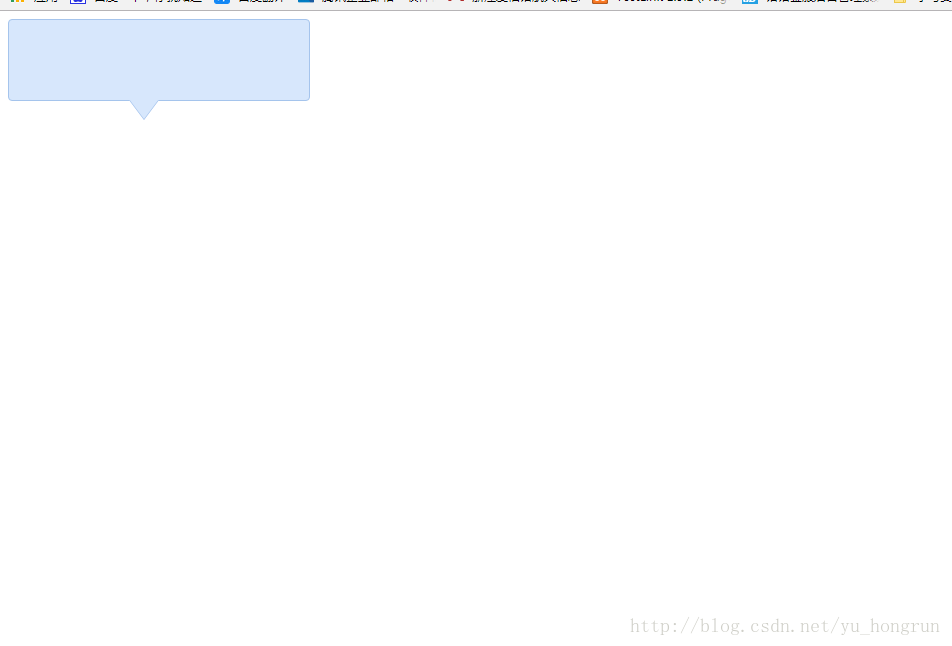
代码和效果图如下:
<!DOCTYPE html>
<html>
    <head>
        <meta charset="utf-8" />
        <title></title>
        <style type="text/css">
            .tooltips {
                position: relative;
                width: 300px;
                height: 80px;
                line-height: 60px;
                background: #D7E7FC;
                border-radius: 4px;
            }
            .arrow {
                position: absolute;
                color: #D7E7FC;
                width: 0px;
                height: 0px;
                line-height: 0px;
                border-width: 20px 15px 0;
                border-style: solid dashed dashed dashed;
                border-left-color: transparent;
                border-right-color: transparent;
                bottom: -20px;
                right: 50%;
            }
            .tooltips {
                position: relative;
                width: 300px;
                height: 80px;
                line-height: 60px;
                background: #D7E7FC;
                border: 1px solid #A5C4EC;
                border-radius: 4px;
            }
            .arrow {
                position: absolute;
                width: 0px;
                height: 0px;
                line-height: 0px;
                border-width: 20px 15px 0;
                border-style: solid dashed dashed dashed;
                border-left-color: transparent;
                border-right-color: transparent;
            }
            .arrow-border {
                color: #A5C4EC;
                bottom: -20px;
                right: 50%;
            }
            .arrow-bg {
                color: #D7E7FC;
                bottom: -19px;
                right: 50%;
            }
        </style>
    </head>
    <body>
        <!--先定义一个相对定位的盒子div:-->
        <div class="tooltips">
            <!--给div盒子添加一个三角型图标-->
            <div class="arrow "></div>
            <!--给“小三角穿上松紧带”需要使用两个三角形叠加的方式-->
            <!--首先我们定义两个三角形的div,一个背景色和盒子的边框颜色相同,一个背景色和盒子的背景色一致:-->
            <div class="arrow arrow-border"></div>
            <div class="arrow arrow-bg"></div>
            <!--注意:.arrow-bg和.arrow-border的bottom位置相差为1px(可根据边框宽度调整)两个div的顺序不可颠倒。-->
        </div>
    </body>
</html>
效果展示图
总结
以上所述是小编给大家介绍的 div+css样式自制带小三角的tooltips效果,希望对大家有所帮助,如果大家有任何疑问请给我留言,小编会及时回复大家的。在此也非常感谢大家对脚本之家网站的支持!

填充颜色 艺术离不开色彩,今天咱们来介绍一下填充颜色,体会一下色彩的魅力。 ...
全世界有超过1000万的Javascript开发人员,而且这个数字每天都在增加。尽管JavaS...
TOP云 (west.cn)7月22日讯,据外媒thedomains消息,迪拜一家名为Mondia的数字...
很多初学前台设计的朋友是不是经常遇到写出来的网页乱码的问题,这里笔者今天也...
据业内消息,前两天 域名 wifichain.com以13.8万元被秒,背后买家乃是小米公司。...
html5桌面通知(Web Notifications)对于需要实现在新消息入线时,有桌面通知效果...
HTML标签 开始标签(opening tag):开放标签 结束标签(closing tag):闭合标签 元素...
最近在做我的足球导航网站的时候遇到一个网页内部锚点跳转后向下偏移一点,以避...
1.BFC 定义 BFC(Block formatting context)直译为块级格式化上下文。它是一个独...
?不是吧,不是吧,原来真的有人都2021年了,连TypeScript都没听说过吧?在项目中...

