

整理文档,搜刮出一个css3实现wifi信号逐渐增强效果实例的代码,稍微整理精简一下做下分享。
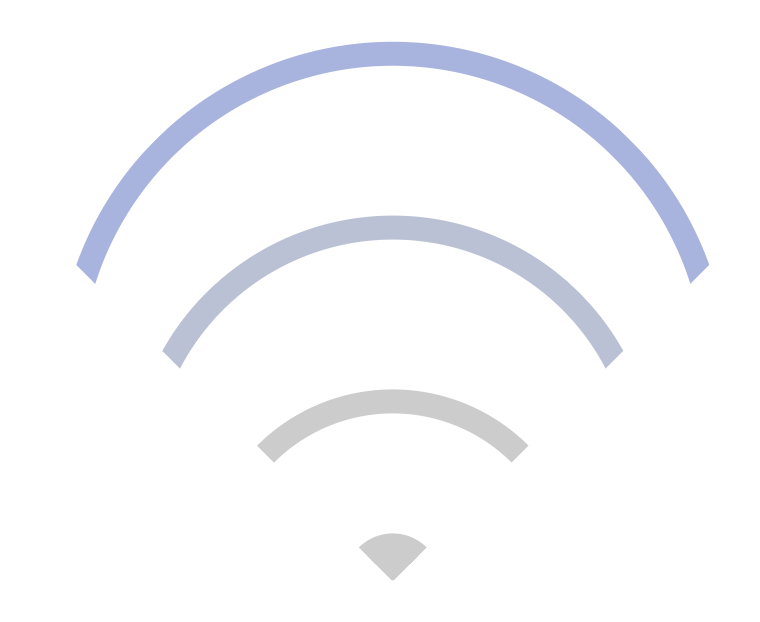
效果图
下面是实现代码:
<!DOCTYPE html>
<meta charset="utf-8">
<html>
<head>
    <title>wifi信号</title>
    <style type="text/css">
        *{
            margin: 0;
            padding: 0;
        }
        .box {
            width: 240px;
            height: 240px;
            box-sizing: border-box;
            position: relative;
            margin: 100px auto;
        }
        .wifi-symbol {
            width: 200px;
            height: 200px;
            margin-left: 18px;
            box-sizing: border-box;
            overflow: hidden;
            transform: rotate(45deg);

        }
        .wifi-circle {
            border: 10px solid #ccc;
            border-radius: 50%;
            position: absolute;
        }
        .first {
            width: 260px;
            height: 260px;
            top: 0;
            left: 0;
            animation: run1 4s linear infinite;
        }
        @keyframes run1 {
            0% {
                border-color: #ccc;
            }
            25% {
                border-color: #ccc;
            }
            50% {
                border-color: #ccc;
            }
            75% {
                border-color: #ccc;
            }
            100% {
                border-color: #97a8e6;
            }
        }
        .second {
            width: 200px;
            height: 200px;
            top: 60px;
            left: 60px;
            animation: run2 4s linear infinite;
        }
        @keyframes run2 {
            0% {
                border-color: #ccc;
            }
            25% {
                border-color: #ccc;
            }
            50% {
                border-color: #ccc;
            }
            75% {
                border-color: #97a8e6;
            }
            100% {
                border-color: #ccc;
            }
        }
        .third {
            width: 140px;
            height: 140px;
            top: 120px;
            left: 120px;
            animation: run3 4s linear infinite;
        }
        @keyframes run3 {
            0% {
                border-color: #ccc;
            }
            25% {
                border-color: #ccc;
            }
            50% {
                border-color: #97a8e6;
            }
            75% {
                border-color: #ccc;
            }
            100% {
                border-color: #ccc;
            }
        }
        .fourth {
            width: 20px;
            height: 20px;
            background: #ccc;
            top: 180px;
            left: 180px;
            animation: run4 4s linear infinite;
        }
        @keyframes run4 {
            0% {
                background: #ccc;
                border-color: #ccc;
            }
            25% {
                background: #97a8e6;
                border-color: #97a8e6;
            }
            50% {
                background: #ccc;
                border-color: #ccc;
            }
            75% {
                background: #ccc;
                border-color: #ccc;
            }
            100% {
                background: #ccc;
                border-color: #ccc;
            }
        }
    </style>
</head>
<body>
    <div class="box">
        <div class="wifi-symbol">
          <div class="wifi-circle first"></div>
          <div class="wifi-circle second"></div>
          <div class="wifi-circle third"></div>
          <div class="wifi-circle fourth">
        </div>
    </div>

</body>
</html>
以上就是本文的全部内容,希望对大家的学习有所帮助,也希望大家多多支持脚本之家。

今天,跟大家分享一下,IntelliJ IDEA 2021 Win 和 Mac 快捷键大全,IDEA 基本所...
Dreamweaver是集网页制作和管理网站于一身的所见即所得网页编辑器。由于DW的功能...
TOP云 (west.cn)2月27日消息,昨天外卖领域传出重磅消息:阿里将以95亿美元全...
在 go-zero 的分布式缓存系统分享里,Kevin 重点讲到过一致性hash的原理和分布式...
TOP云 (west.cn)3月20日消息,据账户为.app Domain的用户在推特上曝料称,日前...
CSS中有一个属性叫做clip,为修剪,剪裁之意。 clip 属性剪裁绝对定位元素。这个...
TOP云 (west.cn)11月17日消息,据DNJournal公布的最新交易榜显示,两枚三字母 ...
一、H5自带进度条 div id=d p id=pgv进度:%/p progress id=pg max= value=/prog...
有过网站运营经历的用户,一定都听说过注入攻击或网站木马、恶意代码等。或许你...
近期的 域名 消息多不胜数,其中不乏精品,比如flo.com以127258美元(超81万元)...

