

这里只是一个小demo,一个用CSS3写的进度条。
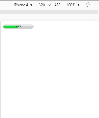
如图所示:
具体代码如下:
<!DOCTYPE HTML PUBLIC "-//W3C//DTD HTML 4.01//EN" "http://www.w3.org/TR/html4/strict.dtd">
<html>
<head>
<title> new document </title>
<meta http-equiv="Content-Type" content="text/html; charset=utf-8"   />
<meta name="viewport" content="initial-scale=1">
<style>
.process-bar
{
    width:100px;
    display:inline-block;
    *zoom:1;
}
.pb-wrapper
{
    border:1px solid #cfd0d2;
    position:relative;
    background:#cfd0d2;
    border-radius: 8px;
}
.pb-container
{
    height:12px;
    position:relative;
    left:-1px;
    margin-right:-2px;
    font:1px/0 arial;
    padding:1px;
}
.pb-highlight
{
    position:absolute;
    left:0;
    top:0;
    _top:1px;
    width:100%;
    opacity:0.6;
    filter:alpha(opacity=60);
    height:6px;
    background:white;
    font-size:1px;
    line-height:0;
    z-index:1
}
.pb-text
{
    width:100%;
    position:absolute;
    left:0;
    top:0;
    text-align:center;
    font:10px/12px arial;
    color:black;
    font:10px/12px arial
}
</style>
</head>
<body>
    <div class="process-bar skin-green">
        <div class="pb-wrapper">
            <div class="pb-highlight"></div>
            <div class="pb-container">
                <div class="pb-text">50%</div>
                <div class="pb-value" style="height: 100%;width: 50%;background: #19d73d;border-radius: 8px;"></div>
            </div>
        </div>
    </div>
</body>
</html>
以上所述是小编给大家介绍的使用CSS3制作一个简单的进度条(demo),希望对大家有所帮助,如果大家有任何疑问请给我留言,小编会及时回复大家的。在此也非常感谢大家对脚本之家网站的支持!

背景 京东购物小程序作为京东小程序业务流量的主要入口,承载着许多的活动和页面...
最近在做项目时,发现CSS3中关于动画的技术,自己很少运用在项目中,平时一些列...
Dreamweaver中如何使用Flash影片 1、首先需要我们准备的是一个Flash文件,其次最...
CSS3实现酷炫的3D旋转透视 3D动画效果现在越来越普及,已经被广泛的应用到了各个...
作者 / Krish Vitaldevara,Google Play 信任与安全产品管理总监 多年来,向数十...
在ie下设置 css 样式 style="cursor:hand;" 可以正常显示 但是在firefox下就不行...
行高line-height实现单行文本垂直居中 以前一直认为单行文本垂直居中要将高度和...
一、作用 离线浏览 - 根据文件规则把资源缓存在本地,脱机依然能够访问资源,联...
打开软件,我们按快捷键ctrl+n,建立一个新的文件。 点击常用,选择布局。 点击...
在讲CSS优先级之前,我们得要了解什么是CSS,CSS是用来做什么的。 首先,我们对C...

