


前不久,做了一个H5项目,需要在横竖屏变化时,做一些处理。毫无疑问,需要使用orientationchange来监听横竖屏的变化。
方案一:
- // 监听 orientation changes
- window.addEventListener("orientationchange", function(event) {
- // 根据event.orientation|screen.orientation.angle等于0|180、90|-90度来判断横竖屏
- }, false);
代码添加上后,就各种兼容性问题。这里兼容性问题出现在两个地方:
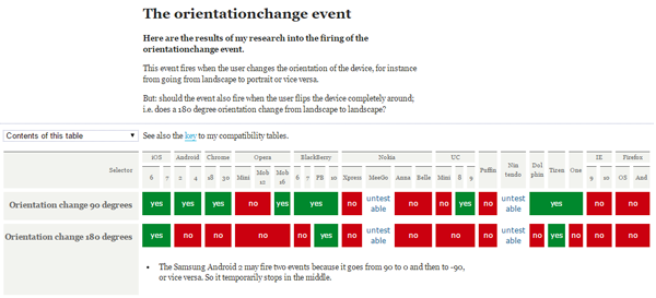
如下是orientationchange事件的兼容性:
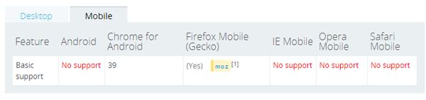
如下是screen.orientation的兼容性:
方案二:
上述方案不行,只能另行他法了。google一下,了解到可以通过resize配合(window.inner/outerWidth, window.inner/outerHeight)来实现:
- window.addEventListener("resize", function(event) {
- var orientation=(window.innerWidth > window.innerHeight)? "landscape":"portrait";
- if(oritentation === 'portrait'){
- // do something ……
- } else {
- // do something else ……
- }
- }, false);
这种方案基本满足大部分项目的需求,但是还是有些不足之处:
关键代码如下:
- var resizeCB = function(){
- if(win.innerWidth > win.innerHeight){//初始化判断
- meta.init = 'landscape';
- meta.current = 'landscape';
- } else {
- meta.init = 'portrait';
- meta.current = 'portrait';
- }
- return function(){
- if(win.innerWidth > win.innerHeight){
- if(meta.current !== 'landscape'){
- meta.current = 'landscape';
- event.trigger('__orientationChange__', meta);
- }
- } else {
- if(meta.current !== 'portrait'){
- meta.current = 'portrait';
- event.trigger('__orientationChange__', meta);
- }
- }
- }
- }();
方案三:
不过个人觉得通过window.innerWidth > window.innerHeight来实现的是一种伪检测,有点不可靠。 可不可以通过浏览器来实现检测?如基于CSS3@media媒体查询来实现。
如下@media兼容性:
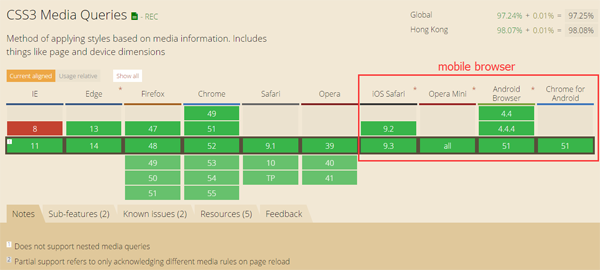
如上上图所示,移动端浏览器都支持CSS3 media。
实现思路:
这里我选择<html></html>的节点font-family作为检测样式属性。理由如下:
1.优先使用排在前面的字体。
2.如果找不到该种字体,或者该种字体不包括所要渲染的文字,则使用下一种字体。
3.如果所列出的字体,都无法满足需要,则让操作系统自行决定使用哪种字体。
这样我们就可以指定特定标识来标识横竖屏的状态,不过需要将指定的标识放置在其他字体的前面,这样就不会引起hmtl字体的变化。
关键代码如下:
- // callback
- var resizeCB = function() {
- var hstyle = win.getComputedStyle(html, null),
- ffstr = hstyle['font-family'],
- pstr = "portrait, " + ffstr,
- lstr = "landscape, " + ffstr,
- // 拼接css
- cssstr = '@media (orientation: portrait) { .orientation{font-family:' + pstr + ';} } @media (orientation: landscape) { .orientation{font-family:' + lstr + ';}}';
- // 载入样式
- loadStyleString(cssstr);
- // 添加类
- html.className = 'orientation' + html.className;
- if (hstyle['font-family'] === pstr) { //初始化判断
- meta.init = 'portrait';
- meta.current = 'portrait';
- } else {
- meta.init = 'landscape';
- meta.current = 'landscape';
- }
- return function() {
- if (hstyle['font-family'] === pstr) {
- if (meta.current !== 'portrait') {
- meta.current = 'portrait';
- event.trigger('__orientationChange__', meta);
- }
- } else {
- if (meta.current !== 'landscape') {
- meta.current = 'landscape';
- event.trigger('__orientationChange__', meta);
- }
- }
- }
- }();
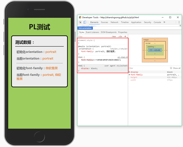
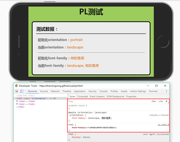
测试效果
方案四:
可以再改进一下,在支持orientationchange时,就使用原生的orientationchange,不支持则使用方案三。
关键代码如下:
- // 是否支持orientationchange事件
- var isOrientation = ('orientation' in window && 'onorientationchange' in window);
- // callback
- var orientationCB = function(e) {
- if (win.orientation === 180 || win.orientation === 0) {
- meta.init = 'portrait';
- meta.current = 'portrait';
- }
- if (win.orientation === 90 || win.orientation === -90) {
- meta.init = 'landscape';
- meta.current = 'landscape';
- }
- return function() {
- if (win.orientation === 180 || win.orientation === 0) {
- meta.current = 'portrait';
- }
- if (win.orientation === 90 || win.orientation === -90) {
- meta.current = 'landscape';
- }
- event.trigger(eventType, meta);
- }
- };
- var callback = isOrientation ? orientationCB() : (function() {
- resizeCB();
- return function() {
- timer && win.clearTimeout(timer);
- timer = win.setTimeout(resizeCB, 300);
- }
- })();
- // 监听
- win.addEventListener(isOrientation ? eventType : 'resize', callback, false);
方案五:
目前,上述几种方案都是通过自定制的订阅与发布事件模式来实现的。这里可以基于浏览器的事件机制,来模拟orientationchange。即对orientationchange的不兼容进行修复。
关键代码如下:
- var eventType = 'orientationchange';
- // 触发原生orientationchange
- var fire = function() {
- var e;
- if (document.createEvent) {
- e = document.createEvent('HTMLEvents');
- e.initEvent(eventType, true, false);
- win.dispatchEvent(e);
- } else {
- e = document.createEventObject();
- e.eventType = eventType;
- if (win[eventType]) {
- win[eventType]();
- } else if (win['on' + eventType]) {
- win['on' + eventType]();
- } else {
- win.fireEvent(eventType, e);
- }
- }
- }
通过上述5种方案,自己对移动端横竖屏检测有了更进一步的认识,有些东西只有自己亲身经历过才知道为什么要这么写,自己也把其中缘由记录在文章中,希望对大家有帮助。经过5种方案的演变得到了最终orientationchange-fix,github地址:https://github.com/zhansingsong/orientationchange-fix

2020年11月17日,北京16日晚,主题为创新思,享未来的中国Unity线上技术大会正式...
【引自CoorChice的博客】 背景介绍 我们在Android开发过程中,几乎都离不开线程...
相信大家在购买手机时都会有自己的喜好,比如游戏玩家更关注芯片、时尚达人更看...
微信上也能登录QQ并接收消息了,腾讯这一举动很快上了微博的热搜榜。 有网友吐槽...
如果按照「隔代大升级」的规律,今年的新 iPhone 本该迎来「S」后缀的一代。 但...
微信最近动作不断,更新频繁起来,这不新版又来了,这次带来了几个实用的新功能...
【Counterpoint发布的报告指出,2020年全球5G智能手机出货量将超过2.7亿台,5G手...
人工智能(AI)包括自然科学的各个学科,主要是计算机的研究,该计算机用于对某些...
11月4日,微信红包封面团队在公众号发文称,红包封面开放平台即将升级,个人也可...
网络管理指南解释了企业网络管理面临的挑战、自动化任务的优秀实践,以及如何采...

