【积水成渊】CSS磨砂玻璃效果和渐变主题色文字

磨砂玻璃效果已经在互联网上流行了很多年,Mac OS以其磨砂玻璃效果而闻名,Windows 10也通过其他一些灯光,深度,运动,材质,比例尺实现了磨砂玻璃的效果 。
在CSS中使用磨砂玻璃效果时,我们中的一些人知道该怎么做,而其他人仍会在百度搜索:
怎么做?
“ css光泽效果” “ css毛玻璃” “透明模糊背景css” “毛玻璃效果photoshop” “仅cs模糊背景” “ css玻璃窗格” “ css背景滤镜” “ css模糊覆盖物” “ css div后面的模糊背景”
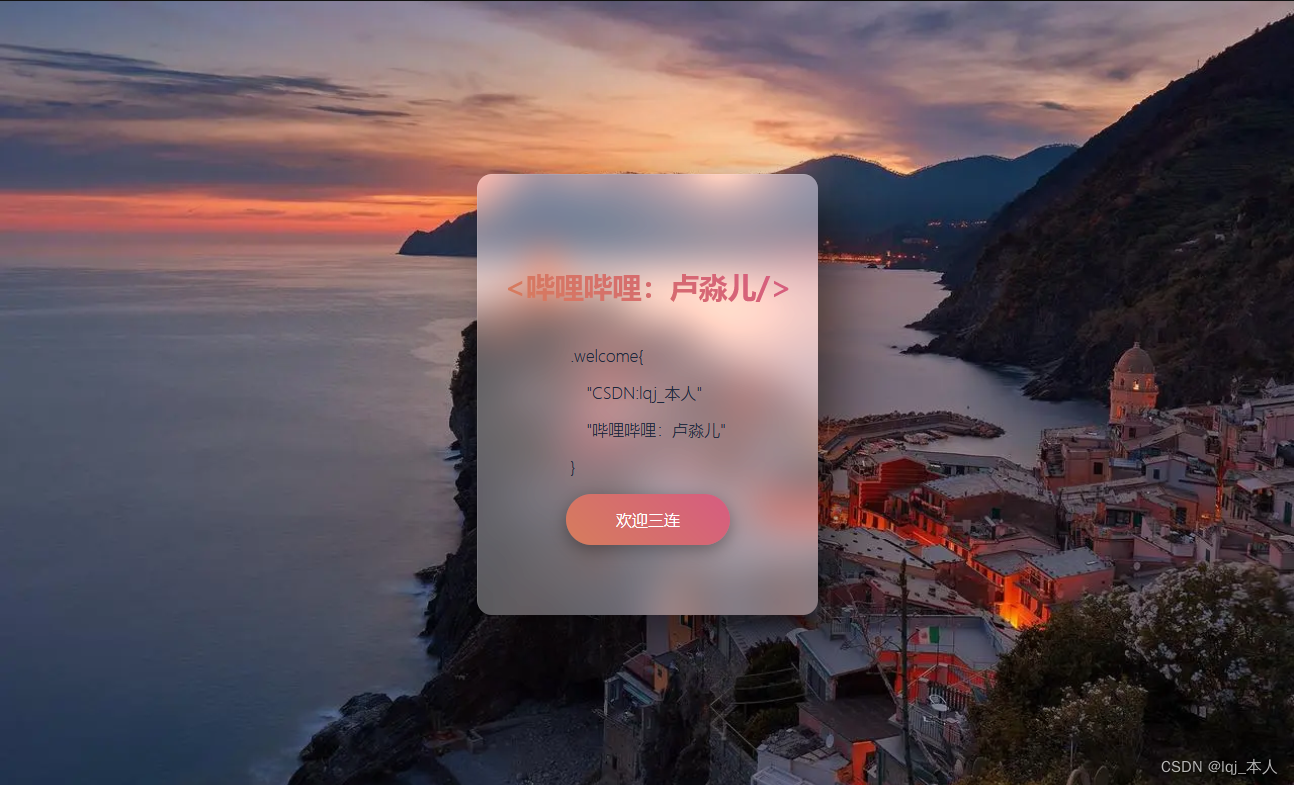
今天,我将展示仅CSS的一种方法,教你可以使用该方法在CSS中进行磨砂玻璃效果。?
HTML
<div class="card">
  <h2 class="gradient">
    <哔哩哔哩:卢淼儿/>
  </h2>
  <div>
    <p>.welcome{</p>
    <p class="indent">"CSDN:lqj_本人"</p>
    <p class="indent">"哔哩哔哩:卢淼儿"</p>
    <p>}</p>
  </div>
  <a href="#" class="gradient">欢迎三连</a>
</div>
CSS
body {
	display: flex;
	justify-content: center;
	align-items: center;
	margin: 0;
	padding: 0;
	width: 100vw;
	min-height: 100vh;
	background: url(https://img0.baidu.com/it/u=1049144354,3589714554&fm=253&fmt=auto&app=120&f=JPEG?w=1280&h=800) no-repeat;
	background-size: cover;
}

.card {
	display: flex;
	flex-direction: column;
	justify-content: center;
	align-items: center;
	padding: 20px;
	width: 300px;
	height: 400px;
	box-shadow: 20px 20px 50px rgba(0, 0, 0, 0.5);
	border-top: 1px solid rgba(255, 255, 255, 0.1);
	border-left: 1px solid rgba(255, 255, 255, 0.1);
	border-radius: 15px;
	background: rgba(255, 255, 255, .9);

	//   background: rgba(255, 255, 255, .3);
	//   backdrop-filter: blur(20px) brightness(150%);
	@supports (backdrop-filter: blur(20px) brightness(150%)) {
		background: rgba(255, 255, 255, .3);
		backdrop-filter: blur(20px) brightness(150%);
	}

	h2 {
		font-size: 1.8em;
		color: transparent;
		-webkit-background-clip: text;
		background-clip: text;
	}

	p {
		font-size: 1em;
		color: #1b263b;
		font-weight: 300;

		&.indent {
			text-indent: 1em;
		}
	}

	a {
		padding: 15px 50px;
		border-radius: 30px;
		color: white;
		text-decoration: none;
		font-weight: 500;
		// background-image: linear-gradient(
		//     45deg,
		//     hsl(220deg 67.24% 60%),
		//     hsl(333.91deg 50% 60%)
		// );
		box-shadow: 0 5px 15px rgba(0, 0, 0, 0.3);
        transition: filter .5s;

		&:hover {
			filter: brightness(120%);
		}
	}
}
js
function rgbToHsl(r, g, b) {
  r /= 255;
  g /= 255;
  b /= 255;

  let max = Math.max(r, g, b);
  let min = Math.min(r, g, b);
  let h, s, l = (max + min) / 2;

  if (max === min) {
    h = s = 0;
  } else {
    let d = max - min;
    s = l > 0.5 ? d / (2 - max - min) : d / (max + min);

    switch (max) {
      case r:
        h = (g - b) / d + (g < b ? 6 : 0);
        break;
      case g:
        h = (b - r) / d + 2;
        break;
      case b:
        h = (r - g) / d + 4;
        break;
    }

    h /= 6;
  }

  return [h * 360, s * 100, l * 100];
}
const gradientBtn = () => {
	const img = new Image();
	img.addEventListener('load', function() {
		const colorThief = new ColorThief();
		let palette = colorThief.getPalette(img, 3);
		palette.forEach((item, index) => {
			palette[index] = rgbToHsl(...item);
		})
		// document.getElementById('button').style.backgroundImage = `linear-gradient(
        //     45deg,
        //     hsl(${palette[1][0]}deg 60% 60%),
        //     hsl(${palette[2][0]}deg 60% 60%)
        // )`;
        document.querySelectorAll('.gradient').forEach(el => el.style.backgroundImage = `linear-gradient(
            45deg,
            hsl(${palette[1][0]}deg 60% 60%),
            hsl(${palette[2][0]}deg 60% 60%)
        )`);
        // document.getElementById('button').style.backgroundImage = `linear-gradient(
        //     45deg,
        //     hsl(${palette[1][0]}deg ${palette[1][1]}% ${palette[1][2]}%),
        //     hsl(${palette[2][0]}deg ${palette[2][1]}% ${palette[2][2]}%)
        // )`;
		// document.getElementById('button').style.backgroundImage = `linear-gradient(
        //     45deg,
        //     rgb(${palette[1][0]}, ${palette[1][1]}, ${palette[1][2]}),
        //     rgb(${palette[2][0]}, ${palette[2][1]}, ${palette[2][2]})
        // )`;
	});
	img.crossOrigin = 'anonymous';
	img.src = 'https://img0.baidu.com/it/u=1049144354,3589714554&fm=253&fmt=auto&app=120&f=JPEG?w=1280&h=800 no-repeat';
}

gradientBtn();本文参与?腾讯云自媒体分享计划,分享自作者个人站点/博客。
原始发表:2023-08-04,如有侵权请联系 cloudcommunity@tencent.com 删除
评论
登录后参与评论
推荐阅读
目录