在Python中实现条形图动态追赶动画效果
原创
动画是提高可视化吸引力和用户吸引度的优秀手段。它能够以有意义的方式展示数据可视化。Python提供了强大的库,使我们能够轻松创建动画可视化。Matplotlib是一个广受欢迎的数据可视化库,通常用于绘制数据图表以及创建基于内置函数的动画。
使用Matplotlib创建动画有两种主要方法:
- 使用pause()函数
- 使用FuncAnimation()函数
? 方法一:使用pause()函数
在这种方法中,我们使用matplotlib库的pyplot模块中的pause()函数来实现暂停。该函数在程序执行过程中会暂停指定的时间间隔,使动画能够逐帧展示。下面是一个示例,演示了如何使用Matplotlib创建一个简单的线性图,并通过pause()函数设置适当的时间间隔展示动画:
from matplotlib import pyplot as plt

x = []
y = []

for i in range(100):
    x.append(i)
    y.append(i)

    plt.xlim(0, 100)
    plt.ylim(0, 100)

    plt.plot(x, y, color='green')
    plt.pause(0.01)

plt.show()
输出:
同样,pause()函数也可以用于在各种图形中创建动画。
? 方法二:使用FuncAnimation()函数
FuncAnimation()函数不会自行创建动画,而是从我们传递的一系列图形中生成动画。其语法如下:
from matplotlib.animation import FuncAnimation

animation = FuncAnimation(figure, animation_function, frames=None, init_func=None, fargs=None, save_count=None, cache_frame_data=True, **kwargs)
现在,我们可以使用FuncAnimation函数创建多种类型的动画。以下是几个示例:
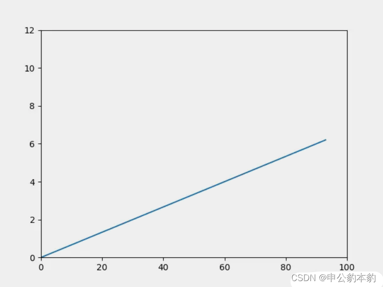
? 线性图动画:
在这个例子中,我们创建了一个简单的线性图,展示了线条的动画效果。通过FuncAnimation,我们可以定义动画的具体表现形式,然后将其传递给FuncAnimation。
from matplotlib.animation import FuncAnimation
import numpy as np

x = []
y = []
figure, ax = plt.subplots()

ax.set_xlim(0, 100)
ax.set_ylim(0, 12)

line, = ax.plot(0, 0)

def animation_function(i):
    x.append(i * 15)
    y.append(i)

    line.set_xdata(x)
    line.set_ydata(y)
    return line,

animation = FuncAnimation(figure,
                          func=animation_function,
                          frames=np.arange(0, 10, 0.1),
                          interval=10)
plt.show()
输出:
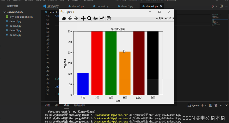
? Python中的条形图追赶动画
在这个例子中,我们展示了一个条形图动画,每个条形图都有自己的动画效果。
import numpy as np

plt.rcParams['font.sans-serif'] = ['Microsoft YaHei']
fig = plt.figure(figsize=(7, 5))
axes = fig.add_subplot(1, 1, 1)
axes.set_ylim(0, 300)
palette = ['blue', 'red', 'green', 'darkorange', 'maroon', 'black']

y1, y2, y3, y4, y5, y6 = [], [], [], [], [], []

def animation_function(i):
    y1 = i
    y2 = 6 * i
    y3 = 3 * i
    y4 = 2 * i
    y5 = 5 * i
    y6 = 3 * i

    plt.xlabel("国家")
    plt.ylabel("国家GDP")

    plt.bar(["印度", "中国", "德国", "美国", "加拿大", "英国"],
            [y1, y2, y3, y4, y5, y6],
            color=palette)

plt.title("条形图动画")

animation = FuncAnimation(fig, animation_function,
                          interval=50)
plt.show()
输出:
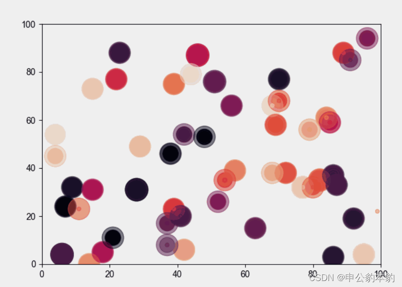
? Python中的散点图动画:
在这个例子中,我们使用随机函数在Python中创建了一个动画散点图。通过迭代animation_func,在每次迭代时绘制随机的x和y坐标值。
import random

x = []
y = []
colors = []
fig = plt.figure(figsize=(7, 5))

def animation_func(i):
    x.append(random.randint(0, 100))
    y.append(random.randint(0, 100))
    colors.append(np.random.rand(1))
    area = random.randint(0, 30) * random.randint(0, 30)
    plt.xlim(0, 100)
    plt.ylim(0, 100)
    plt.scatter(x, y, c=colors, s=area, alpha=0.5)

animation = FuncAnimation(fig, animation_func,
                          interval=100)
plt.show()
输出:
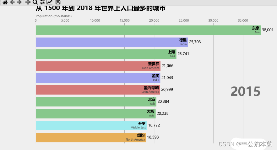
? 条形图追赶的水平移动:
在这个例子中,我们使用城市数据集中最高人口的城市创建了一个条形图竞赛动画。每个城市都有自己的条形图,而动画则会在1990年到2018年之间迭代。数据集可以从这里下载。
import pandas

 as pd
import matplotlib.ticker as ticker
from matplotlib.animation import FuncAnimation

plt.rcParams['font.sans-serif'] = ['Microsoft YaHei']
df = pd.read_csv('city_populations.csv', usecols=['name', 'group', 'year', 'value'])

colors = dict(zip(['India', 'Europe', 'Asia', 'Latin America', 'Middle East', 'North America', 'Africa'],
                  ['#adb0ff', '#ffb3ff', '#90d595', '#e48381', '#aafbff', '#f7bb5f', '#eafb50']))

group_lk = df.set_index('name')['group'].to_dict()

def draw_barchart(year):
    dff = df[df['year'].eq(year)].sort_values(by='value', ascending=True).tail(10)
    ax.clear()
    ax.barh(dff['name'], dff['value'], color=[colors[group_lk[x]] for x in dff['name']])
    dx = dff['value'].max() / 200

    for i, (value, name) in enumerate(zip(dff['value'], dff['name'])):
        ax.text(value-dx, i, name, size=14, weight=600, ha='right', va='bottom')
        ax.text(value-dx, i-.25, group_lk[name], size=10, color='#444444', ha='right', va='baseline')
        ax.text(value+dx, i, f'{value:,.0f}', size=14, ha='left', va='center')

    ax.text(1, 0.4, year, transform=ax.transAxes, color='#777777', size=46, ha='right', weight=800)
    ax.text(0, 1.06, 'Population (thousands)', transform=ax.transAxes, size=12, color='#777777')

    ax.xaxis.set_major_formatter(ticker.StrMethodFormatter('{x:,.0f}'))
    ax.xaxis.set_ticks_position('top')
    ax.tick_params(axis='x', colors='#777777', labelsize=12)
    ax.set_yticks([])
    ax.margins(0, 0.01)
    ax.grid(which='major', axis='x', linestyle='-')
    ax.set_axisbelow(True)
    ax.text(0, 1.12, '从 1500 年到 2018 年世界上人口最多的城市',
            transform=ax.transAxes, size=24, weight=600, ha='left')

    ax.text(1, 0, 'by haiyong.site | 海拥', transform=ax.transAxes, ha='right', color='#777777',
            bbox=dict(facecolor='white', alpha=0.8, edgecolor='white'))
    plt.box(False)
    plt.show()

fig, ax = plt.subplots(figsize=(15, 8))
animator = FuncAnimation(fig, draw_barchart, frames=range(1990, 2019))
plt.show()
输出:
? wuhu!起飞!
如果您从这篇文章中学到了新知识并喜欢它,请收藏并与您的朋友分享。最后,请不要忘记给予?或?支持。
原创声明:本文系作者授权腾讯云开发者社区发表,未经许可,不得转载。
如有侵权,请联系 cloudcommunity@tencent.com 删除。
原创声明:本文系作者授权腾讯云开发者社区发表,未经许可,不得转载。
如有侵权,请联系 cloudcommunity@tencent.com 删除。