Angular17 使用 ngx-formly 动态表单
Angular17 使用 ngx-formly 动态表单

ngx-formly 是 Angular 应用实现响应式的动态表单框架,不仅支持自动生成表单、易于上手的自定义字段扩展、自定义验证扩展、支持 Formly Schema 和 JSON Schema,还有开箱即用的内置表单主题。
快速开始
创建 Angular 项目:
安装并执行 CLI 创建 Angular 项目
# 基于 Angular 17 版本演示
# 注意要将 Nodejs 版本切换至 18.13+
npm install -g @angular/cli

# 创建为 standalone 类型的项目
ng new angular-ngx-formly --standalone=false
安装 NG-ZORRO 组件库:
推荐使用 angular-cli 提供的 ng add 进行安装配置:
# 1. 启用 Icon 动态加载 Yes
# 2. 设置自定义主题文件 Yes
# 3. 选择语言环境代码: zh_CN
# 4. 选择创建项目的模板: sidemenu
ng add ng-zorro-antd
安装 Formly 核心模块:
推荐使用 angular-cli 提供的 ng add 进行安装配置:
# 可选主题包括:bootstrap / material / ng-zorro-antd / ionic / primeng / kendo / nativescript
# 需要组件库的使用同步
ng add @ngx-formly/schematics --ui-theme=ng-zorro-antd
Angular CLI 添加新页面:
推荐使用 angular-cli 提供的 ng generate 自动生成:
ng g m pages/<new-page> --routing
ng g c pages/<new-page> --skip-tests
配置页面/组件级路由:
import { NgModule } from '@angular/core';
import { RouterModule, Routes } from '@angular/router';

// 配置路由
const routes: Routes = [{ path: '', component: <new-page>Component }];

@NgModule({
  imports: [RouterModule.forChild(routes)],
  exports: [RouterModule],
})
export class <new-page>RoutingModule {}
将新页面组件懒加载到根组件路由:
{
    path: '<new-page>',
    loadChildren: () =>
      import('./pages/<new-page>/<new-page>.module').then(
        (m) => m.<new-page>Module
    ),
}
更新主页左侧导航菜单:
<li nz-menu-item nzMatchRouter>
  <a routerLink="/<new-page>"> new-page </a>
</li>
使用 Formly 实现新用户注册:
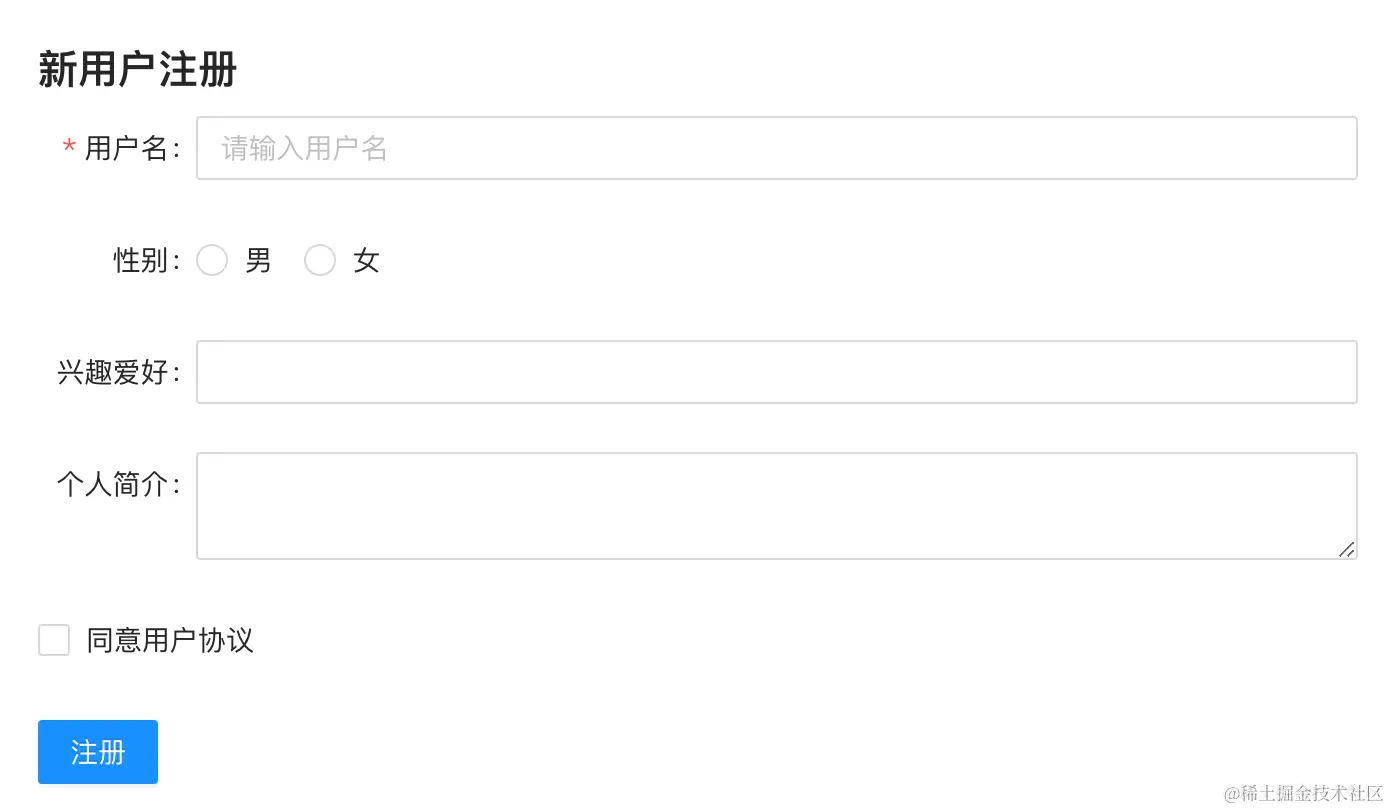
第一步:在页面级组件的模块中导入必要的三个模块:
ReactiveFormsModule:响应式表单核心模块;FormlyModule.forChild():Formly 核心模块;FormlyNgZorroAntdModule:二次封装Zorro组件模块;
@NgModule({
  imports: [
		...
		ReactiveFormsModule,
		FormlyModule.forChild(),
		FormlyNgZorroAntdModule,
	],
	...
})
export class WelcomeModule {}
第二步:在页面中添加 form 和 formly-form 组件:
<form [formGroup]="form" (ngSubmit)="onSubmit(model)">
  <formly-form [form]="form" [fields]="fields" [model]="model"></formly-form>
  <button type="submit">注册</button>
</form>
第三步:添加 form 和 formly-form 组件必要的属性和函数,表单动态渲染主要依赖 fields 的定义:
export class WelcomeComponent {
  form = new FormGroup({});
  model = {};
  fields: FormlyFieldConfig[] = [];

  onSubmit(model: any) {
    console.log(model);
  }
}
如何定义 Input 组件,重要属性 type、className、required:
- type:定义组件的类型为 input;
- className:为当前 Input 组件绑定 className,用来调整其样式;
- required:表示当前 Input 组件必须录入内容
{
  className: 'label-width',
  key: 'username',
  type: 'input',
  props: {
    label: '用户名',
    placeholder: '请输入用户名',
    required: true,
  },
}
如何定义 Radio 组件,重要属性 options:
options: 定义 Radio 组件所支持的选项;
{
  className: 'label-width',
  key: 'gender',
  type: 'radio',
  props: {
    label: ' 性别',
    options: [
      {
        label: '男',
        value: 'male',
      },
      {
        label: '女',
        value: 'female',
      },
    ],
  },
}
如何定义 Select 组件,重要属性 multiple:
- multiple:表示当前 Select 组件为多选状态;
{
  className: 'label-width',
  key: 'hobby',
  type: 'select',
  props: {
    label: '兴趣爱好',
    options: [
      {
        label: '篮球',
        value: 'basketball',
      },
      {
        label: '足球',
        value: 'football',
      },
      {
        label: '乒乓球',
        value: 'pingpong',
      },
    ],
    multiple: true,
  },
}
如何定义 TextArea 组件:
{
  className: 'label-width',
  key: 'description',
  type: 'textarea',
  props: {
    label: '个人简介',
  },
}
如何定义 CheckBox 组件,重要属性 defaultValue:
- defaultValue:当 model 未提供默认值时,将使用 defaultValue;
{
  className: 'label-width ml14',
  key: 'agree',
  type: 'checkbox',
  defaultValue: false,
  props: {
    label: '同意用户协议',
    options: [
      {
        label: '用户协议',
        value: 'agree',
      },
    ],
  },
}
表单验证 Validation
表单验证主要包括:Formly 内置验证、自定义验证消息及自定义验证函数三大块,自定义验证消息和验证函数分别还可以正在全局注册和指定字段注册,在不同的场景可以考虑不同的自定义方式;
使用 Formly 内置验证:
在新用户注册表单的基础上增加输入年龄字段的配置,再为每个字段配置的 props 增加 required 属性,表示这是一个必填的字段,就像新用户注册表单中用户名字段一样,当点击提交按钮或删除字段录入的内容时字段边框颜色会变成红色,表示字段验证不通过:
// 省略了部分字段
[
  {
    key: 'username',
    props: {
      label: '用户名',
			// 激活字段必填校验 - 下同
      required: true,
    },
  },
  {
    key: 'age',
    props: {
			label: '年龄',
      required: true,
    },
  },
  {
    key: 'gender',
    props: {
      label: ' 性别',
      required: true,
    },
  },
  {
    key: 'hobby',
    props: {
      label: '兴趣爱好',
      required: true,
    },
  },
  {
    key: 'description',
    props: {
      label: '个人简介',
      required: true,
    },
  },
  {
    key: 'agree',
    props: {
      label: '同意用户协议',
      required: true,
    },
  },
]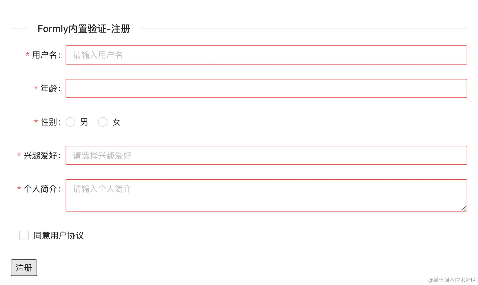
接着分别为不同的字段添加合适的内置验证,如:
- 年龄(
min=18,max=60):
{
  key: 'age',
  type: 'input',
  props: {
    label: '年龄',
    type: 'number',
    required: true,
    min: 18,
    max: 60,
  },
}- 个人简介(
minLength=10,maxLength=200):
{
  key: 'description',
  type: 'textarea',
  props: {
    label: '个人简介',
    required: true,
    minLength: 10,
    maxLength: 200,
  },
}- 用户名(
pattern=/^[\u4e00-\u9fa5]+$/):
{
  key: 'username',
  type: 'input',
  props: {
    label: '用户名',
    required: true,
    pattern: /^[\u4e00-\u9fa5]+$/,
  },
}
为字段添加自定义验证消息:
到目前不通过验证的字段仅仅是通过边框颜色的改变的区分,现在就为字段添加自定义的验证消息,自定义验证消息同时支持字符串和函数两种方式设置;
- 全局注册自定义验证消息,需要在
FormlyModule注册时通过validationMessages选项设置:
FormlyModule.forChild({
  validationMessages: [
    { name: 'required', message: '必填字段' },
    {
      name: 'min',
      message: (error: any, field: FormlyFieldConfig) => {
        return `${field.props?.label}最小是: ${error.min}岁`;
      },
    },
    {
      name: 'max',
      message: (error: any, field: FormlyFieldConfig) => {
        return `${field.props?.label}最大是: ${error.max}岁`;
      },
    }
  ],
}),- 指定字段注册自定义验证消息,使用正则验证字段需要在字段定义时通过
validation属性设置:
{
  key: 'username',
  type: 'input',
  props: {
    label: '用户名',
    required: true,
    pattern: /^[\u4e00-\u9fa5]+$/,
  },
  validation: {
    messages: {
      pattern: (error: any, field: FormlyFieldConfig) =>
        `${field.props?.label}仅支持录入中文`,
    },
  },
}
为字段添加自定义验证函数:
接着为新注册用户表单添加新的字段:邮箱、身份证、手机号,分别非这三个字段自定义校验函数:
- 全局注册自定义校验函数,需要在
FormlyModule注册时通过validators选项设置:
FormlyModule.forChild({
  validators: [
    {
      name: 'email',
      validation: (
        c: AbstractControl,
        field: FormlyFieldConfig
      ): ValidationErrors | null => {
        return /^[a-zA-Z0-9._%+-]+@[a-zA-Z0-9.-]+\.[a-zA-Z]{2,}$/.test(
          c.value
        )
          ? null
          : { email: true };
      },
    },
  ],
	validationMessages: [
    {
      name: 'email',
      message: (error: any, field: FormlyFieldConfig) => {
        return `${field.props?.label}格式不正确`;
      },
    },
  ],
})// 字段绑定自定义验证函数
{
key: 'email',
type: 'input',
props: {
label: '邮箱',
required: true,
},
validators: {
validation: ['email'],
},
}PS:需要为 email 定义验证消息,且需要在定义 email 字段时通过
validators.validation:['email']绑定;
- 指定字段注册自定义校验函数 ①,在定义字段时通过
validators.validation设置:
{
  key: 'idcard',
  type: 'input',
  props: {
    label: '身份证',
    required: true,
  },
  validators: {
    validation: [
      (control: AbstractControl): ValidationErrors | null => {
        return /^(\d{15}$|^\d{18}$|^\d{17}(\d|X|x))$/.test(control.value)
          ? null
          : { idcard: true };
      },
    ],
  },
}// 全局自定义验证消息
FormlyModule.forChild({
validationMessages: [
{
name: 'idcard',
message: (error: any, field: FormlyFieldConfig) => {
return `${field.props?.label}格式不正确`;
},
},
],
})PS:需要全局注册自定义验证消息;
- 指定字段注册自定义校验函数 ②,在定义字段时通过
validators.expression设置:
{
  key: 'phone',
  type: 'input',
  props: {
    label: '手机号',
    required: true,
  },
  validators: {
    phone: {
      expression: (c: AbstractControl) =>
        !c.value || /^(\+?86)?1[3-9]\d{9}|\d{3}-?\d{8}$/.test(c.value),
      message: (error: any, field: FormlyFieldConfig) =>
        `${field.props?.label}格式不正确`,
    },
  },
}
自定义携带选项的验证函数:
在前面为邮箱定义的验证函数使用了一个比较通用的正则,如果在实际使用时除了直接修改验证函数中的正则外,还可以通过第三个选项参数实现验证范围的缩小,如:在实际验证时需要校验特定后缀的邮箱;
FormlyModule.forChild({
	validators: [
    {
      name: 'email',
      validation: (
        c: AbstractControl, field: FormlyFieldConfig,
				options?: { [id: string]: any; }
      ): ValidationErrors | null => {
        return (
					// 优先使用选项传递的正则
          options?.['pattern'] ||
          /^[a-zA-Z0-9._%+-]+@[a-zA-Z0-9.-]+\.[a-zA-Z]{2,}$/
        ).test(c.value)
          ? null
          : { email: true };
      },
    },
  ],
}){
key: 'email',
type: 'input',
props: {
label: '邮箱',
required: true,
},
validators: {
validation: [
{
name: 'email',
// 使用指定正则替换 email 默认正则
options: {
pattern: /^[a-zA-Z0-9._%+-]+@qq\.[a-zA-Z]{2,}$/,
},
},
],
},
}自定义异步验证实现唯一校验:
通过接口实现手机号在系统中唯一使用也是最为常见的一个场景,通过异步验证需要使用将使用同步验证函数时的 validators 切换为 asyncValidators;
{
  key: 'phone',
  type: 'input',
  props: {
    label: '手机号',
    required: true,
  },
  asyncValidators: {
    uniquePhone: {
      expression: (c: AbstractControl) =>
        timer(1000).pipe(
          map(() => this.existingPhones.indexOf(c.value) === -1)
        ),
      message: (error: any, field: FormlyFieldConfig) =>
        `${field.props?.label}已被使用`,
    },
  },
}
字段默认在 change 事件发生后就会触发验证,对于异步验证来说体验就不是很好,可以通过 modelOptions.updateOn 改变验证触发的时机:
modelOptions: {
updateOn: 'blur', // submit
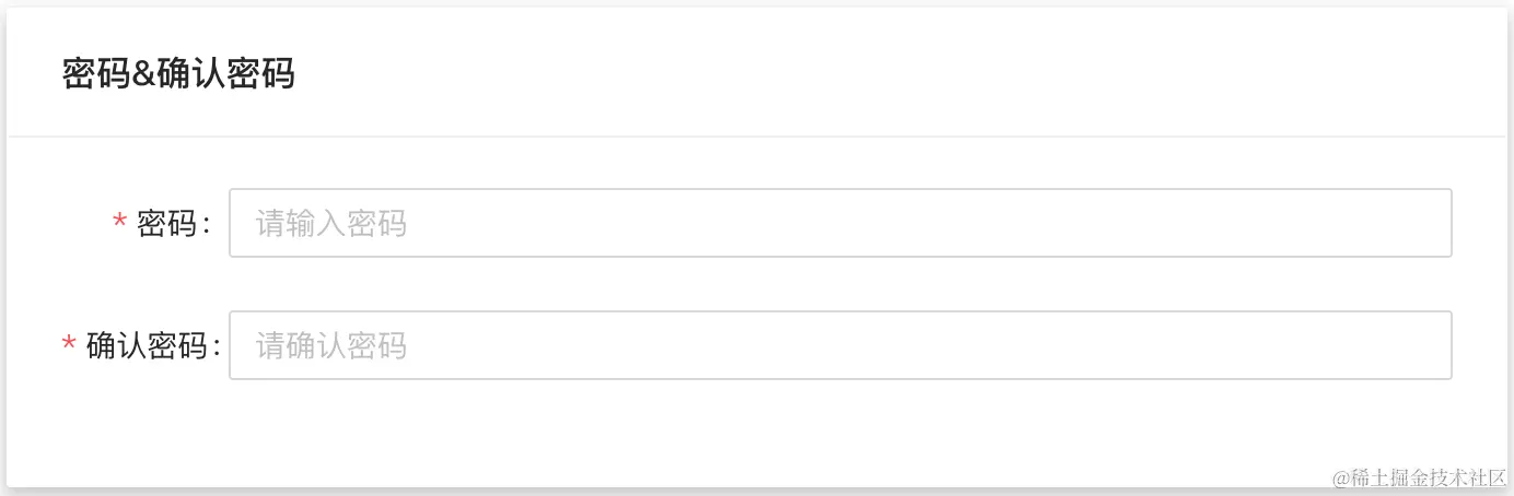
}自定义关联字段验证函数:
将相关联的字段放到同一个 fieldGroup ,并在 fieldGroup 同级添加自定义验证函数,同时还要通过 options.errorPath 设置显示验证消息的字段:
{
  validators: {
    validation: [
      {
        name: 'fieldMatch',
				// 设置后 checkPassword 字段才会在触发验证时显示验证消息
        options: { errorPath: 'checkPassword' },
      },
    ],
  },
  fieldGroup: [
    {
      key: 'password',
      type: 'input',
      props: {
        type: 'password',
        label: '密码',
        required: true,
      },
    },
    {
      key: 'checkPassword',
      type: 'input',
      props: {
        type: 'password',
        label: '确认密码',
        required: true,
      },
    },
  ],
}export function fieldMatchValidator(control: AbstractControl) {
const { password, checkPassword } = control.value;
if (!checkPassword || !password) {
return null;
}
if (checkPassword === password) {
return null;
}
return { fieldMatch: { message: '两次录入的密码不一致' } };
}
FormlyModule.forChild({
validators: [
{
name: 'fieldMatch',
validation: fieldMatchValidator,
}
]
})表达式 Expressions
利用表达式可以实现字段属性的动态修改,还可以监听状态改变时派发的事件。
隐藏/显示字段:
如果需要使前面加入的确认密码字段在输入密码字段后才显示时就需要使用 expressions.hide 来控制隐藏或显示:
{
  key: 'checkPassword',
  type: 'input',
  props: {
    type: 'password',
    label: '确认密码',
    required: true,
  },
  expressions: {
    hide: '!model.password',
  },
}
PS:通过 model.password 获取密码的输入,取反后表示未输入内容,隐藏确认密码字段;
禁用/启用字段:
将 expressions.hide 更换为 expressions.'props.disabled’ 就可以控制字段禁用或启用:
{
  key: 'checkPassword',
  type: 'input',
  props: {
    type: 'password',
    label: '确认密码',
    required: true,
  },
  expressions: {
    'props.disabled': '!model.password',
  },
}
PS:
hide是框架显示提供的属性,props.disabled是继承自组件的属性;
强制显示错误状态:
使用 formState 可以实现字段之间的通信,所以让 formState & expressions.validation.show 共同控制错误状态的显示;
首先需要定义一个选项并绑定到 formly-form 组件:
signInOptions = {
  formState: {
    showValidation: false,
  },
};

// 绑定到 formly-form 组件
<formly-form
  [form]="signInForm"
  [fields]="signInFields"
  [model]="signInModel"
  [options]="signInOptions"
></formly-form>
接着将 formState 绑定到 expressions,最后通过 changeValidation 函数强制显示错误状态:
fieldGroup: [
  {
    key: 'password',
    type: 'input',
    props: {
      type: 'password',
      label: '密码',
      required: true,
    },
    expressions: {
      'validation.show': 'formState.showValidation',
    },
  },
  {
    key: 'checkPassword',
    type: 'input',
    props: {
      type: 'password',
      label: '确认密码',
      required: true,
    },
    expressions: {
      'validation.show': 'formState.showValidation',
    },
  },
]

// 切换 showValidation 状态
changeValidation() {
  this.signInOptions.formState.showValidation =
    !this.signInOptions.formState.showValidation;
}
监听状态变化:
通过在 hooks.onInit 注册 fieldChanges,可以在运行时获取表达式改变派发的事件;
hooks: {
  onInit: (field: FormlyFieldConfig) => {
    return field.options?.fieldChanges?.pipe(
      filter(
        (e) => e.type === 'expressionChanges' && e.field === field
      ),
      tap((e) => console.warn(e))
    );
  },
}
PS:过滤指定的
field和type缩小监听结果的范围;
创建自定义 Types
自定义 type 需要创建一个继承自 FieldType 的组件;
# input-field
ng g c types/input-field --skip-tests --skip-import
组件的模板可以是简单的 input 组件:
<input
  type="input"
  nz-input
  [formControl]="formControl"
  [formlyAttributes]="field"
/>
接着将常见的 input-field 组件注册到 FormlyModule.types:
FormlyModule.forRoot({
	types: [{ name: 'input-field', component: InputFieldComponent }],
})
最后将其中一个 input 类型的字段配置调整 type 为 input-field:
{
  type: 'input-field'
}
PS:注意导入 NzInputModule 模块;
创建自定义 Wrapper
自定义 Wrapper 同样也是一个组件,需要继承自 FieldWrapper 类,这样实现了一个简单包装字段的 Wrapper:
# 创建 card-panel 组件
ng g c wrappers/card-panel --skip-tests --skip-importexport class CardPanelComponent extends FieldWrapper {}// 继承 FieldWrapper 类
export class CardPanelComponent extends FieldWrapper {}<!-- 创建用来包装字段的 Wrapper 并提供 field 插入的插槽 -->
<nz-card [nzTitle]="props.label" nzHoverable>
<ng-container #fieldComponent></ng-container>
</nz-card>注册自定义的 CardPanel Wrapper:
FormlyModule.forRoot({
  wrappers: [{ name: 'card-panel', component: CardPanelComponent }],
})
使用别名配置 CardPanel 到密码与确认密码字段组:
{
	wrappers: ['card-panel'],
	props: { label: '密码&确认密码' },
	fieldGroup: [
	  {
	    key: 'password',
	    type: 'input',
	    props: {
	      type: 'password',
	      label: '密码',
	      required: true,
	    },
	  },
	  {
	    key: 'checkPassword',
	    type: 'input',
	    props: {
	      type: 'password',
	      label: '确认密码',
	      required: true,
	    },
	  },
	]
}
PS:wrappers 还可以设置为具体的 CardPanel 组件类,但要记得将 CardPanel 组件提前注册后再使用;
创建自定义 Extensions
自定义扩展可以为实现动态表单提供更加便利的帮助,如在系统中通常相同 key 的表单需要对应相同的 label 字段,如果在前期考虑不好的话容易造成后期维护的困难,这里就可以考虑通过自定义扩展在生成动态表单前自动匹配 label 字段。
定义类型为 FormlyExtension 的对象,在 prePopulate 时进行 label 字段匹配:
import { FormlyExtension } from '@ngx-formly/core';

export const selfAdaptionExtension: FormlyExtension = {
  prePopulate(field): void {
    const key = field.key as string;
    field.props = {
      ...field.props,
      label: Reflect.get(labels, key),
    };
  },
};// 抽离系统中的 key 和对应的 label
const labels = {
username: '用户名',
age: '年龄',
gender: '性别',
hobby: '兴趣爱好',
email: '邮箱',
idcard: '身份证',
phone: '手机号',
description: '个人简介',
agree: '同意用户协议',
password: '密码',
checkPassword: '确认密码',
};接着在 FormlyModule 中注册,其中还可以通过 priority 调整扩展生效的优先级:
FormlyModule.forRoot({
  extensions: [
    {
      name: 'self-adaption',
      extension: selfAdaptionExtension,
      priority: 100,
    },
  ],
})
PS:注册扩展后,绑定到每个字段上的
label属性就不再需要了;