3w字长文带你【从0开发一个自己的前端组件库】 | 技术创作特训营第五期
原创3w字长文带你【从0开发一个自己的前端组件库】 | 技术创作特训营第五期
原创
前言
这篇文章从0介绍如何开发组件库。包括以下内容:
- 为什么大厂都要建设自己的组件库
- 组件设计理论
- 组件开发顺序
- 环境搭建
- storybook
- 样式处理
- Button组件开发
- 单元测试
- 本地测试
- 打包
- 发布
为什么大厂都要建设自己的组件库
- 提效、节省资源
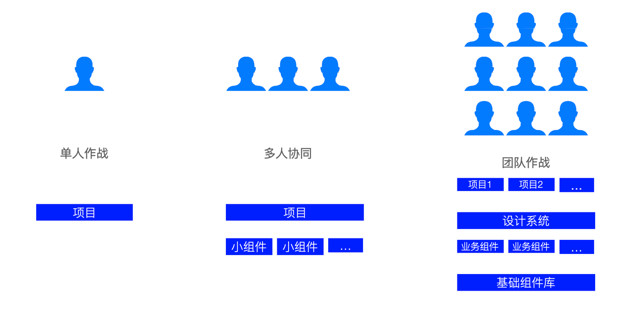
2.一致性、协同

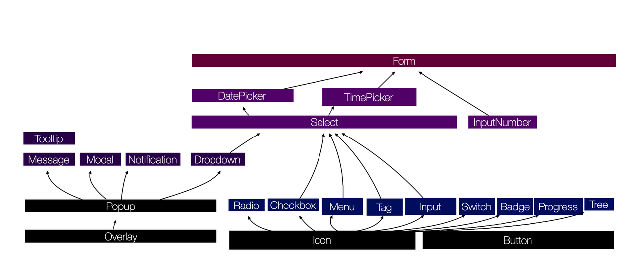
组件设计理论

组件的组织结构 - 开发顺序
环境搭建
组件库名字
因为我们的组件库要发布到npm上面,所以你的组件库名称不能和其他npm包的名称重复。
我起的组件库名称是叫:curry-design
首先去 npm 仓库查找curry-design,看有没有人在使用。。
https://www.npmjs.com/search?q=curry-design

从结果可以看到,这个名字没有其他包在用,所以我可以使用这个名字作为组件库的包名。
如果你起的名字,在npm里面查询到,则需要换个名字。
创建项目
使用create-react-app创建项目
在终端执行如下命令:
npx create-react-app curry-design --template typescript执行后,就会下载成功react+ts模版
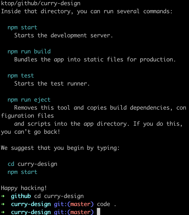
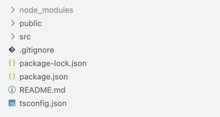
创建后的目录如下:
配置eslint
1.安装lint
pnpm i eslint -D -w2.初始化
npx eslint --init3.手动安装其他包
pnpm i -D -w typesript @typescript-eslint/eslint-plugin@latest @typescript-eslint/parser@latest4.修改eslint 配置
{
	"env": {
		"browser": true,
		"es2021": true,
		"node": true,
		"jest": true
	},
	"extends": [
		"eslint:recommended",
		"plugin:@typescript-eslint/recommended",
		"prettier",
		"plugin:prettier/recommended"
	],
	"parser": "@typescript-eslint/parser",
	"parserOptions": {
		"ecmaVersion": "latest",
		"sourceType": "module"
	},
	"plugins": ["@typescript-eslint", "prettier"],
	"rules": {
		"prettier/prettier": "error",
		"no-case-declarations": "off",
		"no-constant-condition": "off",
		"@typescript-eslint/ban-ts-comment": "off",
		"@typescript-eslint/no-unused-vars": "off",
		"@typescript-eslint/no-var-requires": "off",
		"no-unused-vars": "off"
	}
}
5.安装ts lint
pnpm i -D -w @typescript-eslint/eslint-plugin配置prettier
1.安装prettier
pnpm i -D -w prettier2.新建.pretterrc.json
{
  "printWidth": 80,
  "tabWidth": 2,
  "useTabs": true,
  "singleQuote": true,
  "semi": true,
  "trailingComma": "none",
  "bracketSpacing": true
}
3.将pretter集成到eslint中
pnpm i -D -w eslint-config-prettier eslint-plugin-prettier4.在scripts中增加lint命令
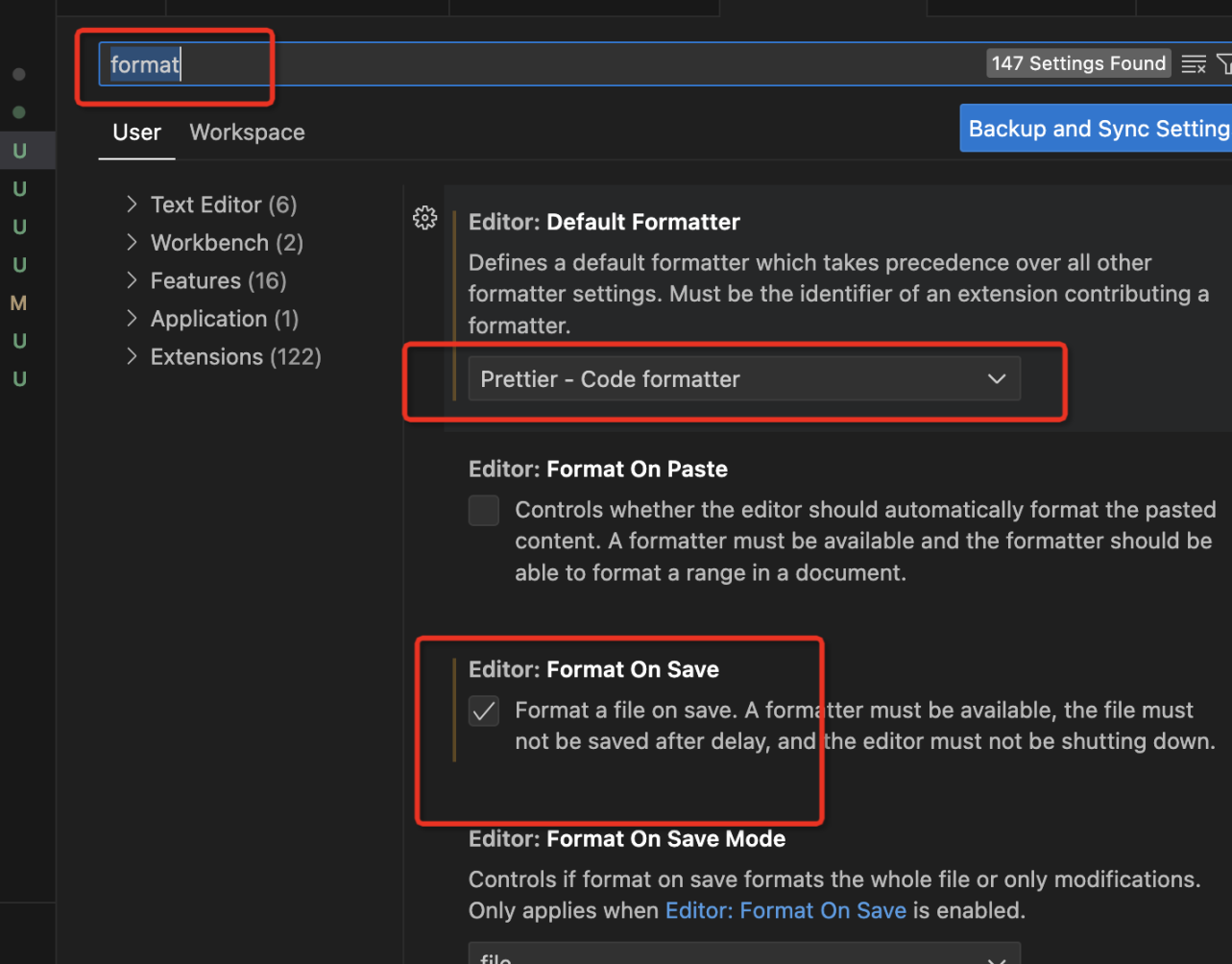
"lint": "eslint --ext .ts,.jsx,.tsx --fix --quiet ./packages"5.安装eslint pretter两个vscode插件
6.在vscode settings中设置format:pretter和 on save
检查commit
1.安装husky
pnpm i -D -w husky2.初始化husky
npx husky install3.将lint增加到husky中
npx husky add .husky/pre-commit "pnpm lint "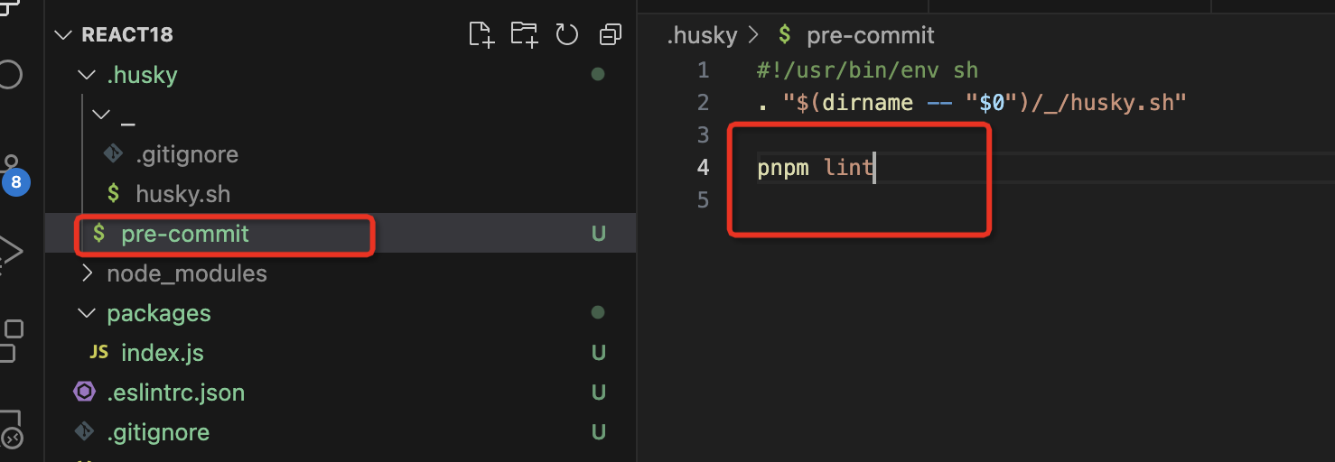
在commit的时候会执行pnpm lint
检查commit msg
1.安装包
pnpm i -D -w commitlint @commitlint/cli @commitlint/config-conventional2.新建.commitlintrc.js
module.exports = {
	extends: ['@commitlint/config-conventional']
};
3.集成到husky中
在终端执行下面命令
npx husky add .husky/commit-msg "npx --no-install commitlint -e $HUSKY_GIT_PARAMS"TypeScript配置
在根目录新建tsconfig.json
{
	"compileOnSave": true,
	"include": ["./packages/**/*"],
	"compilerOptions": {
		"target": "ESNext",
		"useDefineForClassFields": true,
		"module": "ESNext",
		"lib": ["ESNext", "DOM"],
		"moduleResolution": "Node",
		"strict": true,
		"sourceMap": true,
		"resolveJsonModule": true,
		"isolatedModules": true,
		"esModuleInterop": true,
		"noEmit": true,
		"noUnusedLocals": false,
		"noUnusedParameters": false,
		"noImplicitReturns": false,
		"skipLibCheck": true,
		"baseUrl": "./packages",
		"paths": {
			"hostConfig": ["./react-dom/src/hostConfig.ts"]
		}
	}
}
storybook
这里使用storybook来呈现组件库
1.安装storybook
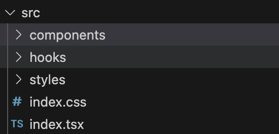
npx storybook@latest init2.改造项目
将storybook初始化的项目结构改造成这样的结构
改造前:
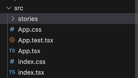
改造后:
样式
使用scss来编写样式代码
样式结构我们采用如下的结构:
_variables.scss:各种变量以及可配置设置 _mixins.scss:全局mixins _functions.scss:全局 functions style.scss:组件单独的样式
以Button组件为例子:
-styles
  - _variables.scss
  - _mixins.scss
  - _functions.scss
-components
  - Button
  - style.scss
因为我们使用的是create-react-app创建的项目,但是create-react-app不支持scss,需要安装node-sass解决
pnpm install node-sass --save因为我们做的是组件库,比如像antd design组件库是蓝色样式,所以我们做的组件库也需要设置色彩系统的样式,因为我们使用的是scss,所以我们可以将这些系统的样式颜色通过变量来定义,方便复用。
颜色变量
1.新建src/styles/_variables.scss
这里会放公共的颜色变量
$white:    #fff !default;
$gray-100: #f8f9fa !default;
$gray-200: #e9ecef !default;
$gray-300: #dee2e6 !default;
$gray-400: #ced4da !default;
$gray-500: #adb5bd !default;
$gray-600: #6c757d !default;
$gray-700: #495057 !default;
$gray-800: #343a40 !default;
$gray-900: #212529 !default;
$black:    #000 !default;

$blue:    #0d6efd !default;
$indigo:  #6610f2 !default;
$purple:  #6f42c1 !default;
$pink:    #d63384 !default;
$red:     #dc3545 !default;
$orange:  #fd7e14 !default;
$yellow:  #fadb14 !default;
$green:   #52c41a !default;
$teal:    #20c997 !default;
$cyan:    #17a2b8 !default;

$primary:       $blue !default;
$secondary:     $gray-600 !default;
$success:       $green !default;
$info:          $cyan !default;
$warning:       $yellow !default;
$danger:        $red !default;
$light:         $gray-100 !default;
$dark:          $gray-800 !default;

$theme-colors:
(
  "primary":    $primary,
  "secondary":  $secondary,
  "success":    $success,
  "info":       $info,
  "warning":    $warning,
  "danger":     $danger,
  "light":      $light,
  "dark":       $dark
);

$font-family-sans-serif:      -apple-system, BlinkMacSystemFont, "Segoe UI", Roboto, "Helvetica Neue", Arial, "Noto Sans", sans-serif, "Apple Color Emoji", "Segoe UI Emoji", "Segoe UI Symbol", "Noto Color Emoji" !default;
$font-family-monospace:       SFMono-Regular, Menlo, Monaco, Consolas, "Liberation Mono", "Courier New", monospace !default;
$font-family-base:            $font-family-sans-serif !default;

// 字体大小
$font-size-base:              1rem !default; // Assumes the browser default, typically `16px`
$font-size-lg:                $font-size-base * 1.25 !default;
$font-size-sm:                $font-size-base * .875 !default;
$font-size-root:              null !default;

// 字重
$font-weight-lighter:         lighter !default;
$font-weight-light:           300 !default;
$font-weight-normal:          400 !default;
$font-weight-bold:            700 !default;
$font-weight-bolder:          bolder !default;
$font-weight-base:            $font-weight-normal !default;

// 行高
$line-height-base:            1.5 !default;
$line-height-lg:              2 !default;
$line-height-sm:              1.25 !default;

// 标题大小
$h1-font-size:                $font-size-base * 2.5 !default;
$h2-font-size:                $font-size-base * 2 !default;
$h3-font-size:                $font-size-base * 1.75 !default;
$h4-font-size:                $font-size-base * 1.5 !default;
$h5-font-size:                $font-size-base * 1.25 !default;
$h6-font-size:                $font-size-base !default;

// 链接
$link-color:                              $primary !default;
$link-decoration:                         none !default;
$link-hover-color:                        darken($link-color, 15%) !default;
$link-hover-decoration:                   underline !default;

// body
$body-bg:                   $white !default;
$body-color:                $gray-900 !default;
$body-text-align:           null !default;

// Spacing
$spacer: 1rem !default;

$headings-margin-bottom:      $spacer / 2 !default;
$headings-font-family:        null !default;
$headings-font-style:         null !default;
$headings-font-weight:        500 !default;
$headings-line-height:        1.2 !default;
$headings-color:              null !default;

// Paragraphs

$paragraph-margin-bottom:   1rem !default;

// 字体其他部分 heading list hr 等等
$headings-margin-bottom:      $spacer / 2 !default;
$headings-font-family:        null !default;
$headings-font-style:         null !default;
$headings-font-weight:        500 !default;
$headings-line-height:        1.2 !default;
$headings-color:              null !default;

$display1-size:               6rem !default;
$display2-size:               5.5rem !default;
$display3-size:               4.5rem !default;
$display4-size:               3.5rem !default;

$display1-weight:             300 !default;
$display2-weight:             300 !default;
$display3-weight:             300 !default;
$display4-weight:             300 !default;
$display-line-height:         $headings-line-height !default;

$lead-font-size:              $font-size-base * 1.25 !default;
$lead-font-weight:            300 !default;

$small-font-size:             .875em !default;

$sub-sup-font-size:           .75em !default;

$text-muted:                  $gray-600 !default;

$initialism-font-size:        $small-font-size !default;

$blockquote-small-color:      $gray-600 !default;
$blockquote-small-font-size:  $small-font-size !default;
$blockquote-font-size:        $font-size-base * 1.25 !default;

$hr-color:                    inherit !default;
$hr-height:                   1px !default;
$hr-opacity:                  .25 !default;

$legend-margin-bottom:        .5rem !default;
$legend-font-size:            1.5rem !default;
$legend-font-weight:          null !default;

$mark-padding:                .2em !default;

$dt-font-weight:              $font-weight-bold !default;

$nested-kbd-font-weight:      $font-weight-bold !default;

$list-inline-padding:         .5rem !default;

$mark-bg:                     #fcf8e3 !default;

$hr-margin-y:                 $spacer !default;

// Code

$code-font-size:                    $small-font-size !default;
$code-color:                        $pink !default;
$pre-color:                         null !default;

// options 可配置选项
$enable-pointer-cursor-for-buttons:           true !default;

// 边框 和 border radius

$border-width:                1px !default;
$border-color:                $gray-300 !default;

$border-radius:               .25rem !default;
$border-radius-lg:            .3rem !default;
$border-radius-sm:            .2rem !default;

// 不同类型的 box shadow
$box-shadow-sm:               0 .125rem .25rem rgba($black, .075) !default;
$box-shadow:                  0 .5rem 1rem rgba($black, .15) !default;
$box-shadow-lg:               0 1rem 3rem rgba($black, .175) !default;
$box-shadow-inset:            inset 0 1px 2px rgba($black, .075) !default;

// 按钮
// 按钮基本属性
$btn-font-weight:             400;
$btn-padding-y:               .375rem !default;
$btn-padding-x:               .75rem !default;
$btn-font-family:             $font-family-base !default;
$btn-font-size:               $font-size-base !default;
$btn-line-height:             $line-height-base !default;

//不同大小按钮的 padding 和 font size
$btn-padding-y-sm:            .25rem !default;
$btn-padding-x-sm:            .5rem !default;
$btn-font-size-sm:            $font-size-sm !default;

$btn-padding-y-lg:            .5rem !default;
$btn-padding-x-lg:            1rem !default;
$btn-font-size-lg:            $font-size-lg !default;

// 按钮边框
$btn-border-width:            $border-width !default;

// 按钮其他
$btn-box-shadow:              inset 0 1px 0 rgba($white, .15), 0 1px 1px rgba($black, .075) !default;
$btn-disabled-opacity:        .65 !default;

// 链接按钮
$btn-link-color:              $link-color !default;
$btn-link-hover-color:        $link-hover-color !default;
$btn-link-disabled-color:     $gray-600 !default;

// 按钮 radius
$btn-border-radius:           $border-radius !default;
$btn-border-radius-lg:        $border-radius-lg !default;
$btn-border-radius-sm:        $border-radius-sm !default;

$btn-transition:              color .15s ease-in-out, background-color .15s ease-in-out, border-color .15s ease-in-out, box-shadow .15s ease-in-out !default;

// 其他组件的颜色变量
重置样式
新建src/styles/_reboot.scss,这里为了解决浏览器样式兼容性问题
// stylelint-disable at-rule-no-vendor-prefix, declaration-no-important, selector-no-qualifying-type, property-no-vendor-prefix

// Reboot
//
// Normalization of HTML elements, manually forked from Normalize.css to remove
// styles targeting irrelevant browsers while applying new styles.
//
// Normalize is licensed MIT. https://github.com/necolas/normalize.css

// Document
//
// Change from `box-sizing: content-box` so that `width` is not affected by `padding` or `border`.
*,
*::before,
*::after {
  box-sizing: border-box;
}

// Body
//
// 1. Remove the margin in all browsers.
// 2. As a best practice, apply a default `background-color`.
// 3. Prevent adjustments of font size after orientation changes in IE on Windows Phone and in iOS.
// 4. Change the default tap highlight to be completely transparent in iOS.
body {
  margin: 0; // 1
  font-family: $font-family-base;
  font-size: $font-size-base;
  font-weight: $font-weight-base;
  line-height: $line-height-base;
  color: $body-color;
  text-align: $body-text-align;
  background-color: $body-bg; // 2
  -webkit-text-size-adjust: 100%; // 3
  -webkit-tap-highlight-color: rgba($black, 0); // 4
}

// Future-proof rule: in browsers that support :focus-visible, suppress the focus outline
// on elements that programmatically receive focus but wouldn't normally show a visible
// focus outline. In general, this would mean that the outline is only applied if the
// interaction that led to the element receiving programmatic focus was a keyboard interaction,
// or the browser has somehow determined that the user is primarily a keyboard user and/or
// wants focus outlines to always be presented.
//
// See https://developer.mozilla.org/en-US/docs/Web/CSS/:focus-visible
// and https://developer.paciellogroup.com/blog/2018/03/focus-visible-and-backwards-compatibility/

[tabindex="-1"]:focus:not(:focus-visible) {
  outline: 0 !important;
}

// Content grouping
//
// 1. Reset Firefox's gray color
// 2. Set correct height and prevent the `size` attribute to make the `hr` look like an input field
//    See https://www.w3schools.com/tags/tryit.asp?filename=tryhtml_hr_size

hr {
  margin: $hr-margin-y 0;
  color: $hr-color; // 1
  background-color: currentColor;
  border: 0;
  opacity: $hr-opacity;
}

hr:not([size]) {
  height: $hr-height; // 2
}

// Typography
//
// 1. Remove top margins from headings
//    By default, `<h1>`-`<h6>` all receive top and bottom margins. We nuke the top
//    margin for easier control within type scales as it avoids margin collapsing.

%heading {
  margin-top: 0; // 1
  margin-bottom: $headings-margin-bottom;
  font-family: $headings-font-family;
  font-style: $headings-font-style;
  font-weight: $headings-font-weight;
  line-height: $headings-line-height;
  color: $headings-color;
}

h1 {
  @extend %heading;
  font-size: $h1-font-size;
}

h2 {
  @extend %heading;
  font-size: $h2-font-size;
}

h3 {
  @extend %heading;
  font-size: $h3-font-size;
}

h4 {
  @extend %heading;
  font-size: $h4-font-size;
}

h5 {
  @extend %heading;
  font-size: $h5-font-size;
}

h6 {
  @extend %heading;
  font-size: $h6-font-size;
}

// Reset margins on paragraphs
//
// Similarly, the top margin on `<p>`s get reset. However, we also reset the
// bottom margin to use `rem` units instead of `em`.

p {
  margin-top: 0;
  margin-bottom: $paragraph-margin-bottom;
}

// Abbreviations
//
// 1. Duplicate behavior to the data-* attribute for our tooltip plugin
// 2. Add the correct text decoration in Chrome, Edge, IE, Opera, and Safari.
// 3. Add explicit cursor to indicate changed behavior.
// 4. Prevent the text-decoration to be skipped.

abbr[title],
abbr[data-original-title] { // 1
  text-decoration: underline; // 2
  text-decoration: underline dotted; // 2
  cursor: help; // 3
  text-decoration-skip-ink: none; // 4
}

address {
  margin-bottom: 1rem;
  font-style: normal;
  line-height: inherit;
}

ol,
ul {
  padding-left: 2rem;
}

ol,
ul,
dl {
  margin-top: 0;
  margin-bottom: 1rem;
}

ol ol,
ul ul,
ol ul,
ul ol {
  margin-bottom: 0;
}

dt {
  font-weight: $dt-font-weight;
}

// 1. Undo browser default

dd {
  margin-bottom: .5rem;
  margin-left: 0; // 1
}

blockquote {
  margin: 0 0 1rem;
}

// Add the correct font weight in Chrome, Edge, and Safari

b,
strong {
  font-weight: $font-weight-bolder;
}

// Add the correct font size in all browsers

small {
  font-size: $small-font-size;
}

// Prevent `sub` and `sup` elements from affecting the line height in
// all browsers.

sub,
sup {
  position: relative;
  font-size: $sub-sup-font-size;
  line-height: 0;
  vertical-align: baseline;
}

sub { bottom: -.25em; }
sup { top: -.5em; }

// Links

a {
  color: $link-color;
  text-decoration: $link-decoration;

  &:hover {
    color: $link-hover-color;
    text-decoration: $link-hover-decoration;
  }
}

// And undo these styles for placeholder links/named anchors (without href).
// It would be more straightforward to just use a[href] in previous block, but that
// causes specificity issues in many other styles that are too complex to fix.
// See https://github.com/twbs/bootstrap/issues/19402

a:not([href]) {
  &,
  &:hover {
    color: inherit;
    text-decoration: none;
  }
}

// Code

pre,
code,
kbd,
samp {
  font-family: $font-family-monospace;
  font-size: 1em; // Correct the odd `em` font sizing in all browsers.
}

// 1. Remove browser default top margin
// 2. Reset browser default of `1em` to use `rem`s
// 3. Don't allow content to break outside

pre {
  display: block;
  margin-top: 0; // 1
  margin-bottom: 1rem; // 2
  overflow: auto; // 3
  font-size: $code-font-size;
  color: $pre-color;

  // Account for some code outputs that place code tags in pre tags
  code {
    font-size: inherit;
    color: inherit;
    word-break: normal;
  }
}

code {
  font-size: $code-font-size;
  color: $code-color;
  word-wrap: break-word;

  // Streamline the style when inside anchors to avoid broken underline and more
  a > & {
    color: inherit;
  }
}

// Figures

// Apply a consistent margin strategy (matches our type styles).

figure {
  margin: 0 0 1rem;
}

// Images and content

img {
  vertical-align: middle;
}

// 1. Workaround for the SVG overflow bug in IE 11 is still required.
//    See https://github.com/twbs/bootstrap/issues/26878

svg {
  overflow: hidden; // 1
  vertical-align: middle;
}

// Tables

// Prevent double borders

table {
  border-collapse: collapse;
}

caption {
  padding-top: .5rem;
  padding-bottom: .5rem;
  color: $text-muted;
  text-align: left;
  caption-side: bottom;
}

// Matches default `<td>` alignment by inheriting from the `<body>`, or the
// closest parent with a set `text-align`.

th {
  text-align: inherit;
}

// Forms

// 1. Allow labels to use `margin` for spacing.

label {
  display: inline-block; // 1
  margin-bottom: .5rem;
}

// Remove the default `border-radius` that macOS Chrome adds.
//
// Details at https://github.com/twbs/bootstrap/issues/24093

button {
  // stylelint-disable-next-line property-blacklist
  border-radius: 0;
}

// Work around a Firefox/IE bug where the transparent `button` background
// results in a loss of the default `button` focus styles.
//
// Credit: https://github.com/suitcss/base/

button:focus {
  outline: 1px dotted;
  outline: 5px auto -webkit-focus-ring-color;
}

// 1. Remove the margin in Firefox and Safari

input,
button,
select,
optgroup,
textarea {
  margin: 0;
  font-family: inherit;
  font-size: inherit;
  line-height: inherit;
}

// Show the overflow in Edge

button,
input {
  overflow: visible;
}

// Remove the inheritance of text transform in Firefox

button,
select {
  text-transform: none;
}

// Remove the inheritance of word-wrap in Safari.
//
// Details at https://github.com/twbs/bootstrap/issues/24990

select {
  word-wrap: normal;
}

// Remove the dropdown arrow in Chrome from inputs built with datalists.
//
// Source: https://stackoverflow.com/a/54997118

[list]::-webkit-calendar-picker-indicator {
  display: none;
}

// 1. Prevent a WebKit bug where (2) destroys native `audio` and `video`
//    controls in Android 4.
// 2. Correct the inability to style clickable types in iOS and Safari.
// 3. Opinionated: add "hand" cursor to non-disabled button elements.

button,
[type="button"], // 1
[type="reset"],
[type="submit"] {
  -webkit-appearance: button; // 2

  @if $enable-pointer-cursor-for-buttons {
    &:not(:disabled) {
      cursor: pointer; // 3
    }
  }
}

// Remove inner border and padding from Firefox, but don't restore the outline like Normalize.

::-moz-focus-inner {
  padding: 0;
  border-style: none;
}

// Remove the default appearance of temporal inputs to avoid a Mobile Safari
// bug where setting a custom line-height prevents text from being vertically
// centered within the input.
// See https://bugs.webkit.org/show_bug.cgi?id=139848
// and https://github.com/twbs/bootstrap/issues/11266

input[type="date"],
input[type="time"],
input[type="datetime-local"],
input[type="month"] {
  -webkit-appearance: textfield;
}

// 1. Remove the default vertical scrollbar in IE.
// 2. Textareas should really only resize vertically so they don't break their (horizontal) containers.

textarea {
  overflow: auto; // 1
  resize: vertical;  // 2
}

// 1. Browsers set a default `min-width: min-content;` on fieldsets,
//    unlike e.g. `<div>`s, which have `min-width: 0;` by default.
//    So we reset that to ensure fieldsets behave more like a standard block element.
//    See https://github.com/twbs/bootstrap/issues/12359
//    and https://html.spec.whatwg.org/multipage/#the-fieldset-and-legend-elements
// 2. Reset the default outline behavior of fieldsets so they don't affect page layout.

fieldset {
  min-width: 0; // 1
  padding: 0;  // 2
  margin: 0; // 2
  border: 0; // 2
}

// 1. By using `float: left`, the legend will behave like a block element
// 2. Correct the color inheritance from `fieldset` elements in IE.
// 3. Correct the text wrapping in Edge and IE.

legend {
  float: left; // 1
  width: 100%;
  padding: 0;
  margin-bottom: $legend-margin-bottom;
  font-size: $legend-font-size;
  font-weight: $legend-font-weight;
  line-height: inherit;
  color: inherit; // 2
  white-space: normal; // 3
}

mark {
  padding: $mark-padding;
  background-color: $mark-bg;
}

// Add the correct vertical alignment in Chrome, Firefox, and Opera.

progress {
  vertical-align: baseline;
}

// Fix height of inputs with a type of datetime-local, date, month, week, or time
// See https://github.com/twbs/bootstrap/issues/18842

::-webkit-datetime-edit {
  overflow: visible;
  line-height: 0;
}

// 1. Correct the outline style in Safari.
// 2. This overrides the extra rounded corners on search inputs in iOS so that our
//    `.form-control` class can properly style them. Note that this cannot simply
//    be added to `.form-control` as it's not specific enough. For details, see
//    https://github.com/twbs/bootstrap/issues/11586.

[type="search"] {
  outline-offset: -2px; // 1
  -webkit-appearance: textfield; // 2
}

// Remove the inner padding in Chrome and Safari on macOS.

::-webkit-search-decoration {
  -webkit-appearance: none;
}

// Remove padding around color pickers in webkit browsers

::-webkit-color-swatch-wrapper {
  padding: 0;
}

// 1. Change font properties to `inherit` in Safari.
// 2. Correct the inability to style clickable types in iOS and Safari.

::-webkit-file-upload-button {
  font: inherit; // 1
  -webkit-appearance: button; // 2
}

// Correct element displays

output {
  display: inline-block;
}

// 1. Add the correct display in all browsers

summary {
  display: list-item; // 1
  cursor: pointer;
}

// Add the correct display for template & main in IE 11

template {
  display: none;
}

main {
  display: block;
}

// Always hide an element with the `hidden` HTML attribute.

[hidden] {
  display: none !important;
}
创建样式入口文件
创建src/styles/index.scss文件,将上面两个文件导入// config @import "variables";//layout @import "reboot";
引入样式文件
在.storybook中引入
// .storybook/preview.ts
import type { Preview } from "@storybook/react";
import '../src/styles/index.scss'; // 引入样式文件
const preview: Preview = {
  parameters: {
    actions: { argTypesRegex: "^on[A-Z].*" },
    controls: {
      matchers: {
        color: /(background|color)$/i,
        date: /Date$/,
      },
    },
  },
};

export default preview;
Button组件开发
需求分析
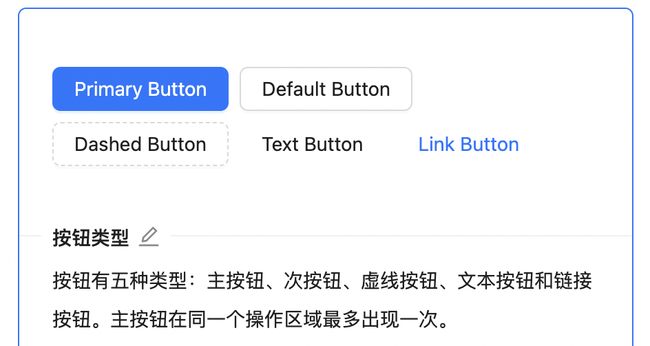
以antd design的Button组件为例
按钮类型:
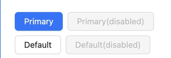
按钮尺寸:

不可用状态:
基本使用
<Button size='large' type='primary' disabled>
按钮
</Button>
API
属性 | 说明 | 类型 | 默认值 |
|---|---|---|---|
type | 按钮类型 | primary | default | danger | link | default |
size | 按钮尺寸 | lg | sm | - |
disabled | 不可用状态 | true | false | false |
href | 点击跳转的地址,指定此属性 button 的行为和 a 链接一致 | string | - |
开发
创建Button组件目录如下
--components
    --Button
        --_style.scss            // 样式文件
        --button.stories.tsx     // demo
        --button.test.tsx        // 单元测试
        --button.tsx            // 核心代码逻辑
        --index.tsx            //  导出组件
定义按钮尺寸大小枚举值
export type ButtonSize = 'lg' | 'sm'定义按钮类型枚举值
export type ButtonType = 'primary' | 'default' | 'danger' | 'link'定义按钮的props
import React, { FC, ButtonHTMLAttributes, AnchorHTMLAttributes } from 'react'

interface BaseButtonProps {
  className?: string;
  /**设置 Button 的禁用 */
  disabled?: boolean;
  /**设置 Button 的尺寸 */
  size?: ButtonSize;
  /**设置 Button 的类型 */
  btnType?: ButtonType;
  children: React.ReactNode;
  href?: string;
}
// ButtonHTMLAttributes 是 React 中的一个内置泛型类型,它用于表示 HTML 按钮元素 (<button>) 上可以接受的属性。这些属性包括按钮的标准 HTML 属性,如 onClick、disabled、type 等
type NativeButtonProps = BaseButtonProps & ButtonHTMLAttributes<HTMLElement>
// AnchorHTMLAttributes 是 React 中的一个内置泛型类型,它用于表示 HTML 锚点元素 (<a>) 上可以接受的属性。这些属性包括锚点元素的标准 HTML 属性,例如 href、target、onClick 等
type AnchorButtonProps = BaseButtonProps & AnchorHTMLAttributes<HTMLElement>
// Partial可选
export type ButtonProps = Partial<NativeButtonProps & AnchorButtonProps>
根据传入的props决定按钮尺寸、按钮类型等逻辑
const {
    btnType,
    className,
    disabled,
    size,
    children,
    href,
    ...restProps
  } = props
  // btn, btn-lg, btn-primary
  const classes = classNames('btn', className, {
    [`btn-${btnType}`]: btnType,
    [`btn-${size}`]: size,
    'disabled': (btnType === 'link') && disabled
  })
判断是显示a标签还是button按钮
if (btnType === 'link' && href) {
    return (
      <a
        className={classes}
        href={href}
        {...restProps}
      >
        {children}
      </a>
    )
  } else {
    return (
      <button
        className={classes}
        disabled={disabled}
        {...restProps}
      >
        {children}
      </button>
    )
  }
定义按钮样式变量
src/styles/_variable.scss
// 按钮
// 按钮基本属性
$btn-font-weight:             400;
$btn-padding-y:               .375rem !default;
$btn-padding-x:               .75rem !default;
$btn-font-family:             $font-family-base !default;
$btn-font-size:               $font-size-base !default;
$btn-line-height:             $line-height-base !default;

//不同大小按钮的 padding 和 font size
$btn-padding-y-sm:            .25rem !default;
$btn-padding-x-sm:            .5rem !default;
$btn-font-size-sm:            $font-size-sm !default;

$btn-padding-y-lg:            .5rem !default;
$btn-padding-x-lg:            1rem !default;
$btn-font-size-lg:            $font-size-lg !default;

// 按钮边框
$btn-border-width:            $border-width !default;

// 按钮其他
$btn-box-shadow:              inset 0 1px 0 rgba($white, .15), 0 1px 1px rgba($black, .075) !default;
$btn-disabled-opacity:        .65 !default;

// 链接按钮
$btn-link-color:              $link-color !default;
$btn-link-hover-color:        $link-hover-color !default;
$btn-link-disabled-color:     $gray-600 !default;


// 按钮 radius
$btn-border-radius:           $border-radius !default;
$btn-border-radius-lg:        $border-radius-lg !default;
$btn-border-radius-sm:        $border-radius-sm !default;

$btn-transition:              color .15s ease-in-out, background-color .15s ease-in-out, border-color .15s ease-in-out, box-shadow .15s ease-in-out !default;
编写按钮基本样式
.btn {
  position: relative;
  display: inline-block;
  font-weight: $btn-font-weight;
  line-height: $btn-line-height;
  color: $body-color;
  white-space: nowrap;
  text-align: center;
  vertical-align: middle;
  background-image: none;
  border: $btn-border-width solid transparent;
  @include button-size( $btn-padding-y,  $btn-padding-x,  $btn-font-size,  $border-radius);
  box-shadow: $btn-box-shadow;
  cursor: pointer;
  transition: $btn-transition;
  &.disabled,
  &[disabled] {
    cursor: not-allowed;
    opacity: $btn-disabled-opacity;
    box-shadow: none;
    > * {
      pointer-events: none;
    }
  }
}
在这里为了不重复复制样式代码,我们采用mixin来处理。
比如上面代码中的@include button-size 函数,这个是scss的一个特性,可以从官网上看下介绍。
@include button-size( $btn-padding-y, $btn-padding-x, $btn-font-size, $border-radius);要使用上面的方法,需要在mixin编写上面的函数
新建 src/styles/_mixin.scss,编写如下代码:
这里解释一下:相当于在button-size中传了4个参数,使用这4个参数来定义样式属性,使用的时候即可传入对应的样式变量即可。
@mixin button-size($padding-y, $padding-x, $font-size, $border-raduis) {
  padding: $padding-y $padding-x;
  font-size: $font-size;
  border-radius: $border-raduis;
}
编写按钮尺寸大小的代码,这里同样适用mixin,使用button-size函数进行复用。
.btn-lg {
  @include button-size($btn-padding-y-lg, $btn-padding-x-lg, $btn-font-size-lg, $btn-border-radius-lg);
}
.btn-sm {
  @include button-size($btn-padding-y-sm, $btn-padding-x-sm, $btn-font-size-sm, $btn-border-radius-sm);
}
编写按钮类型的样式代码,这里同样适用mixin,使用了button-style,这就需要在_mixin.scss中进行定义
.btn-primary {
  @include button-style($primary, $primary, $white)
}
.btn-danger {
  @include button-style($danger, $danger, $white)
}

.btn-default {
  @include button-style($white, $gray-400, $body-color, $white, $primary, $primary)
}
在_mixin.scss中定义 button-style函数
@mixin button-style(
  $background,
  $border,
  $color,
  $hover-background: lighten($background, 7.5%),
  $hover-border: lighten($border, 10%),
  $hover-color: $color,
) {
  color: $color;
  background: $background;
  border-color: $border;
  &:hover {
    color: $hover-color;
    background: $hover-background;
    border-color: $hover-border;
  }
  &:focus,
  &.focus {
    color: $hover-color;
    background: $hover-background;
    border-color: $hover-border;
  }
  &:disabled,
  &.disabled {
    color: $color;
    background: $background;
    border-color: $border;
  }
}
编写 按钮是 link 标签时候的样式代码
.btn-link {
  font-weight: $font-weight-normal;
  color: $btn-link-color;
  text-decoration: $link-decoration;
  box-shadow: none;
  &:hover {
    color: $btn-link-hover-color;
    text-decoration: $link-hover-decoration;
  }
  &:focus,
  &.focus {
    text-decoration: $link-hover-decoration;
    box-shadow: none;
  }
  &:disabled,
  &.disabled {
    color: $btn-link-disabled-color;
    pointer-events: none;
  }
}
单元测试
1.安装测试工具
pnpm install --save-dev @testing-library/react @testing-library/jest-dom @types/jest测试1:展示正确的默认按钮
import React from 'react'
import { render, fireEvent } from '@testing-library/react'
import Button from './button'
const defaultProps = {
onClick: jest.fn()
}
describe('test Button component', () => {
// 渲染正确的默认的按钮
it('should render the correct default button', () => {
// 通过 render 来渲染一个按钮,赋值给wrapper
const wrapper = render(<Button {...defaultProps}>按钮</Button>)
// 使用wrapper的getByText获取指定文字的按钮,赋值给element
const element = wrapper.getByText('按钮') as HTMLButtonElement
// 使用expect函数,表示断言。将element传入expect,调用toBeInTheDocument表示按钮插入到了页面中
expect(element).toBeInTheDocument()
// 获取按钮的tagName,使用toEqual函数看按钮的tagName是否叫BUTTON
expect(element.tagName).toEqual('BUTTON')
// 使用toHaveClass函数来判断按钮是否有btn btn-default这两个class
expect(element).toHaveClass('btn btn-default')
// 传入按钮的disabled,使用toBeFalsy来判断按钮是否带有disabled属性,toBeFalsy表示false
expect(element.disabled).toBeFalsy()
// 使用fireEvent执行点击事件
fireEvent.click(element)
// 执行上述点击事件后,使用toHaveBeenCalled来判断按钮是否被点击了,toHaveBeenCalled表示按钮被点击了。
expect(defaultProps.onClick).toHaveBeenCalled()
})
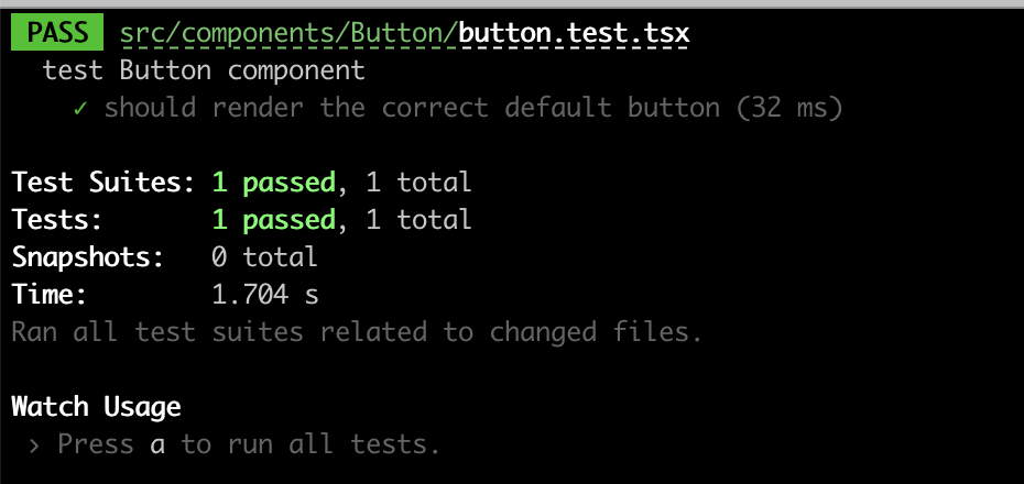
})在终端输入:npm run test 执行下测试用例,看是否通过。可以看到测试用例通过了。
测试2:根据传入的props渲染对应的按钮
const testProps: ButtonProps = {
    btnType: ButtonType.Primary,
    size: ButtonSize.Large,
    className: 'klass'
}

it('should render the correct component based on different props', () => {
        const wrapper = render(<Button {...testProps}>按钮</Button>)
        const element = wrapper.getByText('按钮')
        expect(element).toBeInTheDocument()
        expect(element).toHaveClass('btn-primary btn-lg klass')
    })
测试3:测试按钮类型是a标签
 it('should render a link when btnType equals link and href is provided', () => {
        const wrapper = render(<Button btnType='link' href="http://www.baidu.com">Link</Button>)
        const element = wrapper.getByText('Link')
        expect(element).toBeInTheDocument()
        expect(element.tagName).toEqual('A')
        expect(element).toHaveClass('btn btn-link')
    })
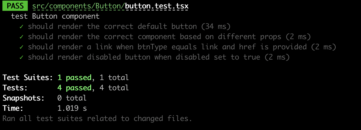
测试4:测试按钮的disabled属性
const disabledProps: ButtonProps = {
    disabled: true,
    onClick: jest.fn(),
}
it('should render disabled button when disabled set to true', () => {
        const wrapper = render(<Button {...disabledProps}>按钮</Button>)
        const element = wrapper.getByText('按钮') as HTMLButtonElement
        expect(element).toBeInTheDocument()
        expect(element.disabled).toBeTruthy()
        fireEvent.click(element)
        expect(disabledProps.onClick).not.toHaveBeenCalled()
    })
本地测试
1.在组件库项目执行link
pnpm link --global2.在测试项目中执行link
pnpm link --global curry-design3.引入curry-design
"curry-design": "0.1.0"4.使用
import React from 'react';
import { Button } from 'curry-design'
import 'curry-design/dist/index.css'

function App() {
  return (
    <div className="App">
      <Button btnType='primary'>按钮</Button>
    </div>
  );
}

export default App;
5.效果

打包
1.新建tsconfig.build.json用来打包
{
    "compilerOptions": {
        "outDir": "build",
        "module": "ESNext", // 输出的类型
        "target": "ES5",
        "declaration": true, // 生产.d.ts
        "jsx": "react",
        "moduleResolution": "node", // 按node方式加载模块
        "allowSyntheticDefaultImports": true // 允许 import React from 'react'方式引入
    },
    "include": [
        "src"
    ],
    "exclude": [
        "src/**/*.test.tsx",
        "src/**/*.stories.tsx"
    ]
}
2.增加tsc build命令
"build-ts": "tsc -p tsconfig.build.json"3.打包ts
pnpm build-ts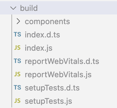
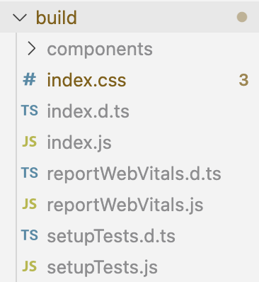
4.打包scss文件
"build-css": "node-sass ./src/styles/index.scss ./build/index.css",5.每次打包前自动删除build,使用rimraf这个跨平台的第三方库
"clean": "rimraf ./build"6.最终build命令
"build": "pnpm clean && pnpm build-ts && pnpm build-css",7.执行pnpm build
8.在package.json中添加打包的文件
"main": "dist/index.js",
"module": "dist/index.js",
"types": "dist/index.d.ts",
发布
1.补充package.json
"description": "react component ",
  "author": "curry",
  "main": "dist/index.js",
  "module": "dist/index.js",
  "types": "dist/index.d.ts",
  "license": "MIT",
  "keywords": [
    "component",
    "ui"
  ],
  "homepage": "https://github.com/liangchaofei/curry-design",
  "repository": {
    "type": "git",
    "url": "https://github.com/liangchaofei/curry-design"
  },
  "files": [
    "dist"
  ],
2.publish之前先进行build
"prepublish": "pnpm build"3.发布。先登录npm
npm publish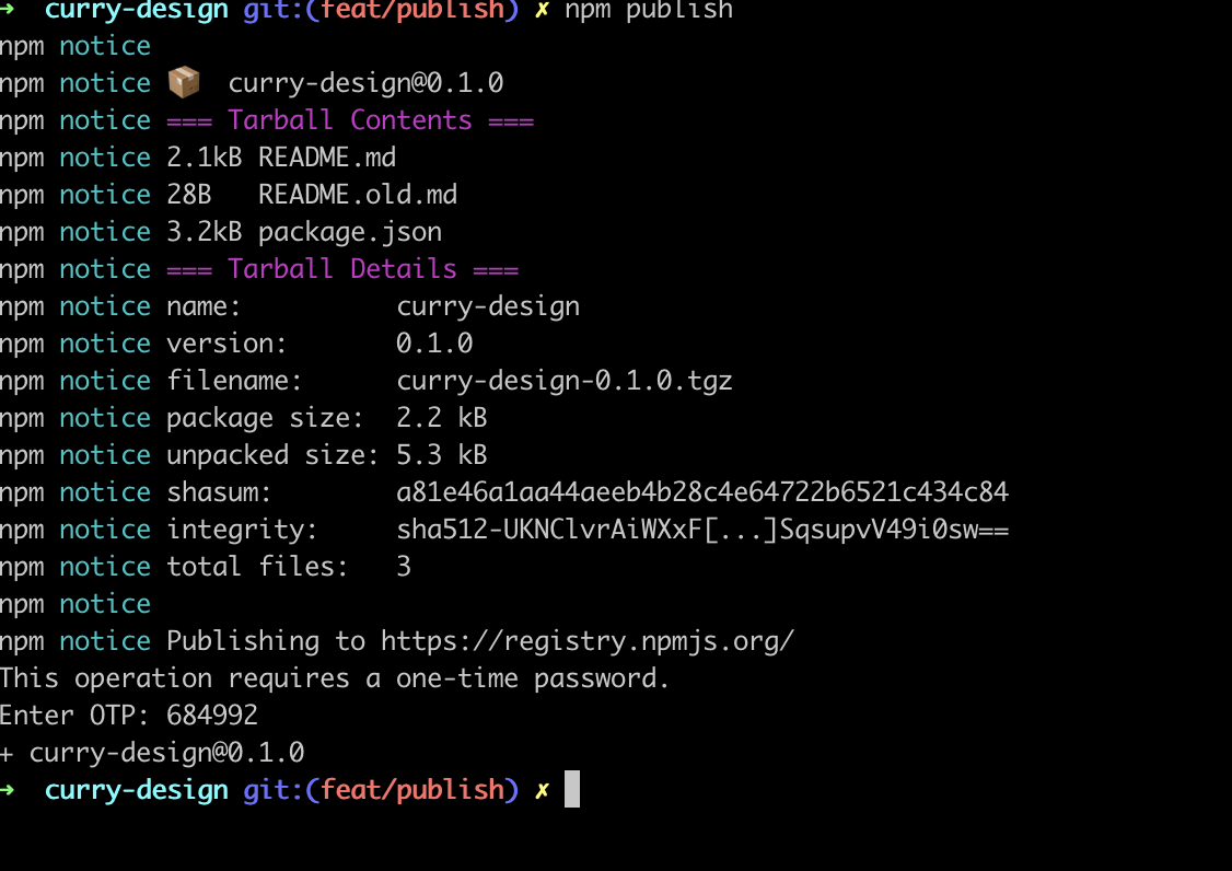
部署完成
使用chromatic+storybook完成部署
点击查看组件库效果
结尾
这篇文章从0搭建了一个前端组件库,其中只开发了Button组件,其余的组件大家可以自行开发,大家可以按照上面的方式搭建自己的组件库。
原创声明:本文系作者授权腾讯云开发者社区发表,未经许可,不得转载。
如有侵权,请联系 cloudcommunity@tencent.com 删除。
原创声明:本文系作者授权腾讯云开发者社区发表,未经许可,不得转载。
如有侵权,请联系 cloudcommunity@tencent.com 删除。