【Vue3+TypeScript】CRM系统项目搭建之 — 登录注册页【部分操作界面搭建】
【Vue3+TypeScript】CRM系统项目搭建之 — 登录注册页【部分操作界面搭建】

HelloWorldZ
发布于 2024-03-20 19:20:33
发布于 2024-03-20 19:20:33
在使用第三方组件库的时候,可以不要一开始就把所有属性添加进去,而是可以使用最原始的状态,之后慢慢添加属性上去,这样会更加容易去理解组件库的设计,当然也可以多去想想它的底层会是如何设计的。
现在开始登录业务的开发:
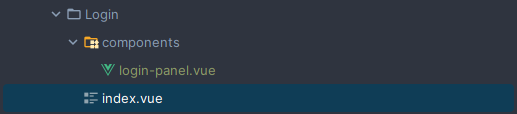
Login / index.vue
<script setup lang="ts">
import LoginPanel from '@/views/Login/components/login-panel.vue'
</script>

<template>
  <div class="login">
    <login-panel></login-panel>
  </div>
</template>

<style scoped lang="scss">
.login {
  display: flex;
  align-items: center;
  justify-content: center;
  width: 100%;
  height: 100%;
  background: url(?developer/article/2399390/&);
}
</style>
Login / components / login-panel.vue
<script setup lang="ts">
import { ref } from 'vue'
const isRememberPassword = ref(false)
</script>
<template>
<div class="login-panel">
<h1 class="title">后台管理系统</h1>
<div class="tabs">tabs</div>
<div class="control-account">
<el-checkbox v-model="isRememberPassword" label="记住密码" size="large" />
<el-link type="primary">忘记密码</el-link>
</div>
<!-- 可以给组件添加 class 类 -> 该类会到该组件的最外层去 -->
<el-button size="large" class="login-btn" type="primary" plain>立即登录</el-button>
</div>
</template>
<style scoped lang="scss">
.login-panel {
width: 330px;
margin-bottom: 150px;
.title {
text-align: center;
margin-bottom: 15px;
}
.icon {
display: flex;
align-items: center;
justify-content: center;
.text {
margin-left: 5px;
}
}
.control-account {
margin-top: 12px;
display: flex;
justify-content: space-between;
}
.login-btn {
margin-top: 10px;
width: 100%;
--el-button-size: 50px;
}
}
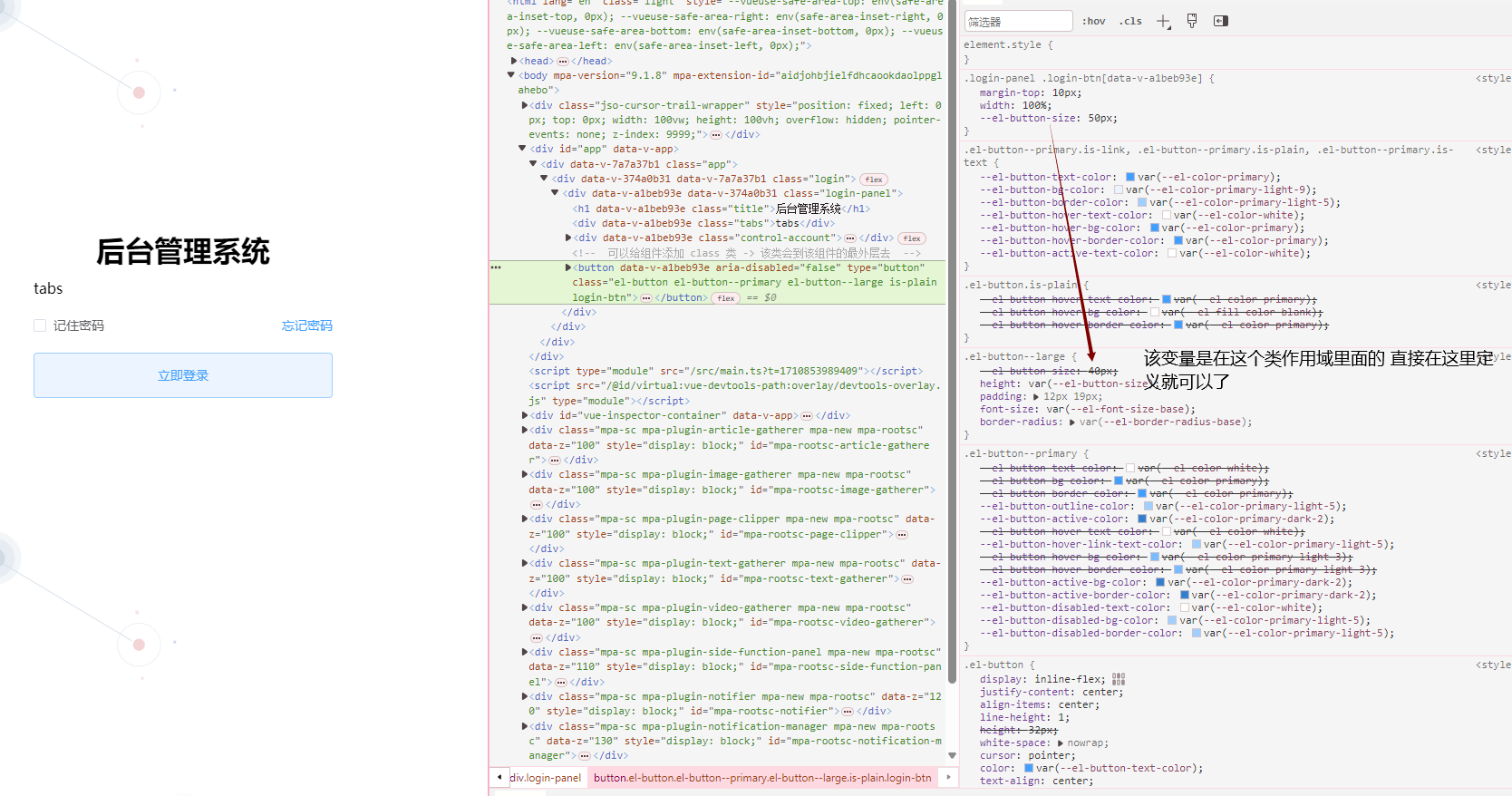
</style>这里是在对于 el-button 的高度的修改,一开始是在 :root { } 来定义变量进行的覆盖,后面发现它添加 size = large 后,它的这个变量是在这个变量作用域里面的,因此,直接在类作用域里面修改变量值就可以了,当然,也是可以直接 height 进行覆盖。
本文参与?腾讯云自媒体分享计划,分享自作者个人站点/博客。
原始发表:2024-03-19,如有侵权请联系 cloudcommunity@tencent.com 删除
评论
登录后参与评论
推荐阅读