05. 快速上手!HarmonyOS4.0 Button_Blank 基础组件详解
05. 快速上手!HarmonyOS4.0 Button_Blank 基础组件详解

全栈若城
发布于 2024-03-30 10:21:48
发布于 2024-03-30 10:21:48
推荐阅读
01.HarmonyOS4.0 工具安装 — 启航篇 02. 快速上手!HarmonyOS4.0 Image组件详解 03. 快速上手!HarmonyOS4.0 Text/Span组件详解 04. 快速上手!HarmonyOS4.0 布局组件(Column/Row)
本章内容概要

Button 概念
Button: 按钮组件,可快速创建不同样式的按钮。
Button 使用方法

ButtonType 按钮类型添加
一共有两种写法, 根据个人喜好来选择哦!!
/**
 * @Author: 若城
 * @Description:
 */
@Entry
@Component
struct ButtonNote {

  build() {
    Row() {
      Column() {
         Row(){
           Text('按钮类型')
             .fontSize(25)
             .fontColor('#ccc')
             .fontWeight(800)
         }
         .width('100%')
         .height(50)
         .padding(10)
        Row(){
//          写法一
//           Button('胶囊型按钮').type(ButtonType.Capsule)
//           Button('圆').type(ButtonType.Circle)
//           Button('普通按钮').type(ButtonType.Normal)

//          写法二:
          Button('胶囊型按钮', {type:ButtonType.Capsule})
          Button('圆', {type:ButtonType.Circle})
          Button('普通按钮', {type:ButtonType.Normal})

        }
        .height(100)
        .width('100%')
        .justifyContent(FlexAlign.SpaceEvenly)
//分隔线
        Divider().strokeWidth(3).color('#999')


      }
      .width('100%')
      .height('100%')
      .alignItems(HorizontalAlign.Start)
      .padding(10)
    }
    .height('100%')
    .width('100%')
    .justifyContent(FlexAlign.Start)
  }
}
名称 | 描述 |
|---|---|
Capsule | 胶囊型按钮(圆角默认为高度的一半)。 |
Circle | 圆形按钮。 |
Normal | 普通按钮(默认不带圆角)。 |
stateEffect 按钮状态添加
按钮按下时是否开启按压态显示效果,当设置为false时,按压效果关闭。 默认值:true 说明:当开启按压态显示效果,开发者设置状态样式时,会基于状态样式设置完成后的背景色再进行颜色叠加。
Button('胶囊型按钮', {type:ButtonType.Capsule, stateEffect:false})
Button('圆', {type:ButtonType.Circle, stateEffect:true})
Button('普通按钮', {type:ButtonType.Normal, stateEffect:true})
按钮文本内容 设置
字符串类型
字符串类型 用法如 1.2. ButtonType 按钮类型添加, 1.3. stateEffect 按钮状态添加 , 直接在组件内添加字符串即可
Resource 类型
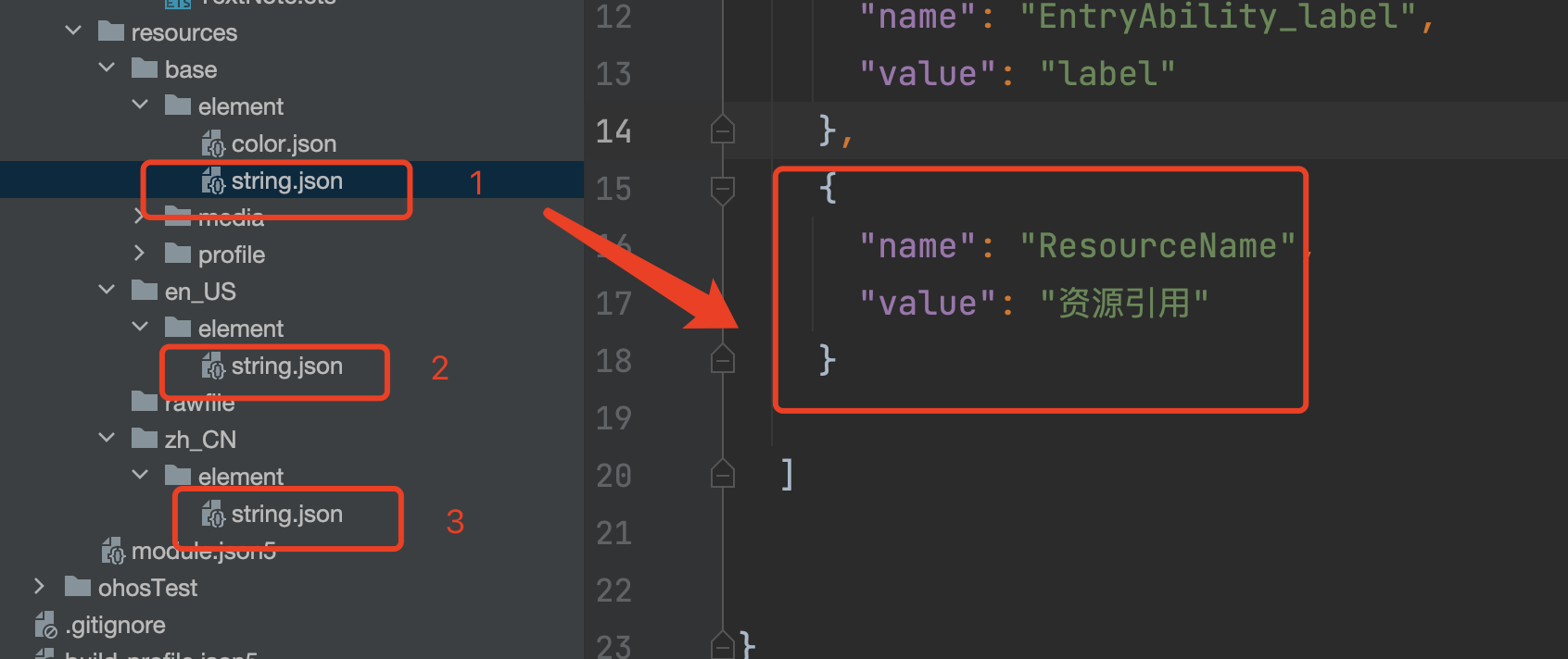
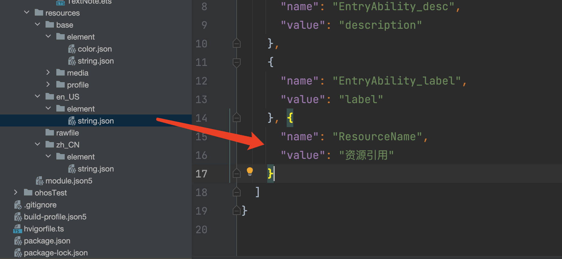
资源引用类型,引入系统资源或者应用资源中的字符串。 如下图所示在element 下的string.json 文件中编写所要展示的内容

效果展示

Row(){
	Button($r('app.string.ResourceName'), {type:ButtonType.Capsule, stateEffect:false})
}
.height(100)
	.width('100%')
	.justifyContent(FlexAlign.SpaceEvenly)
禁用按钮
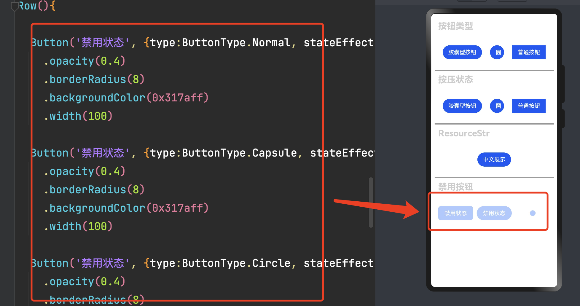
Row(){

	Button('禁用状态', {type:ButtonType.Normal, stateEffect:false})
		.opacity(0.4)
		.borderRadius(8)
		.backgroundColor(0x317aff)
		.width(100)

	Button('禁用状态', {type:ButtonType.Capsule, stateEffect:false})
		.opacity(0.4)
		.borderRadius(8)
		.backgroundColor(0x317aff)
		.width(100)

	Button('禁用状态', {type:ButtonType.Circle, stateEffect:false})
		.opacity(0.4)
		.borderRadius(8)
		.backgroundColor(0x317aff)
		.width(100)
}
.height(100)
	.width('100%')
	.justifyContent(FlexAlign.SpaceEvenly)
加载按钮
此处使用了LoadingProgress 组件 可参考
效果展示

代码展示
Row() {
Button({ type: ButtonType.Circle, stateEffect: true }) {
LoadingProgress().width(20).height(20).color(0xFFFFFF)
}
Button({ type: ButtonType.Capsule, stateEffect: true }) {
Row() {
LoadingProgress().width(20).height(20).margin({ left: 12 }).color(0xFFFFFF)
Text('加载中..').fontSize(12).fontColor(0xffffff).margin({ left: 5, right: 12 })
}.alignItems(VerticalAlign.Center).width(90).height(40)
}
Button({ type: ButtonType.Normal, stateEffect: true }) {
Row() {
LoadingProgress().width(20).height(20).margin({ left: 12 }).color(0xFFFFFF)
Text('加载中..').fontSize(12).fontColor(0xffffff).margin({ left: 5, right: 12 })
}.alignItems(VerticalAlign.Center).width(90).height(40)
}
}
.height(100)
.width('100%')
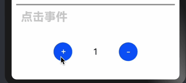
.justifyContent(FlexAlign.SpaceEvenly)添加按钮点击事件
效果演示
代码演示
Row() {

  Button('+', {type:ButtonType.Circle}).fontSize(18)
    .onClick(()=>{
      this.num++
    })
  Text(this.num.toString()).fontSize(18).width(100).textAlign(TextAlign.Center)
  Button('-', {type:ButtonType.Circle}).fontSize(18)
    .onClick(()=>{
      this.num--
    })

}
.height(100)
  .width('100%')
  .justifyContent(FlexAlign.Center)
点击事件优化
效果展示
数据小于0 不可以点击
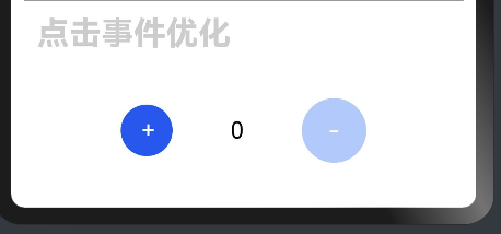
代码演示
Row() {
    Button('+', {type:ButtonType.Circle}).fontSize(18)
      .onClick(()=>{
        this.num++
      })


  Text(this.num.toString()).fontSize(18).width(100).textAlign(TextAlign.Center)
if ( this.num>= 1){
  Button('-', {type:ButtonType.Circle}).fontSize(18)
    .onClick(()=>{
      this.num--
    })
}else{
  Button('-', {type:ButtonType.Normal, stateEffect:false})
    .opacity(0.4)
    .fontSize(18)
    .width(50)
    .height(50)
    .backgroundColor(0x317aff)
    .borderRadius(50)
}

}
.height(100)
.width('100%')
.justifyContent(FlexAlign.Center)
Blank概念
空白填充组件,在容器主轴方向上,空白填充组件具有自动填充容器空余部分的能力。 仅当父组件为Row/Column/Flex时生效。
Blank组件使用
效果演示

代码演示
Row() {
	Button('左侧按钮')
	Blank()
	Button('右侧按钮')


}
.height(100)
	.width('100%')
完整案例代码
注意下面的代码主要是在编写上面案例时的衍生, 因此可能会存在注释,内容配置等情况, 需注意
/**
 * @Author: 若城
 * @Description:
 */
@Entry
  @Component
  struct ButtonNote {
    @State num:number = 1
    build() {
      Row() {
        Column() {
          List(){
            ListItem(){
              Column(){
                Row() {
                  Text('按钮类型')
                    .fontSize(25)
                    .fontColor('#ccc')
                    .fontWeight(800)
                }
                .width('100%')
                  .height(50)
                  .padding(10)

                Row() {
                  //          写法一
                  //           Button('胶囊型按钮').type(ButtonType.Capsule)
                  //           Button('圆').type(ButtonType.Circle)
                  //           Button('普通按钮').type(ButtonType.Normal)

                  //          写法二:
                  Button('胶囊型按钮', { type: ButtonType.Capsule })
                  Button('圆', { type: ButtonType.Circle })
                  Button('普通按钮', { type: ButtonType.Normal })

                }
                .height(100)
                  .width('100%')
                  .justifyContent(FlexAlign.SpaceEvenly)
                //分隔线
                Divider().strokeWidth(3).color('#999')

                Row() {
                  Text('按压状态')
                    .fontSize(25)
                    .fontColor('#ccc')
                    .fontWeight(800)
                }
                .width('100%')
                  .height(50)
                  .padding(10)

                Row() {
                  //          写法一
                  //           Button('胶囊型按钮').type(ButtonType.Capsule)
                  //           Button('圆').type(ButtonType.Circle)
                  //           Button('普通按钮').type(ButtonType.Normal)

                  //          写法二:
                  Button('胶囊型按钮', { type: ButtonType.Capsule, stateEffect: false })
                  Button('圆', { type: ButtonType.Circle, stateEffect: true })
                  Button('普通按钮', { type: ButtonType.Normal, stateEffect: true })

                }
                .height(100)
                  .width('100%')
                  .justifyContent(FlexAlign.SpaceEvenly)


                //分隔线
                Divider().strokeWidth(3).color('#999')

                Row() {
                  Text('ResourceStr')
                    .fontSize(25)
                    .fontColor('#ccc')
                    .fontWeight(800)
                }.width('100%')
                  .height(50)
                  .padding(10)

                Row() {
                  Button($r('app.string.ResourceName'), { type: ButtonType.Capsule, stateEffect: false })
                }
                .height(100)
                  .width('100%')
                  .justifyContent(FlexAlign.SpaceEvenly)


                //分隔线
                Divider().strokeWidth(3).color('#999')

                Row() {
                  Text('禁用按钮')
                    .fontSize(25)
                    .fontColor('#ccc')
                    .fontWeight(800)
                }.width('100%')
                .height(50)
                .padding(10)

                Row() {

                  Button('禁用状态', { type: ButtonType.Normal, stateEffect: false })
                    .opacity(0.4)
                    .borderRadius(8)
                    .backgroundColor(0x317aff)
                    .width(100)

                  Button('禁用状态', { type: ButtonType.Capsule, stateEffect: false })
                    .opacity(0.4)
                    .borderRadius(8)
                    .backgroundColor(0x317aff)
                    .width(100)

                  Button('禁用状态', { type: ButtonType.Circle, stateEffect: false })
                    .opacity(0.4)
                    .borderRadius(8)
                    .backgroundColor(0x317aff)
                    .width(100)
                }
                .height(100)
                .width('100%')
                .justifyContent(FlexAlign.SpaceEvenly)

                //分隔线
                Divider().strokeWidth(3).color('#999')

                Row() {
                  Text('加载中样式')
                    .fontSize(25)
                    .fontColor('#ccc')
                    .fontWeight(800)
                }.width('100%')
                .height(50)
                .padding(10)

                Row() {

                  Button({ type: ButtonType.Circle, stateEffect: true }) {
                    LoadingProgress().width(20).height(20).color(0xFFFFFF)
                  }

                  Button({ type: ButtonType.Capsule, stateEffect: true }) {
                    Row() {
                      LoadingProgress().width(20).height(20).margin({ left: 12 }).color(0xFFFFFF)
                      Text('加载中..').fontSize(12).fontColor(0xffffff).margin({ left: 5, right: 12 })
                    }.alignItems(VerticalAlign.Center).width(90).height(40)
                  }

                  Button({ type: ButtonType.Normal, stateEffect: true }) {
                    Row() {
                      LoadingProgress().width(20).height(20).margin({ left: 12 }).color(0xFFFFFF)
                      Text('加载中..').fontSize(12).fontColor(0xffffff).margin({ left: 5, right: 12 })

                    }.alignItems(VerticalAlign.Center).width(90).height(40)
                  }


                }
                .height(100)
                .width('100%')
                .justifyContent(FlexAlign.SpaceEvenly)


                //分隔线
                Divider().strokeWidth(3).color('#999')

                Row() {
                  Text('点击事件')
                    .fontSize(25)
                    .fontColor('#ccc')
                    .fontWeight(800)
                }.width('100%')
                .height(50)
                .padding(10)

                Row() {

                    Button('+', {type:ButtonType.Circle}).fontSize(18)
                      .onClick(()=>{
                         this.num++
                      })
                    Text(this.num.toString()).fontSize(18).width(100).textAlign(TextAlign.Center)
                    Button('-', {type:ButtonType.Circle}).fontSize(18)
                      .onClick(()=>{
                         this.num--
                      })

                }
                .height(100)
                .width('100%')
                .justifyContent(FlexAlign.Center)


                //分隔线
                Divider().strokeWidth(3).color('#999')

                Row() {
                  Text('点击事件优化')
                    .fontSize(25)
                    .fontColor('#ccc')
                    .fontWeight(800)
                }.width('100%')
                .height(50)
                .padding(10)

                Row() {
                    Button('+', {type:ButtonType.Circle}).fontSize(18)
                      .onClick(()=>{
                        this.num++
                      })


                  Text(this.num.toString()).fontSize(18).width(100).textAlign(TextAlign.Center)
                if ( this.num>= 1){
                  Button('-', {type:ButtonType.Circle}).fontSize(18)
                    .onClick(()=>{
                      this.num--
                    })
                }else{
                  Button('-', {type:ButtonType.Normal, stateEffect:false})
                    .opacity(0.4)
                    .fontSize(18)
                    .width(50)
                    .height(50)
                    .backgroundColor(0x317aff)
                    .borderRadius(50)
                }

                }
                .height(100)
                .width('100%')
                .justifyContent(FlexAlign.Center)


                //分隔线
                Divider().strokeWidth(3).color('#999')

                Row() {
                  Text('Blank组件演示')
                    .fontSize(25)
                    .fontColor('#ccc')
                    .fontWeight(800)
                }.width('100%')
                .height(50)
                .padding(10)

                Row() {
                  Button('左侧按钮')
                  Blank()
                  Button('右侧按钮')


                }
                .height(100)
                .width('100%')
              }
           }
        }


      }
      .width('100%')
      .height('100%')
      .alignItems(HorizontalAlign.Start)
      .padding(10)
    }
    .height('100%')
    .width('100%')
    .justifyContent(FlexAlign.Start)
  }
}本文参与?腾讯云自媒体分享计划,分享自作者个人站点/博客。
原始发表:2024-03-30,如有侵权请联系 cloudcommunity@tencent.com 删除
评论
登录后参与评论
推荐阅读