网红前端按钮

效果图: 太阳:
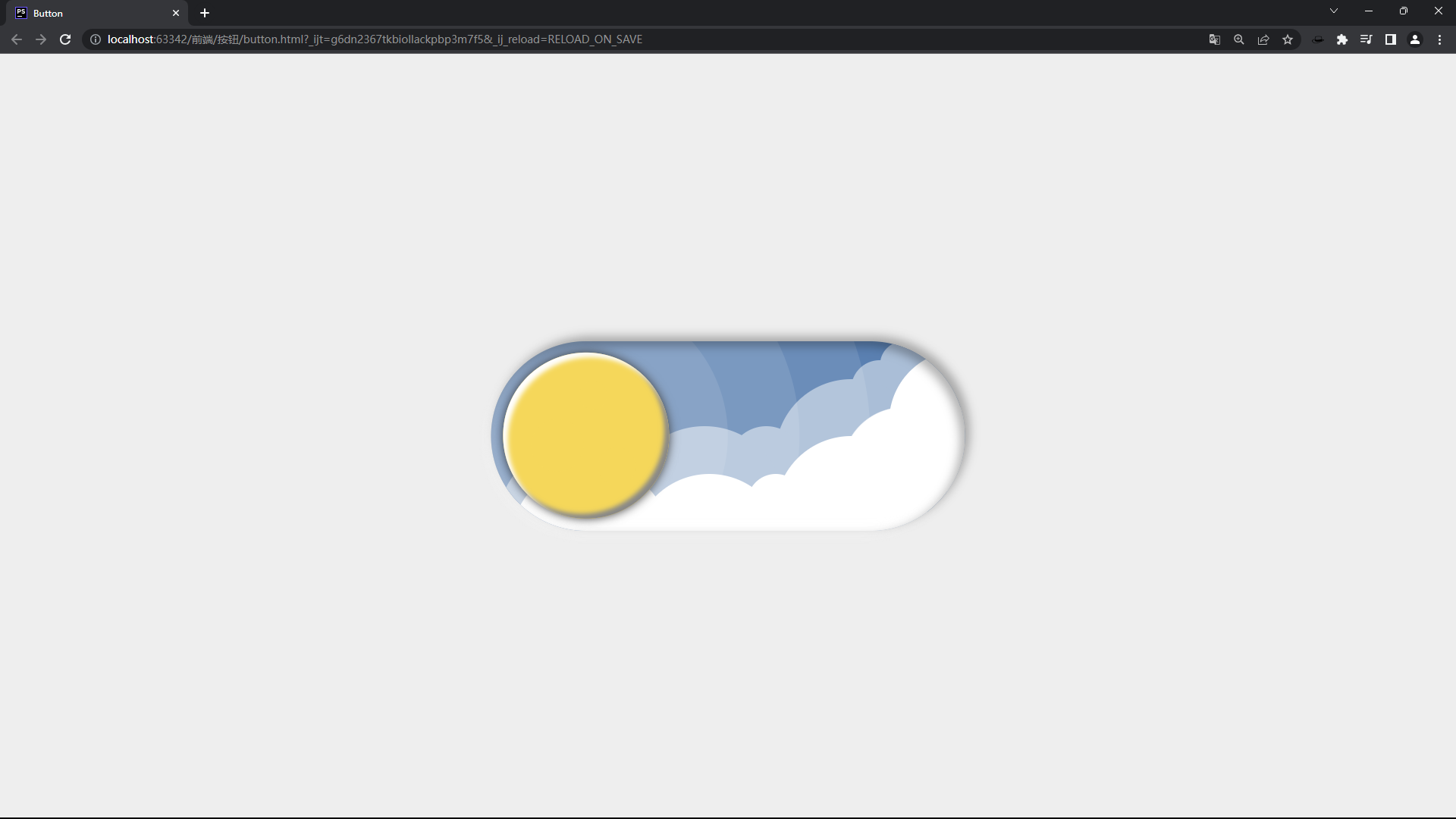
按钮-太阳.png
月亮:
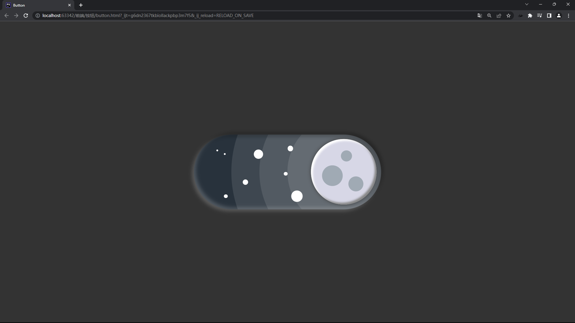
按钮-月亮.png
代码链接:https://leafbackaut.cn/file/%E6%8C%89%E9%92%AE.zip
原理:
- 单击按钮触发js事件,切换css样式表
- 背景垂直平移
- 太阳/月亮水平平移
代码:
html代码
<!DOCTYPE html>
<html lang="en">
<head>
    <meta charset="UTF-8">
    <link rel="stylesheet" href="button.css">
    <link rel="stylesheet" href="dark.css" id="theme" class="dark">
    <script type="text/javascript" src="button.js"></script>
    <title>Button</title>
</head>
<body>
    <div id="box">
        <div id="background">
            <div id="dark">
                <div class="dc"></div>
                <div class="dc"></div>
                <div class="dc"></div>
                <div class="dc"></div>
                <div class="dc"></div>
                <div class="dc"></div>
                <div class="dc"></div>
                <div class="dc"></div>
            </div>
            <div id="light">
                <div class="lc"></div>
                <div class="lc"></div>
                <div class="lc"></div>
                <div class="lc"></div>
                <div class="lc"></div>
                <div class="lc"></div>
                <div class="lc"></div>
                <div class="lc"></div>
                <div class="lc"></div>
                <div class="lc"></div>
                <div class="lc"></div>
                <div class="lc"></div>
            </div>
        </div>
        <div id="o1">
            <div id="o2">
                <div id="o3">
                    <div id="o" onclick="change()">
                        <div class="gra"></div>
                        <div class="gra"></div>
                        <div class="gra"></div>
                    </div>
                </div>
            </div>
        </div>
    </div>
    <div id="box_shadow" onclick="change()"></div>
</body>
</html>
button.css
body{
    transition: 0.4s ease-in-out;
}
#box{
    left: 50%;
    top: 50%;
    transform: translateX(-50%) translateY(-50%);
    position: absolute;
    width: 500px;
    height: 200px;
    border-radius: 100px;
    overflow: hidden;
}
#background{
    width: 500px;
    height: 400px;
    position: absolute;
    transition: 0.4s ease-in-out;
    overflow: hidden;
}
#dark{
    width: 100%;
    height: 50%;
    left: 0;
    top: 0;
    position: absolute;
    background-color: rgb(40, 50, 60);
}
.dc{
    background-color: white;
    border-radius: 50%;
    position: absolute;
}
.dc:nth-of-type(1){
    width: 15px;
    height: 15px;
    top: 30px;
    left: 250px;
}
.dc:nth-of-type(2){
    width: 30px;
    height: 30px;
    left: 260px;
    top: 150px;
}
.dc:nth-of-type(3){
    width: 10px;
    height: 10px;
    left: 240px;
    top: 100px;
}
.dc:nth-of-type(4){
    width: 25px;
    height: 25px;
    left: 160px;
    top: 40px;
}
.dc:nth-of-type(5){
    width: 5px;
    height: 5px;
    left: 60px;
    top: 40px;
}
.dc:nth-of-type(6){
    width: 5px;
    height: 5px;
    left: 80px;
    top: 50px;
}
.dc:nth-of-type(7){
    width: 15px;
    height: 15px;
    left: 130px;
    top: 120px;
}
.dc:nth-of-type(8){
    width: 10px;
    height: 10px;
    left: 80px;
    top: 160px;
}
#light{
    width: 100%;
    height: 50%;
    left: 0;
    bottom: 0;
    position: absolute;
    background-color: rgb(90, 128, 177);
}
.lc{
    background: white;
    position: absolute;
}
.lc:nth-of-type(12){
    width: 170px;
    height: 170px;
    left: 20px;
    bottom: -100px;
    border-radius: 50%;
}
.lc:nth-of-type(11){
    width: 160px;
    height: 160px;
    left: 150px;
    bottom: -100px;
    border-radius: 50%;
}
.lc:nth-of-type(10){
    width: 160px;
    height: 160px;
    left: 300px;
    bottom: -60px;
    border-radius: 50%;
}
.lc:nth-of-type(9){
    width: 150px;
    height: 150px;
    left:420px;
    bottom: 40px;
    border-radius: 50%;
}
.lc:nth-of-type(8){
    width: 60px;
    height: 60px;
    left: 270px;
    bottom: 0;
    border-radius: 50%;
}
.lc:nth-of-type(7){
    width: 130px;
    height: 130px;
    right: 0;
    bottom: 0;
    border-top-left-radius: 50%;
}
.lc:nth-of-type(6){
    width: 200px;
    height: 200px;
    left: 5px;
    bottom: -100px;
    border-radius: 50%;
    background: rgb(170, 190, 215);
}
.lc:nth-of-type(5){
    width: 170px;
    height: 170px;
    left: 140px;
    bottom: -60px;
    border-radius: 50%;
    background: rgb(170, 190, 215);
}
.lc:nth-of-type(4){
    width: 80px;
    height: 80px;
    left: 250px;
    bottom: 30px;
    border-radius: 50%;
    background: rgb(170, 190, 215);
}
.lc:nth-of-type(3){
    width: 160px;
    height: 160px;
    left: 300px;
    bottom: 0;
    border-radius: 50%;
    background: rgb(170, 190, 215);
}
.lc:nth-of-type(2){
    width: 60px;
    height: 60px;
    right: 60px;
    top: 20px;
    position: absolute;
    border-radius: 50%;
    background: rgb(170, 190, 215);
}
.lc:nth-of-type(1){
    width: 50px;
    height: 50px;
    right: 40px;
    top: 0;
    position: absolute;
    border-radius: 50%;
    background: rgb(170, 190, 215);
}
#o{
    width: 175px;
    height: 175px;
    border-radius: 50%;
    left: 50%;
    top: 50%;
    transform: translateX(-50%) translateY(-50%);
    position: absolute;
    transition: 0.4s ease-in-out;
    box-shadow: 5px 5px 5px inset #FFFFFF, -5px -5px 5px inset #888888, 0 0 10px #404040;
}
#o1{
    width: 600px;
    height: 600px;
    border-radius: 50%;
    top: 100px;
    transform: translateX(-50%) translateY(-50%);
    position: absolute;
    background: rgb(255, 255, 255, 0.1);
    transition: 0.4s ease-in-out;
}
#o2{
    width: 450px;
    height: 450px;
    border-radius: 50%;
    left: 50%;
    top: 50%;
    transform: translateX(-50%) translateY(-50%);
    position: absolute;
    background: rgb(255, 255, 255, 0.1);
}
#o3{
    width: 300px;
    height: 300px;
    border-radius: 50%;
    left: 50%;
    top: 50%;
    transform: translateX(-50%) translateY(-50%);
    position: absolute;
    background: rgb(255, 255, 255, 0.1);
}
.gra{
    border-radius: 50%;
    position: absolute;
    transition: 0.4s ease-in-out;
}
.gra:nth-of-type(1){
    width: 30px;
    height: 30px;
    left: 80px;
    top: 30px;
}
.gra:nth-of-type(2){
    width: 55px;
    height: 55px;
    left: 30px;
    top: 70px;
}
.gra:nth-of-type(3){
    width: 40px;
    height: 40px;
    left: 100px;
    top: 100px;
}
#box_shadow{
    left: 50%;
    top: 50%;
    transform: translateX(-50%) translateY(-50%);
    position: absolute;
    width: 500px;
    height: 200px;
    border-radius: 100px;
    box-shadow: 5px -5px 10px inset rgb(250, 250, 250, 0.2), -5px 5px 10px inset rgb(0, 0, 0, 0.3),
    -5px 5px 10px rgb(250, 250, 250, 0.2), 5px -5px 10px rgb(0, 0, 0, 0.3);
}
light.css
body{
    background: #EEEEEE;
}
#background{
    left: 0;
    top: -100%;
}
#o1{
    left: 100px;
}
#o{
    background: rgb(245, 215, 90);
}
.gra{
    background: rgb(245, 215, 90);
}
dark.css
body{
    background: #333333;
}
#background{
    left: 0;
    top: 0;
}
#o1{
    left: 400px;
}
#o{
    background: rgb(215, 215, 230);
}
.gra{
    background: rgb(160, 170, 180);
}
button.js
window.onload = change();

function change(){
    let theme = document.getElementById("theme");
    if (theme.className === "dark"){
        theme.className = "light"
        theme.href = "light.css";
    }
    else {
        theme.className = "dark"
        theme.href = "dark.css";
    }
}本文参与?腾讯云自媒体分享计划,分享自作者个人站点/博客。
原始发表:2023 年 07 月,如有侵权请联系 cloudcommunity@tencent.com 删除
评论
登录后参与评论
推荐阅读