Jetpack Compose 自定义 好看的TabRow Indicator
原创Jetpack Compose 自定义 好看的TabRow Indicator
原创
背景
Jetpack Compose 提供了强大的 Material Design 组件,其中 TabRow 组件可以用于实现 Material Design 规范的选项卡界面。但是默认的 TabRow 样式可能无法满足所有场景,所以我们有时需要自定义 TabRow 的样式。
Jetpack Compose 中使用 TabRow
简单使用 TabRow 一般可以分为以下几步:
- 定义 Tab 数据模型 每个 Tab 对应一个数据类,包含标题、图标等信息:
????data?class?TabItem(
???????val?title:?String,
???????val?icon:?ImageVector?
????)- 在 TabRow 中添加 Tab 项 使用 Tab 组件添加选项卡,传入标题、图标等:
????TabRow?{
???????tabItems.forEach?{?item?->
??????????Tab(
?????????????text?=?{
????????????????Text(item.title)?
?????????????},
?????????????icon?=?{
????????????????item.icon?.let?{?Icon(it)?}
?????????????}
??????????)?
???????}
????}- 处理 Tab 选择事件
通过 selectedTabIndex 跟踪选中的 tab,在 onTabSelected 回调中处理点击事件:
????var?selectedTabIndex?by?remember?{?mutableStateOf(0)?}

????TabRow(
???????selectedTabIndex?=?selectedTabIndex,
???????onTabSelected?=?{
??????????selectedTabIndex?=?it
???????}
????){
???????//?...?
????}
具体详细可以看我之前的文章 Jetpack Compose TabRow与HorizontalPager 联动
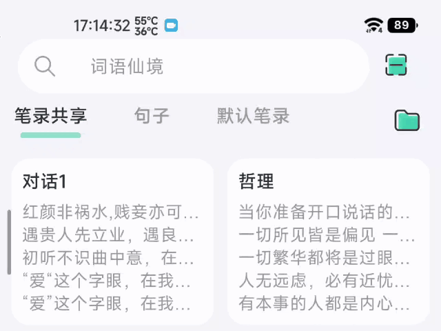
笔记共享App
我新开发的笔记共享App 也用上了TabRow与HorizontalPager联动效果
效果图
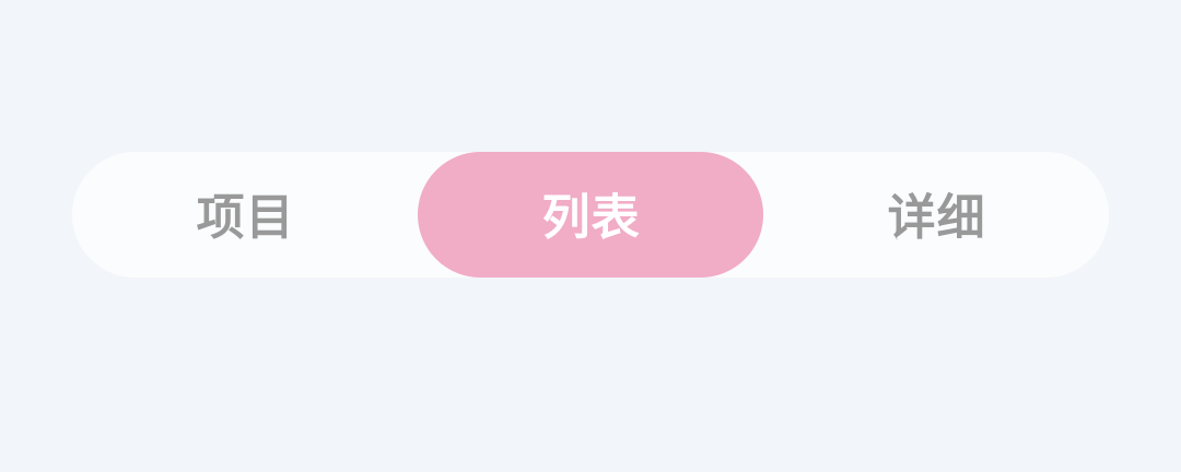
自定义 TabRow 的样式
效果图
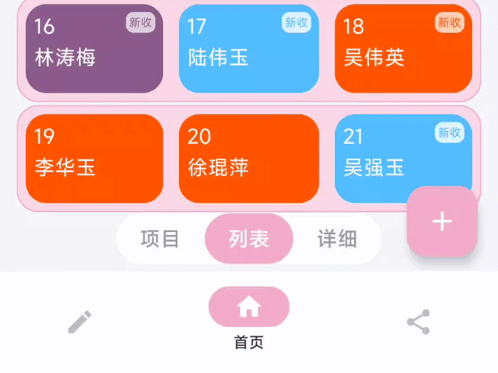
演示图的姓名都是随机生成的,如有雷同纯属巧合
证据如下
val lastNames = arrayOf(
"赵", "钱", "孙", "李", "周", "吴", "郑", "王", "刘", "张", "杨", "陈", "郭", "林", "徐", "罗", "陆", "海"
)
val firstNames = arrayOf(
"伟", "芳", "娜", "敏", "静", "立", "丽", "强", "华", "明", "杰", "涛", "俊", "瑶", "琨", "璐"
)
val secondNames =
arrayOf("燕", "芹", "玲", "玉", "菊", "萍", "倩", "梅", "芳", "秀", "苗", "英")
// 随机选择一个姓氏
val lastName = lastNames.random()

// 随机选择一个名字
val firstName = firstNames.random()
val secondName = secondNames.random()
代码解释
重写TabRow
通过查看TabRow 组件的源代码 ,单单自定义indicator 指示器是行不通的
 layout(tabRowWidth, tabRowHeight) {
                //绘制 tab文本
                tabPlaceables.forEachIndexed { index, placeable ->
                    placeable.placeRelative(index * tabWidth, 0)
                }
                //绘制 divider 分割线
                subcompose(TabSlots.Divider, divider).forEach {
                    val placeable = it.measure(constraints.copy(minHeight = 0))
                    placeable.placeRelative(0, tabRowHeight - placeable.height)
                }
                //最后绘制 Indicator 指示器
                subcompose(TabSlots.Indicator) {
                    indicator(tabPositions)
                }.forEach {
                    it.measure(Constraints.fixed(tabRowWidth, tabRowHeight)).placeRelative(0, 0)
                }
}根据源代码可以看出TabRow 先绘制文本 再绘制 指示器,这的显示效果,当Indicator高度充满TabRow的时候Tab文本是显示不出来的,因为Indicator挡住了,

所以解决办法就是先绘制Indicator再绘制tab文本
 layout(tabRowWidth, tabRowHeight) {
                 //先绘制 Indicator 指示器
                subcompose(TabSlots.Indicator) {
                    indicator(tabPositions)
                }.forEach {
                    it.measure(Constraints.fixed(tabRowWidth, tabRowHeight)).placeRelative(0, 0)
                }
                //因为divider用不上,我便注释了
                //subcompose(TabSlots.Divider, divider).forEach {
                //    val placeable = it.measure(constraints.copy(minHeight = 0))
                //    placeable.placeRelative(0, tabRowHeight - placeable.height)
                //}

                //再绘制 tab文本
                tabPlaceables.forEachIndexed { index, placeable ->
                    placeable.placeRelative(index * tabWidth, 0)
                }

            }
把TabRow宽度改成由内容匹配
未修改时的TabRow宽度由父布局决定,效果图如下
TabRow的宽度从源码上看是,直接获取SubcomposeLayout的最大宽度(constraints.maxWidth)
接着利用宽度和tabCount计算平均值,就是每个tab文本的宽度
SubcomposeLayout(Modifier.fillMaxWidth()) { constraints ->

            //最大宽度
            val tabRowWidth = constraints.maxWidth
            val tabMeasurables = subcompose(TabSlots.Tabs, tabs)
            val tabCount = tabMeasurables.size
            var tabWidth = 0
            if (tabCount > 0) {
                tabWidth = (tabRowWidth / tabCount)
            }
            ...
            }
我们需要TabRow宽度由内容匹配,而不是父布局的最大宽度,这样就要修改测量流程\
不再直接使用constraints.maxWidth作为tabRowWidth,而是记为最大宽度maxWidth
接着封装一个函数,使用标签内容宽度的求和作为 TabRow 的宽度,不再和 maxWidth 做比较
fun measureTabRow(
    measurables: List<Measurable>,
    minWidth: Int
): Int {
    // 依次测量标签页宽度并求和
    val widths = measurables.map {
        it.minIntrinsicWidth(Int.MAX_VALUE)
    }
    var width = widths.max() * measurables.size
    measurables.forEach {
        width += it.minIntrinsicWidth(Int.MAX_VALUE)
    }
    //maxWidth的作用
    // 如果标签较多,可以取一个较小值作为最大标签宽度,防止过宽
    return minOf(width, minWidth)
}
这样就舒服多了
自定义的 Indicator
主要逻辑是在 Canvas 上绘制指示器
- indicator 的宽度根据当前 tab 的宽度及百分比计算
- indicator 的起始 x 轴坐标根据切换进度在当前 tab 和前/后 tab 之间插值
- indicator 的高度是整个 Canvas 的高度,即占据了 TabRow 的全高
fraction 和前后 tab 的 lerping 实现了滑动切换时指示器平滑过渡的效果
具体可以看代码的注释
使用方法
//默认显示第一页
val pagerState = rememberPagerState(initialPage = 1,  pageCount = { 3 } )

 WordsFairyTabRow(
            modifier = Modifier
                .align(Alignment.BottomCenter)
                .padding(bottom = 86.dp, start = 24.dp, end = 24.dp),
            selectedTabIndex = pagerState.currentPage,
            indicator = { tabPositions ->
                if (tabPositions.isNotEmpty()) {
                    PagerTabIndicator(tabPositions = tabPositions, pagerState = pagerState)
                }
            },
        ) {
            // 添加选项卡
            tabs.forEachIndexed { index, title ->
                val selected = (pagerState.currentPage == index)
                Tab(
                    selected = selected,
                    selectedContentColor = WordsFairyTheme.colors.textWhite,
                    unselectedContentColor = WordsFairyTheme.colors.textSecondary,
                    onClick = {
                        scope.launch {
                            feedback.vibration()
                            pagerState.animateScrollToPage(index)
                        }
                    },
                    modifier = Modifier.wrapContentWidth() // 设置Tab的宽度为wrapContent
                ) {
                    Text(
                        text = title,
                        fontWeight = FontWeight.Bold,
                        modifier = Modifier.padding(9.dp)
                    )
                }
            }
        }
完整代码
PagerTabIndicator.kt
@OptIn(ExperimentalFoundationApi::class)
@Composable
fun PagerTabIndicator(
    tabPositions: List<TabPosition>, // TabPosition列表
    pagerState: PagerState, // PageState用于获取当前页和切换进度
    color: Color = WordsFairyTheme.colors.themeUi, // 指示器颜色
    @FloatRange(from = 0.0, to = 1.0) percent: Float = 1f // 指示器宽度占Tab宽度的比例
) {

    // 获取当前选中的页和切换进度
    val currentPage by rememberUpdatedState(newValue = pagerState.currentPage)
    val fraction by rememberUpdatedState(newValue = pagerState.currentPageOffsetFraction)

    // 获取当前tab、前一个tab、后一个tab的TabPosition
    val currentTab = tabPositions[currentPage]
    val previousTab = tabPositions.getOrNull(currentPage - 1)
    val nextTab = tabPositions.getOrNull(currentPage + 1)

    Canvas(
        modifier = Modifier.fillMaxSize(), // 充满TabRow的大小
        onDraw = {
            // 计算指示器宽度
            val indicatorWidth = currentTab.width.toPx() * percent

            // 计算指示器x轴起始位置
            val indicatorOffset = if (fraction > 0 && nextTab != null) {
                // 正在向右滑动到下一页,在当前tab和下一tab之间插值
                lerp(currentTab.left, nextTab.left, fraction).toPx()
            } else if (fraction < 0 && previousTab != null) {
                // 正在向左滑动到上一页,在当前tab和上一tab之间插值
                lerp(currentTab.left, previousTab.left, -fraction).toPx()
            } else {
                // 未在滑动,使用当前tab的left
               currentTab.left.toPx()
            }

            // 绘制指示器
            val canvasHeight = size.height // 高度为整个Canvas高度
            drawRoundRect(
                color = color,
                topLeft = Offset( // 设置圆角矩形的起始点
                    indicatorOffset + (currentTab.width.toPx() * (1 - percent) / 2),
                    0F
                ),
                size = Size( // 设置宽高
                    indicatorWidth + indicatorWidth * abs(fraction),
                    canvasHeight
                ),
                cornerRadius = CornerRadius(26.dp.toPx()) // 圆角半径
            )
        }
    )
}
WordsFairyTabRow.kt
@Composable
fun WordsFairyTabRow(
    selectedTabIndex: Int,
    modifier: Modifier = Modifier,
    indicator: @Composable (tabPositions: List<TabPosition>) -> Unit = @Composable { tabPositions ->
        if (selectedTabIndex < tabPositions.size) {
            TabRowDefaults.Indicator(
                Modifier.tabIndicatorOffset(tabPositions[selectedTabIndex])
            )
        }
    },
    tabs: @Composable () -> Unit
) {


    ImmerseCard(
        modifier = modifier.selectableGroup(),
        shape = RoundedCornerShape(26.dp),
        backgroundColor = WordsFairyTheme.colors.whiteBackground.copy(alpha = 0.7f)
    ) {
        SubcomposeLayout(Modifier.wrapContentWidth()) { constraints ->

            val tabMeasurables = subcompose(TabSlots.Tabs, tabs)
            val tabRowWidth = measureTabRow(tabMeasurables, constraints.maxWidth)

            val tabCount = tabMeasurables.size
            var tabWidth = 0
            if (tabCount > 0) {
                tabWidth = (tabRowWidth / tabCount)
            }
            val tabRowHeight = tabMeasurables.fold(initial = 0) { max, curr ->
                maxOf(curr.maxIntrinsicHeight(tabWidth), max)
            }

            val tabPlaceables = tabMeasurables.map {
                it.measure(
                    constraints.copy(
                        minWidth = tabWidth,
                        maxWidth = tabWidth,
                        minHeight = tabRowHeight,
                        maxHeight = tabRowHeight,
                    )
                )
            }

            val tabPositions = List(tabCount) { index ->
                TabPosition(tabWidth.toDp() * index, tabWidth.toDp())
            }

            layout(tabRowWidth, tabRowHeight) {

                subcompose(TabSlots.Indicator) {
                    indicator(tabPositions)
                }.forEach {
                    it.measure(Constraints.fixed(tabRowWidth, tabRowHeight)).placeRelative(0, 0)
                }

                tabPlaceables.forEachIndexed { index, placeable ->
                    placeable.placeRelative(index * tabWidth, 0)
                }

            }
        }

    }
}

fun measureTabRow(
    measurables: List<Measurable>,
    minWidth: Int
): Int {
    // 依次测量标签页宽度并求和
    val widths = measurables.map {
        it.minIntrinsicWidth(Int.MAX_VALUE)
    }
    var width = widths.max() * measurables.size
    measurables.forEach {
        width += it.minIntrinsicWidth(Int.MAX_VALUE)
    }

    // 如果标签较多,可以取一个较小值作为最大标签宽度,防止过宽
    return minOf(width, minWidth)
}

@Immutable
class TabPosition internal constructor(val left: Dp, val width: Dp) {
    val right: Dp get() = left + width

    override fun equals(other: Any?): Boolean {
        if (this === other) return true
        if (other !is TabPosition) return false

        if (left != other.left) return false
        if (width != other.width) return false

        return true
    }

    override fun hashCode(): Int {
        var result = left.hashCode()
        result = 31 * result + width.hashCode()
        return result
    }

    override fun toString(): String {
        return "TabPosition(left=$left, right=$right, width=$width)"
    }
}

/**
 * Contains default implementations and values used for TabRow.
 */
object TabRowDefaults {
    /** Default container color of a tab row. */
    val containerColor: Color
        @Composable get() =
            WordsFairyTheme.colors.whiteBackground

    /** Default content color of a tab row. */
    val contentColor: Color
        @Composable get() =
            WordsFairyTheme.colors.whiteBackground

    @Composable
    fun Indicator(
        modifier: Modifier = Modifier,
        height: Dp = 3.0.dp,
        color: Color =
            WordsFairyTheme.colors.navigationBarColor

    ) {
        Box(
            modifier
                .fillMaxWidth()
                .height(height)
                .background(color = color)
        )
    }
    fun Modifier.tabIndicatorOffset(
        currentTabPosition: TabPosition
    ): Modifier = composed(
        inspectorInfo = debugInspectorInfo {
            name = "tabIndicatorOffset"
            value = currentTabPosition
        }
    ) {
        val currentTabWidth by animateDpAsState(
            targetValue = currentTabPosition.width,
            animationSpec = tween(durationMillis = 250, easing = FastOutSlowInEasing)
        )
        val indicatorOffset by animateDpAsState(
            targetValue = currentTabPosition.left,
            animationSpec = tween(durationMillis = 250, easing = FastOutSlowInEasing)
        )
        fillMaxWidth()
            .wrapContentSize(Alignment.BottomStart)
            .offset(x = indicatorOffset)
            .width(currentTabWidth)
    }
}

private enum class TabSlots {
    Tabs,
    Divider,
    Indicator
}

/**
 * Class holding onto state needed for [ScrollableTabRow]
 */
private class ScrollableTabData(
    private val scrollState: ScrollState,
    private val coroutineScope: CoroutineScope
) {
    private var selectedTab: Int? = null

    fun onLaidOut(
        density: Density,
        edgeOffset: Int,
        tabPositions: List<TabPosition>,
        selectedTab: Int
    ) {
        // Animate if the new tab is different from the old tab, or this is called for the first
        // time (i.e selectedTab is `null`).
        if (this.selectedTab != selectedTab) {
            this.selectedTab = selectedTab
            tabPositions.getOrNull(selectedTab)?.let {
                // Scrolls to the tab with [tabPosition], trying to place it in the center of the
                // screen or as close to the center as possible.
                val calculatedOffset = it.calculateTabOffset(density, edgeOffset, tabPositions)
                if (scrollState.value != calculatedOffset) {
                    coroutineScope.launch {
                        scrollState.animateScrollTo(
                            calculatedOffset,
                            animationSpec = ScrollableTabRowScrollSpec
                        )
                    }
                }
            }
        }
    }

    private fun TabPosition.calculateTabOffset(
        density: Density,
        edgeOffset: Int,
        tabPositions: List<TabPosition>
    ): Int = with(density) {
        val totalTabRowWidth = tabPositions.last().right.roundToPx() + edgeOffset
        val visibleWidth = totalTabRowWidth - scrollState.maxValue
        val tabOffset = left.roundToPx()
        val scrollerCenter = visibleWidth / 2
        val tabWidth = width.roundToPx()
        val centeredTabOffset = tabOffset - (scrollerCenter - tabWidth / 2)
        // How much space we have to scroll. If the visible width is <= to the total width, then
        // we have no space to scroll as everything is always visible.
        val availableSpace = (totalTabRowWidth - visibleWidth).coerceAtLeast(0)
        return centeredTabOffset.coerceIn(0, availableSpace)
    }
}

private val ScrollableTabRowMinimumTabWidth = 90.dp

/**
 * The default padding from the starting edge before a tab in a [ScrollableTabRow].
 */
private val ScrollableTabRowPadding = 52.dp

/**
 * [AnimationSpec] used when scrolling to a tab that is not fully visible.
 */
private val ScrollableTabRowScrollSpec: AnimationSpec<Float> = tween(
    durationMillis = 250,
    easing = FastOutSlowInEasing
)
原创声明:本文系作者授权腾讯云开发者社区发表,未经许可,不得转载。
如有侵权,请联系 cloudcommunity@tencent.com 删除。
原创声明:本文系作者授权腾讯云开发者社区发表,未经许可,不得转载。
如有侵权,请联系 cloudcommunity@tencent.com 删除。