单细胞文章复现-抗PD-1免疫治疗联合雄激素剥夺治疗可诱导转移性去势敏感前列腺癌的强免疫浸润
单细胞文章复现-抗PD-1免疫治疗联合雄激素剥夺治疗可诱导转移性去势敏感前列腺癌的强免疫浸润

首先下载数据 https://data.mendeley.com/datasets/5nnw8xrh5m/1
记得先通读全文,虽然可以按照自己的方式做出来结果,但一不小心就会认为作者的样本血细胞污染,注释成上皮细胞,pDC注释成B细胞。但实际上作者考虑到了这个问题,使用了其他的注释方式。 ①首先看看文中直接使用基因表达注释的细胞群
rm(list=ls())
options(stringsAsFactors = F)
library(Seurat)
library(ggplot2)
library(clustree)
library(cowplot)
library(dplyr)

###### step1:导入数据 ######
library(data.table)
scRNA=readRDS("primecut.integrated.geneexp.seurat.rds")
table(scRNA@meta.data$orig.ident)  #查看每个样本的细胞数
head(scRNA@meta.data)
meta = scRNA@meta.data
colnames(meta)
table(meta$orig.ident)
table(meta$patient)
table(meta$treatment)
table(meta$tissue)
table(meta$hpca_labels)
table(meta$hpca_main_labels)
table(meta$blueprint_labels)
table(meta$blueprint_main_labels)

library(ggplot2)
sce.all = UpdateSeuratObject(object = scRNA)
table(Idents(sce.all))
sce.all$celltype = Idents(sce.all)

mycolors <-c('#E5D2DD', '#53A85F', '#F1BB72', '#F3B1A0', '#D6E7A3', '#57C3F3', '#F7F398',
                        '#E95C59', '#E59CC4', '#AB3282', '#91D0BE', '#BD956A', '#8C549C', '#585658',
                        '#9FA3A8', '#E0D4CA', '#5F3D69', '#C5DEBA', '#58A4C3', '#E4C755',
                        '#AA9A59', '#E63863', '#E39A35', '#C1E6F3', '#6778AE',  '#B53E2B',
                        '#712820', '#DCC1DD', '#CCE0F5',  '#CCC9E6',  '#68A180',
                        '#968175')

DimPlot(sce.all, reduction = "umap",split.by = 'orig.ident',
        group.by = "celltype",label = T,cols = mycolors)
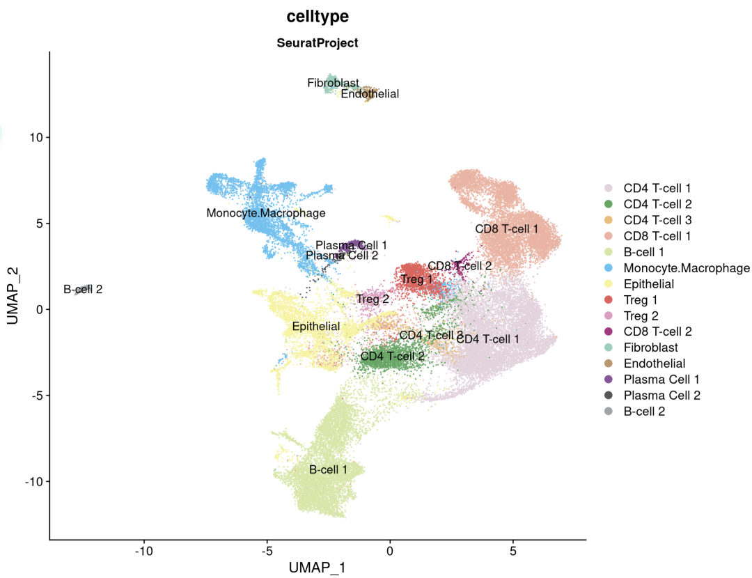
可以看到注释到一个上皮细胞,文中直接使用的SingleR,看看注释结果怎么样
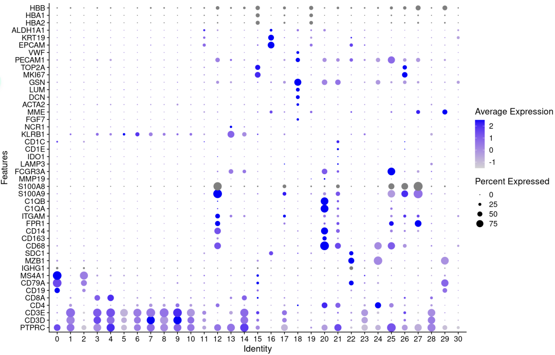
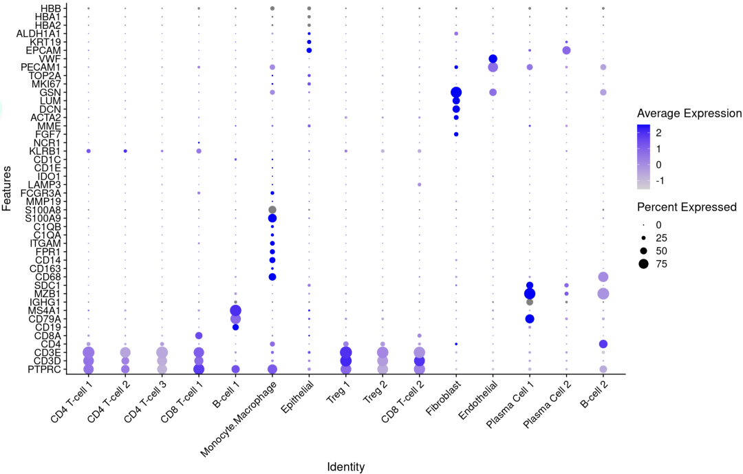
p <- DotPlot(sce.all, features = genes_to_check,
             assay='RNA' ,group.by = 'integrated_snn_res0.8' )  + coord_flip()

p
p1 <- DotPlot(sce.all, features = genes_to_check,
              assay='RNA' ,group.by = 'seurat_clusters' ) +
  coord_flip() +
  theme(axis.text.x = element_text(angle = 45, hjust = 1))

p1
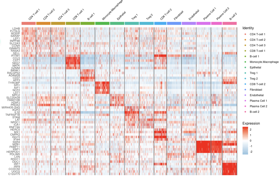
注释亚群的基因表达相符
#2.热图
#remotes::install_github(repo = 'genecell/COSGR')
library(COSG)
marker_cosg <- cosg(
  sce.all,
  groups='all',
  assay='RNA',
  slot='data',
  mu=1,
  n_genes_user=30)

top_genes <- marker_cosg$names
table(gene %in% rownames(sce.all))
gene <- unlist(lapply(top_genes, function(x) head(intersect(x, rownames(sce.all)), 5)))

DoHeatmap(subset(sce.all,downsample=200),gene,size=3)+scale_fill_gradientn(colors=c("#94C4E1","white","red"))
注释的还可以的,说明singleR值得一用呀
但是文中突然就来这么一段话,scRNA达不到分析需求,所以用了VIPER(Virtual Inference of Protein-activity by Enriched Regulon analysis)算法,允许在单个样本的基础上,从基因表达谱数据计算蛋白质活性推断。它利用最直接受特定蛋白质调控的基因表达,如转录因子(TF)的靶标,作为其活性的准确推断手段。大佬说的对大佬想咋样就咋样(小声bb:不会是正常分析分析不出什么花来了吧
Due to high gene dropout levels, scRNA-seq analyses can typically monitor ~20% of all genes in each cell. To address this issue, we utilized an established single cell analysis pipeline,which leverages the VIPER algorithm to measure protein activity from single-cell gene expression data. By assessing protein activity based on the expression of 100 transcriptional targets of each protein, VIPER significantly mitigates gene dropout effects, thus allowing detection of proteins whose encoding gene is completely undetected.
rm(list=ls())
options(stringsAsFactors = F)
library(Seurat)
library(ggplot2)
library(clustree)
library(cowplot)
library(dplyr)

###### step1:导入数据 ######
library(data.table)
scRNA=readRDS("primecut.integrated.VIPER.Seurat.rds")
table(scRNA@meta.data$orig.ident)  #查看每个样本的细胞数
head(scRNA@meta.data)
meta = scRNA@meta.data
colnames(meta)
table(meta$orig.ident)
table(meta$patient)
table(meta$treatment)
table(meta$tissue)
table(meta$blueprint_labels)
table(meta$original_seurat_clusters)

library(ggplot2)
sce.all = UpdateSeuratObject(object = scRNA)
table(Idents(sce.all))
sce.all$celltype = Idents(sce.all)

mycolors <-c('#E5D2DD', '#53A85F', '#F1BB72', '#F3B1A0', '#D6E7A3', '#57C3F3', '#F7F398',
                      '#E95C59', '#E59CC4', '#AB3282', '#91D0BE', '#BD956A', '#8C549C', '#585658',
                      '#9FA3A8', '#E0D4CA', '#5F3D69', '#C5DEBA', '#58A4C3', '#E4C755',
                      '#AA9A59', '#E63863', '#E39A35', '#C1E6F3', '#6778AE',  '#B53E2B',
                      '#712820', '#DCC1DD', '#CCE0F5',  '#CCC9E6',  '#68A180',
                      '#968175')

DimPlot(sce.all, reduction = "umap",split.by = 'orig.ident',
        group.by = "celltype",label = T,cols = mycolors)
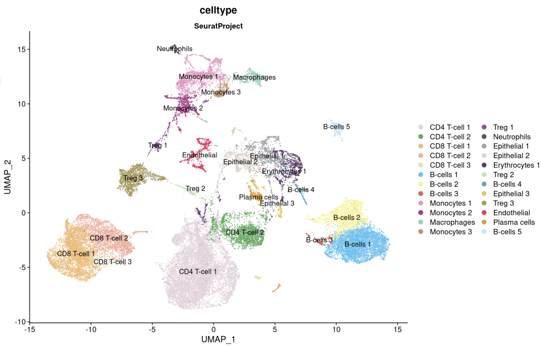
SingleR不提供肿瘤细胞与正常细胞的分类;具有上皮起源的肿瘤细胞,如前列腺癌细胞,被标记为“上皮细胞”。根据前列腺肿瘤标志物基因(如KLK3)的表达,以及使用淋巴细胞和髓系细胞作为拷贝数正常参考的推断拷贝数变异分析,确认三群上皮细胞均为肿瘤细胞。
真的假的,我下载作者提供的Rdata,这基因竟然没有。 我很迷,文中自带的处理数据的代码和文献表格对不上。
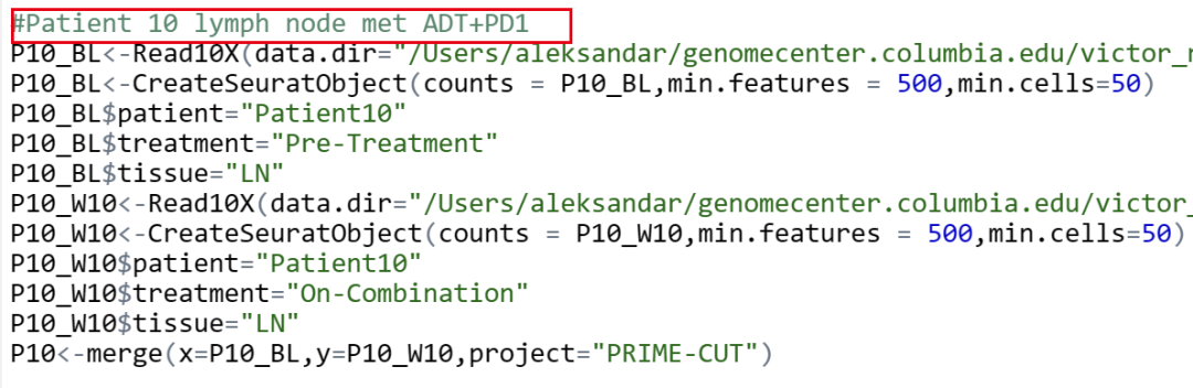

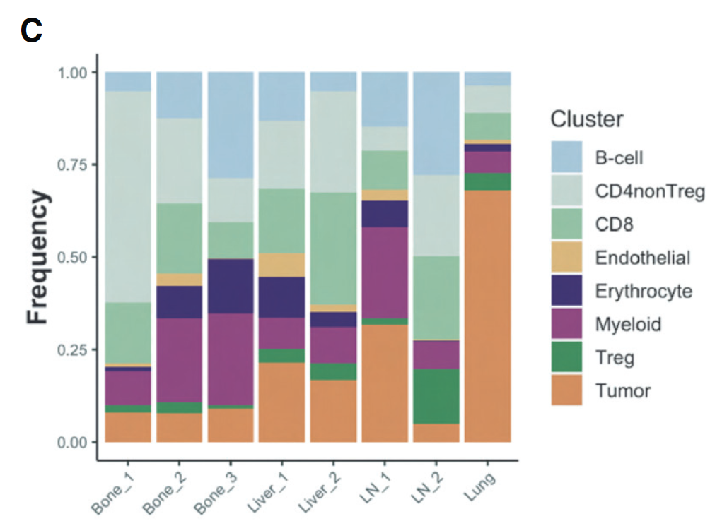
我这里的处理是文中提供的数据,也得不到文中的结果?比例图这种完全不需要改变的也对不上。原文基线期3个患者骨转移,2个患者肝转移,2个患者淋巴结转移,1个患者肺转移。
文中提供的数据筛选基线期
table(sce.all$treatment)
sce = sce.all
library(tidyr)
library(reshape2)
colnames(meta)
table(sce$patient)
table(sce$tissue)
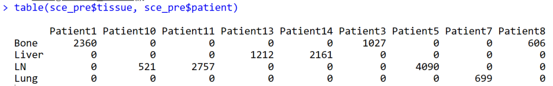
table(sce$tissue, sce$patient)
meta = sce@meta.data
colnames(meta)
table(meta$orig.ident)
table(meta$patient)
table(meta$treatment)
table(meta$tissue)
table(meta$blueprint_labels)
table(meta$original_seurat_clusters)
sce$intecelltype = 'NA'
sce$intecelltype[sce$celltype %in% c('CD4 T-cell 1','CD4 T-cell 2') ] = 'CD4nonTreg'
sce$intecelltype[sce$celltype %in% c('CD4 T-cell 1','CD4 T-cell 2') ] = 'CD4nonTreg'
sce$intecelltype[sce$celltype %in% c('CD8 T-cell 1', 'CD8 T-cell 2', 'CD8 T-cell 3') ] = 'CD8'
sce$intecelltype[sce$celltype %in% c('B-cells 1', 'B-cells 2','B-cells 3','B-cells 4','B-cells 5','Plasma cells') ] = 'B-cell'
sce$intecelltype[sce$celltype %in% c('Treg 3','Treg 2','Treg 1') ] = 'Treg'
sce$intecelltype[sce$celltype %in% c('Epithelial 3','Epithelial 2','Epithelial 1') ] = 'Tumor'
sce$intecelltype[sce$celltype %in% c('Endothelial') ] = 'Endothelial'
sce$intecelltype[sce$celltype %in% c('Erythrocytes 1') ] = 'Erythrocytes'
sce$intecelltype[sce$celltype %in% c('Monocytes 1', 'Monocytes 2', 'Macrophages', 'Monocytes 3','Neutrophils') ] = 'Myeloid'
table(sce$intecelltype)
sce_pre = sce[, sce$treatment %in% c( "Pre-Treatment" )]
table(sce_pre$tissue, sce_pre$patient)
就得到了基线期3个患者骨转移,2个患者肝转移,3个患者淋巴结转移,1个患者肺转移。为什么会多出来一个患者,明明文中也写的是8个基线期患者,我哪里出了问题
sce_pre$group = 'NA'
sce_pre$group[sce_pre$tissue == 'Bone'&sce_pre$patient == 'Patient1'] = 'Bone1'
sce_pre$group[sce_pre$tissue == 'Bone'&sce_pre$patient == 'Patient3'] = 'Bone2'
sce_pre$group[sce_pre$tissue == 'Bone'&sce_pre$patient == 'Patient8'] = 'Bone3'
sce_pre$group[sce_pre$tissue == 'Liver'&sce_pre$patient == 'Patient13'] = 'Liver1'
sce_pre$group[sce_pre$tissue == 'Liver'&sce_pre$patient == 'Patient14'] = 'Liver2'
sce_pre$group[sce_pre$tissue == 'LN'&sce_pre$patient == 'Patient10'] = 'LN1'
sce_pre$group[sce_pre$tissue == 'LN'&sce_pre$patient == 'Patient11'] = 'LN2'
sce_pre$group[sce_pre$tissue == 'LN'&sce_pre$patient == 'Patient5'] = 'LN3'
sce_pre$group[sce_pre$tissue == 'Lung'&sce_pre$patient == 'Patient7'] = 'Lung'
table(sce_pre$group)

tb=table(sce_pre$group, sce_pre$intecelltype)
head(tb)
library (gplots)
balloonplot(tb)
bar_data <- as.data.frame(tb)

bar_per <- bar_data %>%
  group_by(Var1) %>%
  mutate(sum(Freq)) %>%
  mutate(percent = Freq / `sum(Freq)`)
head(bar_per)
col =c("#3176B7","#F78000","#3FA116","#CE2820","#9265C1",
                "#885649","#DD76C5","#BBBE00","#41BED1")
colnames(bar_per)

p2 = ggplot(bar_per, aes(x = percent, y = Var1)) +
  geom_bar(aes(fill = Var2) , stat = "identity") + coord_flip() +
  theme(axis.ticks = element_line(linetype = "blank"),
        legend.position = "top",
        panel.grid.minor = element_line(colour = NA,linetype = "blank"),
        panel.background = element_rect(fill = NA),
        plot.background = element_rect(colour = NA)) +
  labs(y = " ", fill = NULL)+labs(x = 'Relative proportion(%)')+
  scale_fill_manual(values=col)+
  theme_classic()+
  theme(plot.title = element_text(size=12,hjust=0.5))

p2
将最初的24个VIPER细胞群合并成8个细胞群。肺样本的基线活检主要由肿瘤细胞组成。相比之下,骨、肝和肺基线活检样本含有更大比例的免疫细胞。
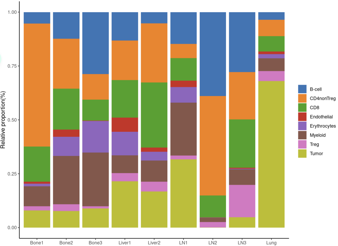
image.png
####分组箱线图
tb=table(sce_pre$group, sce_pre$celltype)
head(tb)
library (gplots)
balloonplot(tb)
bar_data <- as.data.frame(tb)

bar_per <- bar_data %>%
  group_by(Var1) %>%
  mutate(sum(Freq)) %>%
  mutate(percent = Freq / `sum(Freq)`)
head(bar_per)

bar_per$group = 'NA'
bar_per$group[str_detect(bar_per$Var1,'Bone')] = 'Bone'
bar_per$group[str_detect(bar_per$Var1,'Liver')] = 'Liver'
bar_per$group[str_detect(bar_per$Var1,'LN')] = 'LN'
bar_per$group[str_detect(bar_per$Var1,'Lung')] = 'Lung'
table(bar_per$group)


ggplot(bar_per, aes(x = Var2, y = percent))+
  labs(y="Cell Proportion", x =  NULL)+
  geom_boxplot(aes(fill = group), position = position_dodge(0.5), width = 0.5, outlier.alpha = 0)+
  scale_fill_manual(values = c( "#3176B7","#F78000","#3FA116","#CE2820")) +
  theme_bw() +
  theme(plot.title = element_text(size = 12,color="black",hjust = 0.5),
        axis.text.x = element_text(angle = 45, hjust = 1 ),
        panel.grid = element_blank(),
        legend.position = "top",
        legend.text = element_text(size= 12),
        legend.title= element_text(size= 12)) +
  guides(fill=guide_legend(title = "Tissue"))
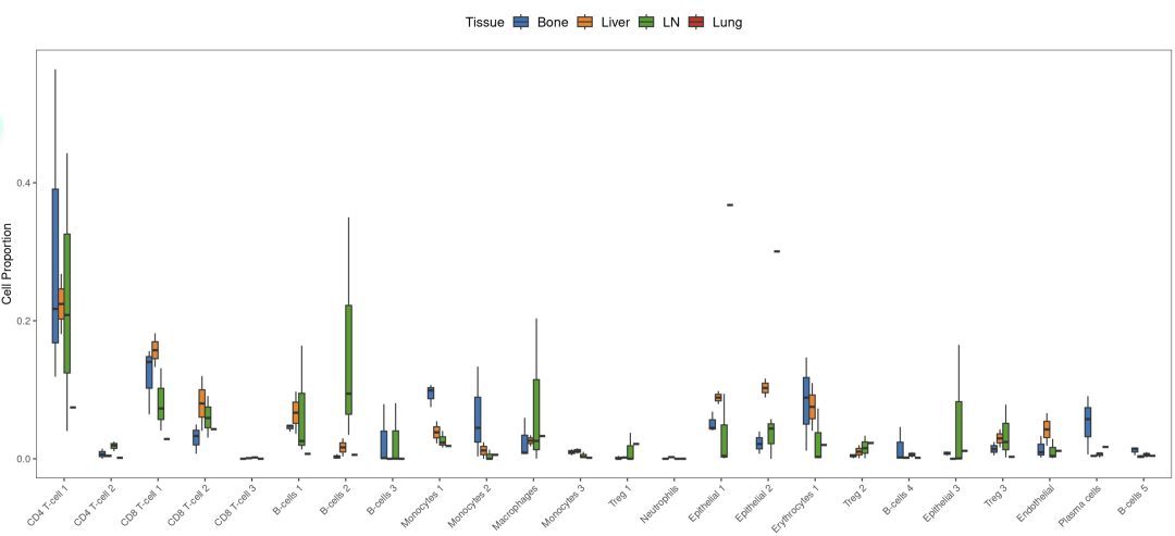
在骨转移中,浆细胞相对于其他部位高度富集,单核细胞1和2亚型的表达增加。在所有组织中,CD8 T细胞和常规(非Treg)CD4细胞占很大比例。
接下来看看不同组织来源的样本和不同治疗阶段样本的细胞亚群差异
table(sce$treatment)
table(sce$tissue)
table(sce$intecelltype)
sce_bone = sce[, sce$tissue %in% c( "Bone" )]
sce_Liver = sce[, sce$tissue %in% c( "Liver" )]
sce_LN = sce[, sce$tissue %in% c( "LN" )]
sce_Lung = sce[, sce$tissue %in% c( "Lung" )]

DimPlot(sce_bone, reduction = "umap", split.by = 'treatment', group.by = "celltype", label = T,
             cols = mycolors)

##堆积柱状图
poplot = function(sce,title){
table(sce$treatment)
tb=table(sce$treatment, sce$intecelltype)
head(tb)
library (gplots)
balloonplot(tb)
bar_data <- as.data.frame(tb)
bar_per <- bar_data %>%
group_by(Var1) %>%
mutate(sum(Freq)) %>%
mutate(percent = Freq / `sum(Freq)`)
head(bar_per)
bar_per = na.omit(bar_per)
col =c("#3176B7","#F78000","#3FA116","#CE2820","#9265C1",
"#885649","#DD76C5","#BBBE00","#41BED1")
colnames(bar_per)
p2 = ggplot(bar_per, aes(x = percent, y = Var1)) +
geom_bar(aes(fill = Var2) , stat = "identity") + coord_flip() +
theme(axis.ticks = element_line(linetype = "blank"),
legend.position = "top",
panel.grid.minor = element_line(colour = NA,linetype = "blank"),
panel.background = element_rect(fill = NA),
plot.background = element_rect(colour = NA)) +
labs(y = " ", fill = NULL)+labs(x = 'Relative proportion(%)')+
scale_fill_manual(values=col)+
theme_classic()+
ggtitle(title) +
theme(plot.title = element_text(size=20,hjust=0.5))
p2
}
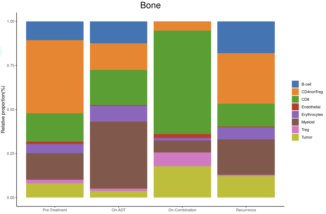
poplot(sce_bone,'Bone')
在骨转移中,ADT诱导髓系细胞增加,CD4 T细胞以及肿瘤细胞减少。相比之下,ADT+aPD-1降低了髓系细胞,同时增加了CD8 T细胞,但是肿瘤细胞竟然也变多了。
###肝
DimPlot(sce_Liver, reduction = "umap", split.by = 'treatment', group.by = "celltype", label = T,
        cols = mycolors)

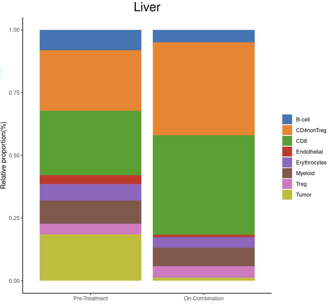
poplot(sce_Liver,'Liver')
内脏(肝脏和肺)的联合治疗后肿瘤细胞组成显著减少,髓系几乎没有变化,CD8 T细胞显著增加。
# ###肺
# DimPlot(sce_Lung, reduction = "umap", split.by = 'treatment', group.by = "celltype", label = T,
#         cols = mycolors)
#
# poplot(sce_Lung,'Lung')


###淋巴结
DimPlot(sce_LN, reduction = "umap", split.by = 'treatment', group.by = "celltype", label = T,
        cols = mycolors)

poplot(sce_LN,'LN')

当与ADT联合使用时,抗PD-1增加了CD8 T细胞浸润到转移部位的程度(骨、肝和肺转移是这样的趋势),而单独使用 ADT时无法观察到。