不是!这才是对角矩阵系列统计图的正确打开方式啊~~
不是!这才是对角矩阵系列统计图的正确打开方式啊~~

DataCharm
发布于 2024-04-11 20:22:52
发布于 2024-04-11 20:22:52
前言
我们的数据可视化课程已经上线啦!!目前课程的主要方向是 科研、统计、地理相关的学术性图形绘制方法,后续也会增加商务插图、机器学等、数据分析等方面的课程。课程免费新增,这点绝对良心!
我们第一个数据可视化交流圈子也已经上线了,主要以我的第一本书籍《科研论文配图绘制指南-基于Python》为基础进行拓展,提供「课堂式」教学视频,还有更多拓展内容,可视化技巧远超书籍本身,书籍修正和新增都会分享到圈子里面~~
参与课程或者圈子的你将获取到:学员答疑、可视化资源分享、可视化技巧补充、可视化业务代做(学员和甲方对接)、副业交流、提升认知等等。
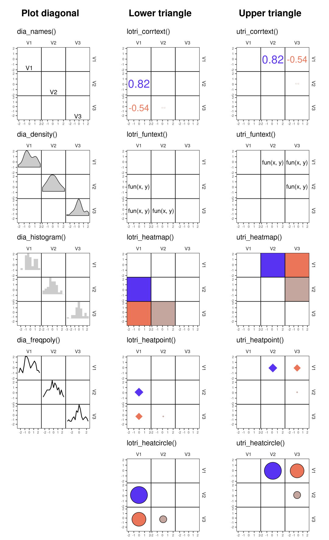
「corrmorant」-对角矩阵系列图表的正确打开方式~~
之前介绍过R语言绘制对角矩阵系列统计图表的文章不是?!这种图一行代码就搞定了,超简单...。今天继续给大家推荐一个个人感觉更好用的对角矩阵图表绘制工具-「corrmorant」。
- corrmorant包介绍
corrmorant 对 ggplot2 进行了扩展,为相关性对角矩阵的绘图提供了一个自动化框架,这些相关矩阵可以通过常规的 ggplot2 语法轻松修改。此外,它还为基于相关矩阵的探索性数据分析提供了大量可视化工具。
- corrmorant包安装
该工具包可通过remotes::install_github()函数方法进行安装:
# install remotes package if necessary
install.packages("remotes")
# install corrmorant from the github repository
remotes::install_github("r-link/corrmorant")
- corrmorant包可视化案例
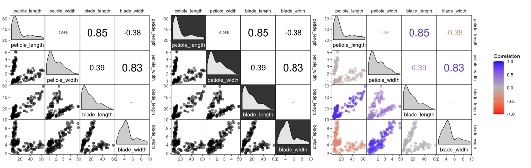
# correlation plot of the drosera data using style = 'light'
corrmorant(drosera, style = "light")
# the "dark" style has a dark background in the diagonal facets
corrmorant(drosera, style = "dark")
# in the "blue_red" style, colors and correlation labels are colored by the strength of
# correlation
corrmorant(drosera, style = "blue_red")
Simple plots with corrmorant()
ggcorrm(drosera, mapping = aes(col = species, fill = species)) +
  lotri(geom_smooth(method = "lm")) +
  lotri(geom_point(alpha = 0.5)) +
  utri_corrtext(nrow = 2, squeeze = 0.6) +
  dia_names(y_pos = 0.15, size = 3) +
  dia_density(lower = 0.3, color = 1)

Basic usage of ggcorrm()

Basic usage of ggcorrm()
还可以进行统计分析的数据可视化展示,结果如下:
Special corrmorant stats and geoms
# simulate some data from a multivariate normal distribution
# (mtcars is only used as a shortcut to a positive definite covariance matrix)
data1 <- MASS::mvrnorm(100, colMeans(mtcars),  cov(mtcars))[, 1:8]
colnames(data1) <- paste("Var.", 1:ncol(data1))

# create plot
ggcorrm(data1,
        mapping = aes(col = .corr, fill = .corr),
        bg_dia = "grey20",
        rescale = "by_sd") +
  lotri(geom_smooth(method = "lm", size = .3)) +
  lotri(geom_point(alpha = 0.5)) +
  utri_corrtext(nrow = 2, squeeze = 0.6) +
  dia_names(y_pos = 0.15, size = 3, color = "white") +
  dia_histogram(lower = 0.3, color = "grey80", fill = "grey60", size = .3) +
  scale_color_corr(aesthetics = c("fill", "color"))
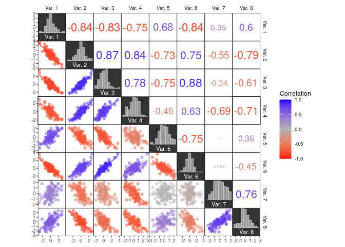
Coloring data by correlation strength
更多关于corrmorant包的使用语法和可视化案例,大家可参考:corrmorant包官网[1]
本文参与?腾讯云自媒体分享计划,分享自微信公众号。
原始发表:2024-04-09,如有侵权请联系?cloudcommunity@tencent.com 删除
评论
登录后参与评论
推荐阅读
目录