Html+CSS绘制三角形图标
发布时间:2021-04-26 00:00| 有 位朋友查看
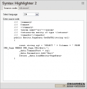
简介:先看看效果图: XML/HTML Code 复制内容到剪贴板 !doctypehtml html lang = en head meta charset = UTF-8 title Document / title style type = text/css #test1{ height:20px; width:20px; border-color:#FF9600#3366ff#12ad2a#f0eb7a; border-style:solid……
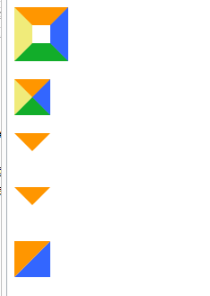
先看看效果图:
XML/HTML Code复制内容到剪贴板
- <!doctype html>
- <html lang="en">
- <head>
- <meta charset="UTF-8">
- <title>Document</title>
- <style type="text/css">
- #test1 {
- height:20px;
- width:20px;
- border-color:#FF9600 #3366ff #12ad2a #f0eb7a;
- border-style:solid;
- border-width:20px;
- }
- #test2 {
- height:0;
- width:0;
- overflow: hidden; /* 这里设置overflow, font-size, line-height */
- font-size: 0; /*是因为, 虽然宽高度为0, 但在IE6下会具有默认的 */
- line-height: 0; /* 字体大小和行高, 导致盒子呈现被撑开的长矩形 */
- border-color:#FF9600 #3366ff #12ad2a #f0eb7a;
- border-style:solid;
- border-width:20px;
- }
- #test3 {
- height:0;
- width:0;
- overflow: hidden;
- font-size: 0;
- line-height: 0;
- border-color:#FF9600 transparent transparent transparent;
- border-style:solid;
- border-width:20px;
- }
- #test4 {
- height:0;
- width:0;
- overflow: hidden;
- font-size: 0;
- line-height: 0;
- border-color:#FF9600 transparent transparent transparent;
- border-style:solid dashed dashed dashed;
- border-width:20px;
- }/*兼容IE6*/
- #test5 {
- height:0;
- width:0;
- overflow: hidden;
- font-size: 0;
- line-height: 0;
- border-color:#FF9600 #3366ff transparent transparent;
- border-style:solid solid dashed dashed;
- border-width:40px 40px 0 0 ;
- }
- </style>
- </head>
- <body>
- <div id="test1"></div><br>
- <div id="test2"></div><br>
- <div id="test3"></div><br>
- <div id="test4"></div><br>
- <div id="test5"></div><br>
- </body>
- </html>
-
以上就是本文的全部内容,希望对大家的学习有所帮助,也希望大家多多支持脚本之家。
原文链接:https://m.jb51.net/web/469371.html
本站部分内容转载于网络,版权归原作者所有,转载之目的在于传播更多优秀技术内容,如有侵权请联系QQ/微信:153890879删除,谢谢!