

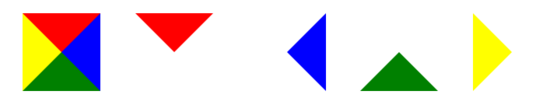
.triangle{width:0;height:0;border-width:50px;border-style:solid;border-color:red blue green yellow;}
.triangle_top{width:0;height: 0;border-width:50px;border-style:solid;border-color:red transparent transparent transparent;}
.triangle_right{width:0;height: 0;border-width:50px;border-style:solid;border-color:transparent blue transparent transparent;}
.triangle_bottom{width:0;height: 0;border-width:50px;border-style:solid;border-color:transparent transparent green transparent;}
.triangle_left{width:0;height: 0;border-width:50px;border-style:solid;border-color:transparent transparent transparent yellow;}
要点
transparent
拓展扇形

border-radius: 50px
饼图思路

先建一个圆,然后分左右两块。
左右两块里面在包含一个半圆,然后对其做旋转处理,来匹配对应的百分比,溢出隐藏处理
注意
因为是左右两块,所以要注意溢出隐藏,以达到最终效果
注意旋转的中心点
如果中心区域掏空的话,注意层级问题
如果百分比<=50%,可以不要右边那块
百分比跟旋转角度的对应换算(百分比/100*360)
例子

<style>
.pie38{width: 100px;height: 100px;border-radius: 50px;margin:20px;background-color: #ddd;position: relative;display: inline-block;overflow: hidden}
.pie38 .pie_content{line-height: 100px;text-align: center;position: absolute;width: 100px;height: 100px;z-index: 8}
.pie38 .pie_left{position: absolute;top:0;left:0;width: 50px;height: 100px;overflow: hidden;}
.pie38 .pie_left:after{content: '';height: 100px;width:50px;border-right:50px solid red;position:absolute;top:0;left:0;transform: rotate(-137deg);}
</style>
<div class="pie38">
 <div class="pie_content">38%</div>
 <div class="pie_left"></div>
</div>

<style>
.pie88{width: 100px;height: 100px;border-radius: 50px;margin:20px;background-color: #ddd;position: relative;display: inline-block;overflow: hidden;}
.pie88 .pie_content{line-height: 100px;text-align: center;position: absolute;width: 100px;height: 100px;z-index: 8}
.pie88 .pie_left{position: absolute;top:0;left:0;width: 50px;height: 100px;overflow: hidden;background-color: red}
.pie88 .pie_right{position: absolute;top:0;right:0;width: 50px;height: 100px;overflow: hidden;}
.pie88 .pie_right:after{content: '';height: 100px;width:50px;border-left:50px solid red;position:absolute;right:0;top:0;border-radius: 50px;transform: rotate(-137deg);}
</style>

<div class="pie88">
 <div class="pie_content">88%</div>
 <div class="pie_left"></div>
 <div class="pie_right"></div>
</div>
总结
以上所述是小编给大家介绍的CSS代码实现三角形和饼图,希望对大家有所帮助,如果大家有任何疑问请给我留言,小编会及时回复大家的。在此也非常感谢大家对脚本之家网站的支持!

Redis 官方在 2020 年 5 月正式推出 6.0 版本,提供很多振奋人心的新特性,所以...
John Au-Yeung 来源:medium 译者:前端小智 有梦想,有干货,微信搜索 【大迁世...
注释1:上图整个大背景是这个网页的全部尺寸,中间的小框才是浏览器中的可见尺寸...
复制代码 代码如下: !DOCTYPE html PUBLIC "-//W3C//DTD XHTML 1.0 Transitional...
1.HTML5的内容类型 内容类型 描述 内嵌 向文档中添加其他类型的内容,例如audio...
data URI scheme 允许我们使用内联(inline-code)的方式在网页中包含数据,可以...
content属性一般用于::before、::after伪元素中,用于呈现伪元素的内容。平时con...
先点赞再看,养成好习惯 前言 这两天在另一个社区看到了一个关于 Tomcat 的提问...
简介: 企业上云多账号架构中,如何做到从上到下管理的同时,处理好员工的权限边...
解决方法如下: 第一种 使用iframe,但是目前使用iframe的人已经越来越少了,而...

