

最近遇到一个需求,要在图片上显示带有半透明背景的文字,效果如下图所示:

需求.png
看到这个需求之后,第一反应是使用CSS3中的opacity设置元素的透明度。
<!DOCTYPE html>
<html lang="en">

<head>
    <meta charset="UTF-8">
    <meta name="viewport" content="width=device-width, initial-scale=1.0">
    <meta http-equiv="X-UA-Compatible" content="ie=edge">
    <title>背景透明,文字也透明</title>
    <style>
        * {
            padding: 0;
            margin: 0;
        }

        .container {
            width: 600px;
            height: 400px;
            background: url('https://img1.dongqiudi.com/fastdfs3/M00/18/56/ChOxM1stHByARuNmAAGsJDKXtuM269.jpg') no-repeat;
            background-size: cover;
            -webkit-background-size: cover;
            -o-background-size: cover;
            background-position: center 0;
        }

        .demo {
            position: absolute;
            width: 260px;
            height: 60px;
            top: 260px;
            line-height: 60px;
            text-align: center;
            background-color: black;
            opacity: 0.5;
        }

        .demo p {
            color: #FFF;
            font-size: 18px;
            font-weight: 600;
        }
    </style>
</head>

<body>
    <div class="container">
        <div class="demo">
            <p>2018世界杯已开幕:10天</p>
        </div>
    </div>
</body>

</html>
效果如下:

背景透明,文字也透明.png
这样貌似也满足了需求,不过并不完美,设置opacity之后,整个元素都半透明了,造成文字显得模糊,这样的解决方式并不可取。
其实实现透明的CSS方法并不只有设置opacity一种方式。还有另外两种:
在这里我采用了设置rgba的方式:
<!DOCTYPE html>
<html lang="en">

<head>
    <meta charset="UTF-8">
    <meta name="viewport" content="width=device-width, initial-scale=1.0">
    <meta http-equiv="X-UA-Compatible" content="ie=edge">
    <title>背景透明,文字不透明</title>
    <style>
        * {
            padding: 0;
            margin: 0;
        }

        .container {
            width: 600px;
            height: 400px;
            background: url('https://img1.dongqiudi.com/fastdfs3/M00/18/56/ChOxM1stHByARuNmAAGsJDKXtuM269.jpg') no-repeat;
            background-size: cover;
            -webkit-background-size: cover;
            -o-background-size: cover;
            background-position: center 0;
        }

        .demo {
            position: absolute;
            width: 260px;
            height: 60px;
            top: 260px;
            line-height: 60px;
            text-align: center;
            background-color: rgba(0,0,0,0.5);
        }

        .demo p {
            color: #FFF;
            font-size: 18px;
            font-weight: 600;
        }
    </style>
</head>

<body>
    <div class="container">
        <div class="demo">
            <p>2018世界杯已开幕:10天</p>
        </div>
    </div>
</body>
</html>
效果如下:
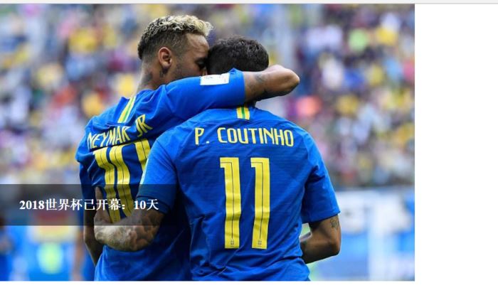
背景透明,文字不透明.png
这样设置之后,文字显得清晰了许多。
小结
其实要实现这个需求,并不只有这一种思路,还可以用两个DIV放在同一个位置,一个是半透明的背景DIV,一个是文字DIV,一样可以解决问题,但是需要写绝对定位或负margin,并出现空内容的DIV,这种方法在有些场景下会显得略微复杂,如下示例所示,所以在实际需求场景中还是要具体问题具体分析。

以上就是本文的全部内容,希望对大家的学习有所帮助,也希望大家多多支持脚本之家。

content属性一般用于::before、::after伪元素中,用于呈现伪元素的内容。平时con...
复制代码 代码如下: !DOCTYPE html PUBLIC "-//W3C//DTD XHTML 1.0 Transitional...
先点赞再看,养成好习惯 前言 这两天在另一个社区看到了一个关于 Tomcat 的提问...
Redis 官方在 2020 年 5 月正式推出 6.0 版本,提供很多振奋人心的新特性,所以...
解决方法如下: 第一种 使用iframe,但是目前使用iframe的人已经越来越少了,而...
注释1:上图整个大背景是这个网页的全部尺寸,中间的小框才是浏览器中的可见尺寸...
data URI scheme 允许我们使用内联(inline-code)的方式在网页中包含数据,可以...
1.HTML5的内容类型 内容类型 描述 内嵌 向文档中添加其他类型的内容,例如audio...
简介: 企业上云多账号架构中,如何做到从上到下管理的同时,处理好员工的权限边...
John Au-Yeung 来源:medium 译者:前端小智 有梦想,有干货,微信搜索 【大迁世...

