mozilla内核浏览器制作background背景渐变
1、制作一个简单的橫条纹渐变背景
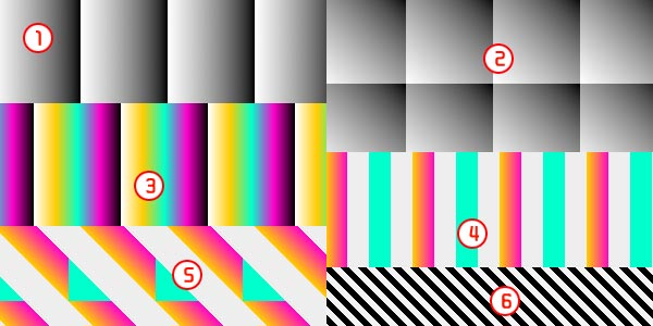
-mozilla内核的浏览器css样式:
CSS Code复制内容到剪贴板
- body {
- background-color: #aaa;
- background-image:-moz-linear-gradient(#000 25%,#fc0 80%);
- background-size: 50px 50px;
- }
以火狐为代表,显示效果如下:
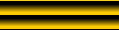
改变background-size的值可以控制背景条纹的高度。上例中-moz-linear-gradient的值分为两组,开始值和结束值,同时设定的开始值的开始位置和结束值的结束位置,位置相差的部分形成渐变。开始位置之前的部分填充为开始的颜色值,结束值之后的部分填充为结束的颜色值。
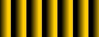
2、改变条纹的方向
CSS Code复制内容到剪贴板
- body {
- background-image:-moz-linear-gradient(0deg,#000 25%,#fc0 80%);
- }
在上面的样式中添加了一组参数<角度位置>,参数分别为0deg-360deg,当这为0deg时,为竖条纹,度数增加时,以逆时针方向转动。下图为它分别为0deg和45deg时效果图:
3、我们尝试着多加几种颜色渐变
CSS Code复制内容到剪贴板
- body {
- background-image:-moz-linear-gradient(45deg,#000 25%,transparent 25%,#fc0 80%);
- }
大家看到,在原来的代码里面我添加了一种透明颜色(transparent 25%),这种渐变的位置和前面一种渐变的位置相重合,它发生了什么样的事情?
从上图中大家可以清晰的看到,第一种颜色嘎然而止。那我们再试着多添加几种这样的颜色,会出现什么样的效果?写到这里我打算把里面的角度先调成0deg,这样看起来会更清楚。
CSS Code复制内容到剪贴板
- body {
- background-image:-moz-linear-gradient(0deg,#000 25%,transparent 25%,transparent 50%,#fc0 50%,#f00 75%,transparent 75%);
- }
猜猜看,效果图会是什么样子的?

在这里大家一定要注意一个问题,这里面写了background-size:50px,50px;那么,它可以被分成重复的块,每个块是50px*50px,注意每个块的起始位置和结束位置。
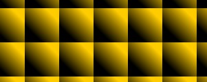
4、斜纹背景的雏形
现在大家再把原来的0deg,改成45deg,会变成什么样子的呢?
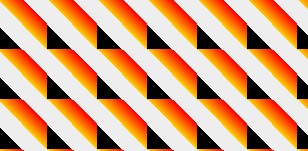
大家应该可以看出来这已经是斜纹背景了吧。再修改一下:
CSS Code复制内容到剪贴板
- body {
- background-image:-moz-linear-gradient(45deg,#000 25%,transparent 25%,transparent 50%,#000 50%,#000 75%,transparent 75%);
- background-size:16px 16px;
- }
大家看到了什么,有没有得到令你满意的效果,修改颜色值,来达到你的目的。这里面还有一个问题,大家自己思考下吧,background-size的值需要注意什么?
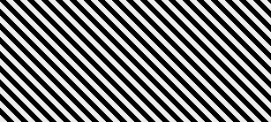
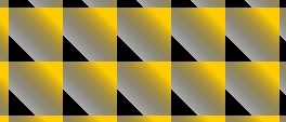
5、最终效果
虽然上面的斜纹背景已经出来了,但还没有达到我们想要的最终效果。我们再把里面的颜色值修改一下,换成白色。现在的颜色值为#fff,我们把它换成rgba形式为rgba(255,255,255,1),前面的三个数字为rgb,第四个数字为alpha,现在我们把这个alpha改成半透明的,代码如下:
CSS Code复制内容到剪贴板
- body {
- background-color: #eee;
- background-image: -moz-linear-gradient(45deg, rgba(255, 255, 255, 0.2) 25%, transparent 25%, transparent 50%, rgba(255, 255, 255, 0.2) 50%, rgba(255, 255, 255, 0.2) 75%, transparent 75%, transparent);
- background-size: 16px 16px;
- }
webkit内核
1、制作一个简单的竖条纹背景
css如下, 这里的效果图可以与上面火狐版的对应起来看
CSS Code复制内容到剪贴板
- body {
- background-color: #eee;
- background-image:-webkit-gradient(linear,0 0,100% 0,from(#fff),to(#000));
- background-size: 80px 80px;
- }
2、改变条纹的方向,
CSS Code复制内容到剪贴板
- body {
- background-image:-webkit-gradient(linear,0 100%,100% 0,from(#fff),to(#000));
- }
3、添加丰富的颜色渐变
CSS Code复制内容到剪贴板
- body {
- background-image:-webkit-gradient(linear,0 0,100% 0,from(#fff),to(#000),color-stop(25%,#fc0),color-stop(50%,#0fc),color-stop(75%,#f0c))
- }
4、调整颜色,并添加透明色。
background-image:-webkit-gradient(linear,0 0,100% 0,color-stop(25%,#0fc),color-stop(25%,transparent),color-stop(50%,transparent),color-stop(50%,#fc0),color-stop(75%,#f0c),color-stop(75%,transparent));
5、按第2步来调整方向
background-image:-webkit-gradient(linear,0 100%,100% 0,color-stop(25%,#0fc),color-stop(25%,transparent),color-stop(50%,transparent),color-stop(50%,#fc0),color-stop(75%,#f0c),color-stop(75%,transparent));
6、调整颜色,调整background-size大小
CSS Code复制内容到剪贴板
- body {
- background-image:-webkit-gradient(linear,0 100%,100% 0,color-stop(25%,#000),color-stop(25%,transparent),color-stop(50%,transparent),color-stop(50%,#000),color-stop(75%,#000),color-stop(75%,transparent));
- background-size: 16px 16px;
- }
7、调整颜色值的透明度,最终效果如下:
虽然上面的斜纹背景已经出来了,但还没有达到我们想要的最终效果。我们再把里面的颜色值修改一下,换成白色。现在的颜色值为#fff,我们再把它换成rgba形式为rgba(255,255,255,1),前面的三个数字为rgb,第四个数字为alpha,现在我们把这个alpha改成半透明的,最终代码如下:
CSS Code复制内容到剪贴板
- body {
- background-color: #eee;
- background-image: -moz-linear-gradient(45deg,#fff 25%, transparent 25%, transparent 50%,#fff 50%,#fff 75%, transparent 75%, transparent);
- background-image:-webkit-gradient(linear,0 100%,100% 0,color-stop(25%,rgba(255,255,255,0.2)),color-stop(25%,transparent),color-stop(50%,transparent),color-stop(50%,rgba(255,255,255,0.2)),color-stop(75%,rgba(255,255,255,0.2)),color-stop(75%,transparent));
- background-size: 16px 16px;
- }
上面的代码加上了上面讲的mozilla内核浏览器下的写法,在火狐、谷歌浏览器中测试显示正常。


